Why Media Room Paint Colors Matter More Than You Think
The right media room paint colors can turn a simple TV area into a true cinematic retreat, creating a vibe similar to a movie theater. Choosing paint for a media room isn’t just about picking a color that looks good; it’s about improving the viewing experience itself.
Paint affects how light bounces around the room and how well you can see your screen. If the walls are too bright or glossy, glare will interfere with the picture. On the other hand, colors that absorb light well help enhance screen contrast and reduce reflections. This makes movies and games clearer, more vibrant, and easier on the eyes.
Picking media room colors also influences mood and comfort. Softer, darker tones can help your brain settle in for long watching sessions, while bright or harsh colors might make it harder to focus or relax.
Unlike regular living rooms where walls often stay light and neutral to open up the space, media rooms benefit from deeper, richer shades that minimize distractions. The type of paint finish matters too. Matte or flat finishes are best because they don’t reflect stray light, keeping the screen as crisp as possible.
The Science Behind Color and Screen Performance
Colors differ in how much light they absorb or reflect. Darker shades soak up most light, reducing reflections that can wash out your TV image. Lighter colors bounce light back, which may cause glare depending on the lighting setup.
Choosing wall colors that soak up light improves the perceived contrast on your screen. This means colors look more vivid and blacks feel deeper, similar to the difference between a glossy and matte photo. Proper contrast is crucial because it helps you notice details in dark movie scenes, avoiding eye strain and boosting immersion.
Creating the Right Atmosphere
Colors don’t just impact how things look—they also affect how you feel. Dark blues and grays tend to promote calmness and focus, which suits media rooms where you want to get lost in your favorite films. Warm neutrals add a cozy vibe but must be balanced carefully to avoid washing out the screen.
Creating the perfect atmosphere means balancing comfort with technical needs. Overly bright colors or flashy tones may energize a space but pull your attention away from the screen. Dark, muted colors, soft lighting, and non-reflective finishes make the room feel like a dedicated space just for entertainment.
Top Dark Media Room Paint Colors That Enhance Your Viewing
Home theater experts often favor dark paint colors because they help your screen stand out and keep distractions low. Dark walls absorb surrounding light so your eyes focus on the screen, creating a theater-like feel in your own house.
Here are some popular dark shades proven to work well in media rooms:
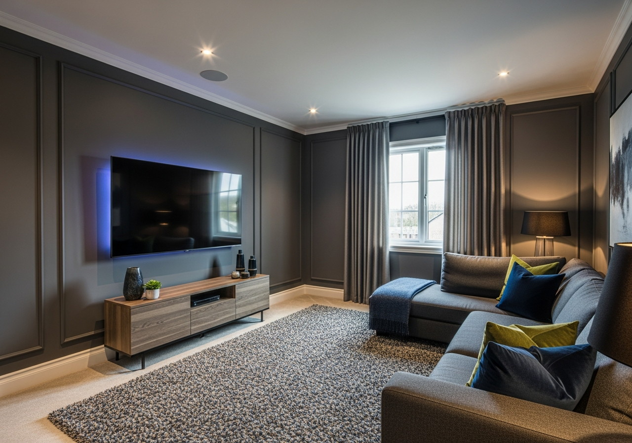
Charcoal Gray: The Safe Bet That Always Works
Charcoal gray is a highly versatile choice. It’s dark enough to reduce glare and light reflection, yet neutral enough to pair well with almost any decor. It creates a modern, sophisticated backdrop without feeling too heavy or closed-in.
For walls, look for deep grays with subtle blue or brown undertones to add richness without pulling the mood too cool or warm. When pairing trim, crisp whites or off-whites brighten edges without stealing attention. Ceilings painted a shade lighter than the walls can keep the room feeling open.
Navy Blue: Adding Depth Without Going Too Dark
Navy blue brings a touch of warmth and personality while maintaining excellent viewing conditions. It’s less severe than black or charcoal but still dark enough to keep light reflections at bay.
Select navy tones with a bit of softness to avoid harsh coldness—those with mild gray undertones work well for rooms of any size. Navy blue walls look stunning alongside leather or fabric seating in brown or tan tones. For decor, natural wood accents and copper highlights harmonize beautifully with this color.
Black: When You Want Theater-Level Immersion
Painting your walls true black will give you the deepest contrast and the most immersive viewing possible. Black absorbs almost all stray light, providing a striking stage for your screen.
Many hesitate to commit to black walls, fearing the space will feel claustrophobic or tragic. But when balanced with lighter ceiling colors and thoughtful lighting, black media rooms can feel sleek and cozy rather than overwhelming.
In multi-use spaces, consider painting only the wall behind the screen black, or using black on lower wall portions paired with lighter upper walls. This approach minimizes the visual impact without losing the benefits for viewing.
Dark Green: A Sophisticated Twist
For a media room that’s both unique and rich, dark green adds drama and elegance. Deep forest or hunter green absorbs light well and introduces a hint of nature’s calm, perfect for long movie nights or gaming marathons.
Pair dark green walls with warm wood tones or brass accents for a luxurious feel. This color works particularly well in rooms with ample natural light, which helps balance the darkness while keeping your screen colors as they should be.
Warm and Neutral Options for Multi-Purpose Media Rooms
Not every media room is solely for watching movies. Sometimes these spaces serve multiple roles like casual living areas, gaming zones, or home offices. In those cases, warm and neutral colors provide flexibility without sacrificing comfort.
Neutrals inspired by earth tones—soft beiges, taupes, or mild greiges—offer a calm, inviting backdrop that suits many activities. These colors reflect some light, helping the room feel spacious, but choosing slightly deeper shades ensures the screen remains the focal point.
Warm tones such as muted terracotta or gentle amber add coziness while avoiding overly bright or distracting walls. They encourage relaxation and focus, especially when paired with carefully controlled lighting and window treatments to limit glare during screen time.
In multi-use rooms, the key is balance. Walls that are too pale may cause reflections, washing out the screen when watching movies. Walls that are too dark can make the space feel smaller or less welcoming during daily use.
Avoiding Common Mistakes
- Don’t pick bright or vibrant colors like reds or yellows that can cause eye fatigue.
- Avoid glossy or satin finishes that reflect light and distract from the screen.
- Consider how natural and artificial light sources affect your color choice at different times of day.
Best Paint Finishes for Multi-Use Rooms
Matte or eggshell finishes strike a good balance in multi-functional rooms. These finishes are less reflective but still scrub-able enough for common wear and tear in lively spaces.
Using an accent wall in a darker neutral can help reinforce the media room vibe while keeping other walls lighter and more lively for daytime activities.
Color Pairing Tips
- Combine a warm beige with deep brown or charcoal trim to frame the room nicely without distracting.
- Use soft gray-greens or blues as complementary accent colors to add subtle variety.
- Incorporate textured wall treatments or fabrics in coordinating hues to enrich the space without overwhelming.
Conclusion
Media room paint colors play a critical role in creating an immersive and comfortable viewing space. Choosing dark colors like charcoal gray, navy blue, or black enhances screen contrast and reduces glare, while warm neutrals offer flexibility for multi-purpose rooms.
Pick matte finishes to minimize reflections and tweak color shades based on your room’s lighting and use. Consider how each shade impacts mood and eye comfort to build the atmosphere you want. Testing samples in your actual space before painting can help find the perfect balance between style and function.
With the right paint colors, your media room can become a personal theater that feels inviting and visually optimized throughout every movie or gaming session.