Understanding Paint Color Schemes for Living Room Design
Choosing a paint color scheme for your living room sets the mood for every moment spent there. The right colors can make the space feel lively, cozy, or calm. Deciding between using a single color or multiple hues, and understanding how your room’s size and lighting play into the choice, will help create a space that feels just right.
There are simple ways to balance colors in a room, like following the 60-30-10 rule. This means using 60% of one color, 30% of a second, and 10% as an accent. Plus, looking at how paint samples appear in different lighting helps avoid surprises after the paint dries.
The Psychology Behind Living Room Colors
Colors influence how we feel. Warm colors—such as reds, oranges, and yellows—can add energy and friendliness, encouraging lively conversation. Cool colors like blues, greens, and purples tend to calm the mind, making them great for a relaxed, peaceful living room.
Some colors invite people to chat and connect, while others make you want to kick back and unwind. For example, soft yellows foster warmth and sociability, while muted blues can reduce stress and create a serene environment.
Assessing Your Space Before Choosing Colors
Start by observing where sunlight enters your living room. Rooms facing south get the warmest, brightest light, bringing out warm hues well. North-facing spaces often have cooler light, so warmer paints can balance the chill. East-facing rooms shine with morning light, while west-facing rooms catch the glow of sunset.
Also, consider fixed elements such as flooring, a fireplace, or built-in shelves. Dark hardwood floors call for lighter walls to brighten the space, while light floors can handle richer paint shades. These details help you choose color schemes that harmonize with what’s already there.
Timeless Neutral Paint Color Schemes for Living Room Comfort
Neutral paint colors provide a calm, versatile backdrop that feels welcoming year-round. They let you switch up furniture and decorations easily without worrying about clashing. Whether you lean toward warm neutrals or cooler greys and whites, layering tones adds subtle depth that keeps the room from feeling flat.
Warm neutrals like greige, beige, and cream bring softness and warmth. Cool neutrals such as light gray and crisp white introduce freshness and modern appeal. Pairing these shades thoughtfully with wood furnishings enhances a cozy, grounded atmosphere.
The Greige Revolution
Greige—a mix of gray and beige—sits perfectly between warm and cool, making it a favorite for many living rooms. Shades like “Revere Pewter” give a soft, comforting feel with faint earthy undertones. When paired with accent colors like muted blues or gentle greens, greige creates a sophisticated and inviting palette.
Greige walls work well with wooden floors or furniture in oak or walnut tones, highlighting natural grains without competing with them. Adding textiles in cream, taupe, or leather completes the layered look.
Creating Contrast with White and Charcoal
High-contrast schemes using white and charcoal gray bring timeless drama without overwhelming the senses. Bright white walls alongside charcoal furniture or a feature wall establish clean lines and visual interest.
The key is balance: Too much dark gray can make the room heavy, while too much white may feel sterile. Combine these tones with natural textures like wool rugs or woven baskets to soften the effect. This contrast works beautifully to modernize spaces while preserving a warm, lived-in vibe.
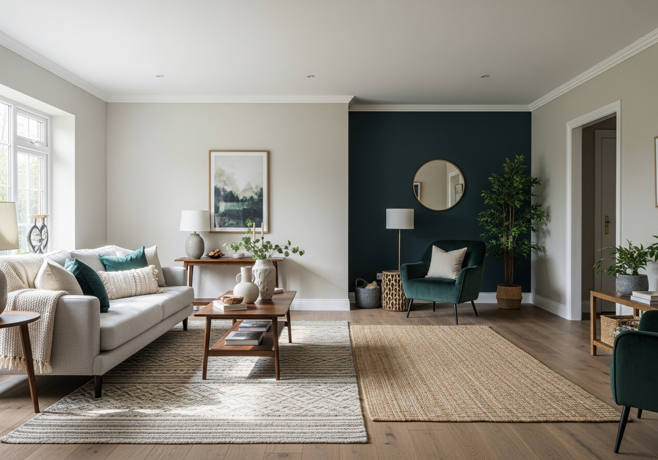
Bold and Moody Color Palettes That Make a Statement
Living rooms painted with deep, rich colors create a bold atmosphere full of personality. These palettes invite you to embrace creativity and make your living space stand out. Colors such as emerald green, navy blue, or dramatic plum bring depth and a cozy sense of luxury.
Using these strong hues on an accent wall or across the entire room can enhance architectural details, such as crown molding or built-in shelves. They pair well with metallic fixtures, leather furniture, and wood, adding a theatrical layer of charm.
Choosing the Right Bold Shades
Dark greens inspire calm and connection with nature. Navy blues evoke a feeling of trust and serenity, while deep purples suggest richness and creativity. Selecting one main color with lighter neutral accents maintains balance and prevents the space from feeling too confined.
Balancing Bold Colors in Different Room Sizes
In smaller rooms, use dark colors on a single wall with lighter shades elsewhere to open the space. Larger living rooms can handle paint on all four walls, creating a cocoon-like effect that feels inviting and stylish.
Lighting is crucial. Ensure good natural or layered artificial light to prevent the dark hues from making the room feel gloomy. Consider reflective surfaces like mirrors or glossy finishes to enhance brightness.
Conclusion
Paint color schemes shape how you feel in your living room by setting the tone for comfort, conversation, or calm. Understanding your space, the mood you want, and how different colors interact helps you make confident choices.
Start by examining natural light and room elements. Test colors in different lights, then use rules like 60-30-10 to balance hues. Whether you choose timeless neutrals or bold shades, layering colors and textures creates an inviting room that fits your lifestyle.