
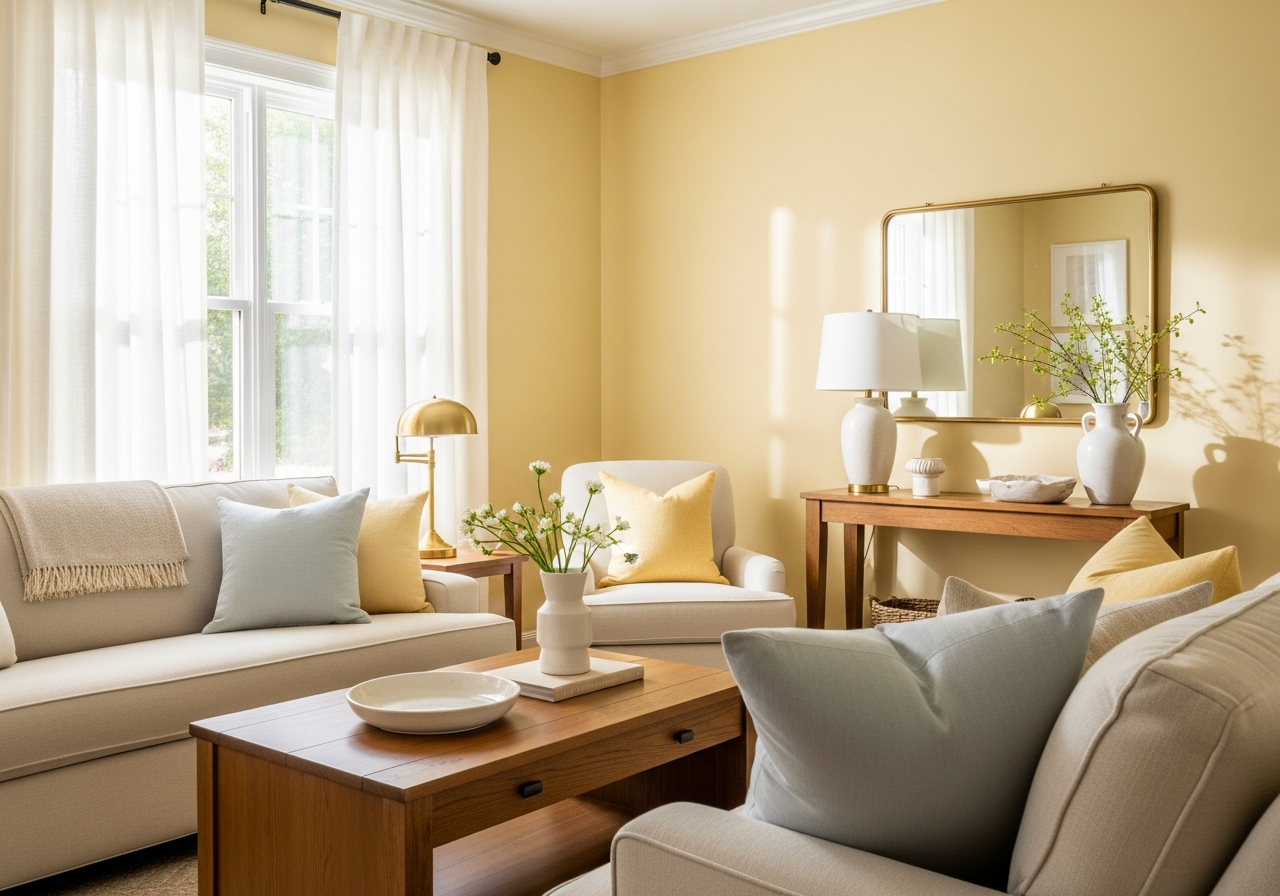

Butter Yellow Paint for Living Room: Color Guide and Design Ideas
Butter yellow paint offers a gentle, welcoming glow that can brighten any living room without feeling harsh or overpowering. Its soft, creamy tone evokes warmth much like sunshine peeking through a window on a calm morning. Perfect for creating a cheerful yet soothing atmosphere, butter yellow works well across different decor styles and room sizes. Understanding how this shade interacts with light, undertones, and your existing furnishings will help you make the most of its mood-boosting power and radiant charm. In this guide, you’ll find useful insights and tips to pick the right shade and design ideas to bring your living room to life with butter yellow paint.
1. What Makes Butter Yellow Paint Perfect for Living Rooms
Butter yellow paint is special because it adds warmth without feeling too bright or sharp. This soft yellow shade often reminds people of fresh butter or creamy custard—comforting and mild. Compared to bright yellows, which can be energetic yet sometimes overwhelming, butter yellow strikes a calm balance. It reflects light beautifully, making rooms appear more open and inviting.
Why Butter Yellow Beats Other Yellows
Butter yellow tends to be easier on the eyes than vivid or neon yellows. Its creamy softness means it doesn’t compete with furniture or decoration but instead highlights them gently. Unlike colder yellows with greenish or overly pale undertones, butter yellow has a creamy warmth that translates well into cozy feelings. It works well in both small, dim rooms and larger, well-lit spaces because it can adapt without losing its charm.
The Science Behind Yellow’s Happy Effect
Yellow is known to boost mood because it stimulates feelings of happiness and energy. It encourages positivity by releasing serotonin—often called the “feel-good” hormone. Butter yellow balances this mood boost with a soothing softness, making it perfect for living rooms where relaxation and social connection are key. The color’s light reflection properties also help brighten shadowed areas, improving the overall ambiance without harshness.
2. Choosing the Right Butter Yellow Paint Shade
Picking the right butter yellow shade matters because slight changes can affect a room’s mood. Some yellows lean too green or orange, altering the feel entirely. To get a smooth, welcoming look, look closely at undertones and finishes. Trying samples on your wall before deciding is smart since paint can look different across spaces.
Reading Paint Undertones Like a Pro
Undertones in butter yellow paint can change how it looks on your walls. Green undertones offer a cooler, fresh vibe but may clash with warm wood tones or brass accents. Orange undertones add warmth and richness but can make a room feel smaller if overdone. Neutral undertones are the safest bet, blending well with many styles and colors. Pay attention to lighting when examining samples; undertones may show differently in daylight versus artificial light.
Best Paint Brands for Butter Yellow
Several popular brands offer butter yellow shades that homeowners love. Brands like Benjamin Moore, Sherwin-Williams, and Behr provide a range of soft yellows with subtle differences in warmth and undertones. For example, Benjamin Moore’s “Buttermilk” and Sherwin-Williams’ “Butter Up” are classic choices. When selecting a brand, also consider the finish. Matte paints hide wall imperfections but absorb more light, while eggshell and satin finishes add soft reflections and are easier to clean.
3. How Natural and Artificial Light Changes Your Butter Yellow
Light dramatically changes how butter yellow paint appears. A paint color can look bright and sunny near a window but take on odd hues under artificial lights or in darker corners. Knowing how different light sources affect your walls helps you avoid surprises.
Testing Paint at Different Times
Natural light changes throughout the day. Morning sun casts cooler light, making butter yellow appear softer, while afternoon sun warms it up. North-facing rooms get less direct light, often giving yellow paint a cooler or muted look. South-facing rooms get warm, direct sunlight that enhances the buttery richness. Test paint samples on different walls and observe them at morning, midday, and evening to see how your chosen shade reacts.
Fixing Bad Lighting Situations
If your room’s lighting dulls butter yellow or gives it unwanted green or orange tones, there are fixes. Using warm LED bulbs with a color temperature around 2700K enhances yellow hues naturally. Light-colored sheer curtains let in daylight without harsh glare. Adding wall mirrors can boost reflected light, making the yellow appear lighter and more vibrant. Sometimes pairing the paint with soft white trim or ceiling color will balance warm undertones and keep the room feeling fresh.
4. Pairing Butter Yellow with Your Existing Living Room
Butter yellow is versatile but knowing how to combine it with your furniture, flooring, and decor helps create a stylish, coherent look. It pairs well with many colors and textures, enhancing both traditional and modern spaces.
Complementing Furniture and Fabrics
Butter yellow complements warm wood tones, soft grays, and muted blues beautifully. Darker furniture in walnut or chestnut contrasts well, grounding the light walls. For fabrics, consider natural materials like linen and cotton in creams, whites, or soft pastels. Avoid too many bright or clashing colors, as butter yellow works best as a calm backdrop.
Patterned cushions or throws with subtle yellows, soft greens, or blush pinks add interest without overpowering.
Accent Colors That Work Well
Soft blues, gentle greens, and warm neutrals bring balance when paired with butter yellow walls. Deep navy or charcoal gray accents add sophistication and depth. White or cream trim and ceiling colors help the yellow pop without chaos. Brass or gold finishes in lamps and frames enhance the warmth and create a cohesive look with the buttery tones.
Conclusion
Butter yellow paint for living rooms means a soft, warm color that brightens spaces and lifts moods gently. It’s a shade that mixes comfort with sunshine, creating inviting and cheerful atmospheres. To use butter yellow well, consider the undertones and finishes that best fit your room. Test paint samples under different lighting and pair the color thoughtfully with your furniture and accents. Taking these steps will help you enjoy a living room that feels both cozy and lively.