

Good Colors to Paint Your Room for Any Style and Mood
Choosing the right colors to paint your room can change everything about how you feel in the space. Whether you want a calm place to relax, a bright spot to work, or a cozy nook to gather with family, the colors you pick set the tone. Color affects not only mood and energy but also how big or bright a room feels. You don’t have to be an expert to pick the perfect shade. Understanding a few simple ideas can help you choose colors that match your style and mood, making your rooms truly your own.
1. Why Room Color Matters More Than You Think
The right paint color does more than decorate walls. It shapes your mood, changes how you sense the size of a room, and helps create a space that feels just right for what you do there. Colors influence energy levels, comfort, and even habits in ways you might not expect.
The Psychology Behind Paint Colors
Colors speak to us quietly but powerfully. Warm colors like reds and oranges can spark energy and excitement, while cool colors like blues and greens bring calm and restfulness. Soft grays and neutrals provide balance and let other design elements shine. Your choice of color can encourage relaxation, boost creativity, or even push you toward better focus. For example, blue tones are often linked with calmness and clear thinking, making them great for bedrooms or offices. Meanwhile, yellow can lift spirits and inspire happiness.
How Light Changes Everything
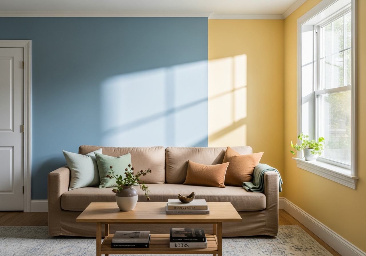
Lighting plays a huge role in how paint colors appear. A shade that looks rich and warm in the afternoon sun might seem cool and dull under artificial lighting at night. Natural light shifts throughout the day, so paint colors can change with it. North-facing rooms tend to get softer, cooler light, which can make some colors feel muted. South-facing rooms flood in sunlight, often making colors look sharper and brighter. That’s why testing paint colors in the actual room and at different times can save you from surprises.
Colors can also impact the feel of space. Light colors make walls seem to recede, making small rooms feel larger and airier. Dark colors absorb light, creating cozy, intimate environments but may shrink perceived space. This effect helps you think about the room’s size and purpose when choosing colors. The right tone lays a foundation for furniture and décor, pulling everything together and creating harmony.
2. Good Colors to Paint Your Room Based on Purpose
Each room has its own role, and the colors you use should support that. Bedrooms, living rooms, kitchens, and work areas all benefit from paint that suits their mood and function.
Bedrooms: Creating Your Sleep Sanctuary
Bedrooms are places to rest and recharge, so soft and soothing colors work best here. Blues and greens are popular because they help slow the heart rate and calm the mind. Light gray shades also perform well, as they add a neutral, peaceful backdrop that won’t overstimulate. Avoid loud or bright colors that might keep you awake. Instead, focus on colors that invite you to relax and feel secure.
Living Spaces: Finding the Social Sweet Spot
Living rooms encourage gathering and conversation. Warm and inviting colors like soft oranges, gentle reds, and earthy tans help create a comfortable environment. These tones stimulate warmth and energy without feeling too intense. Neutral palettes with hints of color work well if you want a versatile space that adapts to different moods and styles. The key is to choose colors that encourage connection while keeping the room cozy.
Work Areas: Colors That Keep You Sharp
Home offices and study areas benefit from colors that promote focus and clarity. Cooler colors such as soft blues, grays, and even greens can help maintain concentration and calm nerves. Avoid overly bright or bold shades that could distract. Subtle, muted tones are best for clear thinking and productivity. Adding a vibrant accent, like a bright chair or art piece, can bring energy without overwhelming the room’s main color.
Kitchen Colors That Boost Appetite and Energy
Kitchens are lively spaces where energy and appetite matter. Warm colors like yellows, reds, and oranges stimulate hunger and conversation. Yellow adds cheerfulness, while red can increase excitement. If you prefer a calmer vibe, soft greens or whites bring freshness and cleanliness, helping the space feel vibrant without being overpowering.
Kids’ Room Colors That Balance Fun and Calm
For children’s rooms, you want colors that are playful yet soothing. Bright hues like blues, greens, and yellows work well because they feel lively but not stressful. Avoid overly dark or busy patterns. A mix of soft pastels with a few bright accents helps keep the energy balanced, supporting both playtime and rest.
3. How to Choose Paint Colors That Work With Your Space
Before selecting a paint color, consider key factors that affect how the color looks and feels in your room. This helps avoid mistakes that lead to frustration later.
The Natural Light Test
Check paint samples in the room at different times during the day. Morning, afternoon, and evening light all affect color differently. A shade that looks perfect in bright sunlight might feel dull in dim light. Paint large swatches on walls and observe how the color changes when the light shifts.
Coordinating with Your Furniture and Décor
Look at the undertones in your furniture and existing decorations. Paint colors come with warm or cool undertones, and matching or complimenting these tones keeps everything feeling cohesive. For example, if your furniture has warm wood tones, warm paint colors with red or yellow undertones often work best.
Working Around Fixed Elements
Consider elements you cannot change, like flooring, countertops, or tile. Their colors and materials limit your paint choices. Neutral wall colors typically work well with diverse styles and finishes, but you can also enhance certain features by choosing complementary colors.
The 60-30-10 Color Rule
This simple design rule helps achieve balance and interest in any room. Use one color for about 60% of the space (usually walls), a second color for 30% (furniture or large accents), and a third color for 10% (small decorations and accessories). This keeps the room visually pleasing without being overwhelming.
North vs. South-Facing Rooms
Know the direction your room faces. North-facing rooms get cooler, less natural light, so warmer, brighter colors can brighten them up. South-facing rooms receive more sunlight and can handle cooler or darker tones while still feeling lively. Picking colors that suit your room’s light exposure helps the space feel right all day long.
Conclusion
Good colors to paint your room depend on the style and mood you want to create. The right paint can change the way a space feels, affects your mood, and makes rooms look bigger or cozier.
Start by thinking about each room’s purpose and how you want to feel there. Test colors in your space under different lighting. Match paint to your furniture and fixed features for harmony. Follow simple design rules, like the 60-30-10 rule, to balance colors effectively. With these steps, you can pick colors that make your home comfortable and inviting every day.