Why Living Room Paint Color Matters More Than You Think
The color you choose for your living room walls is more than just a style choice; it is a powerful tool that shapes how you feel and how others experience your home. This space is where you relax, entertain, and spend a lot of your daily time, so the color sets a tone that echoes throughout your life.
Colors can lift your mood, energize your spirit, or help you unwind after a long day. Picking the right shade can even make the room appear larger or cozier, depending on your goal. Beyond aesthetics, paint choice has been linked to home value, influencing buyers’ impressions and decisions.
The Science Behind Color Psychology
Colors speak to our brain in subtle yet profound ways. Warm colors like reds and oranges can raise energy levels and create a vibrant atmosphere, perfect for lively conversation and activity. Cooler shades like blues and greens tend to have calming effects, lowering blood pressure and fostering relaxation. Neutrals work as a blank slate—they blend well with other colors and support a balanced mood. Understanding this helps you pick a shade that fits the emotional vibe you want for your shared space.
How Paint Color Changes Room Perception
Light and color work together to trick our eyes. Lighter colors such as white, cream, or pale pastels tend to open up a room, making it feel brighter and bigger. Darker colors can create intimacy and depth but might shrink the visual space if overdone. Glossy finishes reflect light and can add an airy feel, while matte paints absorb light, often making a room feel softer and quieter. Using color strategically can visually expand cramped spaces or add warmth to large, open rooms. This balance between light and shade is key to achieving the perfect look and feel in your living room.
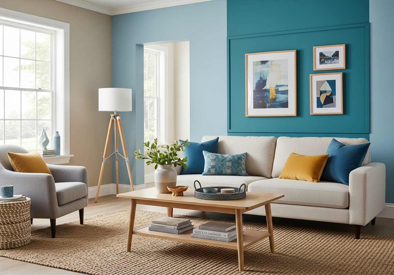
Best Colors to Paint Your Living Room in 2024
This year brings a rich palette for living rooms, combining timeless neutrals with fresh, bold options that reflect personality and style. Whether your space feels small or spacious, there’s a color that suits your needs while standing up well to wear and tear.
Warm Neutrals That Never Go Out of Style
Warm beige, soft taupe, and creamy off-whites are top picks. These colors offer a cozy backdrop that blends with almost any décor. Paint names like “Soft Almond,” “Velvet Sand,” and “Ivory Whisper” highlight the trend toward subtle warmth that invites comfort without overwhelming. They work especially well in rooms with less natural light, helping to keep the space feeling bright and welcoming. These neutrals also age gracefully, maintaining appeal over time.
Bold Colors for Statement Walls
If you want to add drama, look at deep blues, forest greens, or rich terracotta. Colors like “Midnight Teal,” “Emerald Canopy,” and “Burnt Clay” make dynamic accent walls and bring a contemporary edge to your living room. They work well in larger rooms or combined with lighter shades on adjoining walls to avoid feeling heavy. On the practical side, these deeper colors can hide minor wall flaws but may show dust more readily.
Cool Tones for Modern Spaces
Soft grays and pale blues continue their popularity, offering calm, modern vibes that pair well with minimalist or Scandinavian styles. Shades such as “Silver Slate,” “Mist Blue,” and “Polar Fog” give your room a refreshed, cool feel. These tones play well with metal and glass accents, enhancing natural light and creating a slick, airy look. They’re ideal for open-concept homes where the living room flows into other spaces.
How Natural and Artificial Light Changes Your Paint Color
Picking a paint color is only part of the battle. How it looks on your walls depends heavily on lighting. The same shade can feel warm and welcoming or cold and dull, depending on the light hitting it.
Reading Your Room’s Natural Light
Rooms facing north tend to get cool, indirect light that can mute colors, making warm tones appear cooler and cooler shades even colder. South-facing rooms enjoy bright, direct sunlight that enhances colors but can cause some to look washed out in the midday. East-facing rooms get soft morning light, perfect for softer colors, while west-facing rooms receive warm late afternoon sunlight that deepens tones dramatically. By testing paint samples in these different lighting conditions throughout the day, you can better judge the right color.
Choosing Bulbs That Work With Your Paint
Your choice of light bulbs plays a crucial role. Incandescent bulbs cast a yellowish light that warms up colors and suits earthy, warm paints. LED bulbs come in various color temperatures and can be chosen to keep colors natural or emphasize cooler tones. Combining overhead lighting, lamps, and natural sources can balance uneven lighting and prevent colors from appearing flat or one-dimensional. This layering of light helps your chosen paint color look its best at all times.
Conclusion
The best colors to paint your living room blend mood, space, and light to create a room that feels just right for you. They affect how you feel and how others feel when they step inside, making a strong impression every day.
Start by considering the mood you want and the size of your room. Test paint samples on different walls and observe how your lighting shapes the color across the day. This careful approach helps you pick a living room color that not only looks great but feels like home.