Why Paint Color Matters Most in Guest Rooms
Your choice of paint color plays a bigger role in the guest room than you might guess. It sets the tone before guests even step inside or unpack their bags. The right color creates a warm, inviting space. The wrong one can make guests feel like they’re staying in a cold, cramped, or impersonal spot.
Colors affect moods in subtle ways. Soft blues and greens tend to calm and relax, while bright, intense colors might make a room feel busy or restless. Guests usually want a break from the day’s worries, so choosing soothing shades can help them feel at ease.
Paint also changes how big or small a room appears. Light colors reflect more light, making a room feel airy and spacious. Dark colors absorb light and can make even a large space feel tighter. Using paint cleverly ensures your guest room doesn’t feel closed in or overwhelming.
At the same time, the color should strike a balance between your style and what most people will like. While vivid or trend-forward colors express personality, guest rooms work best when they have a universal appeal. Neutral tones and muted colors invite everyone to feel comfortable without clashing with other decor.
Compared to other changes like furniture or flooring, paint is a cost-effective way to completely refresh a space. You can transform a tired guest room into a welcoming retreat simply by changing the walls. It is one of the easiest ways to improve your guests’ experience without spending a lot of money.
Choosing the best guest room paint color means more than picking a shade you like. It means thinking about mood, space, appeal, and impact. Make these choices carefully, and that guest room will feel like a true home away from home.
Best Guest Room Paint Colors for Any Style
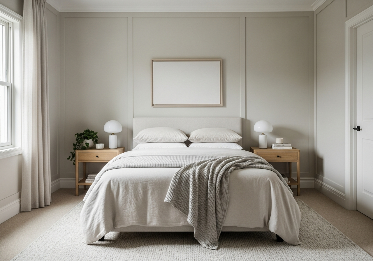
Some paint colors have stood the test of time for guest rooms. They create a welcoming vibe without feeling dull or plain. Below are five top neutral colors often recommended for guest rooms, with examples from popular paint brands.
Warm Whites That Feel Like a Hug
Warm whites carry soft undertones of cream, beige, or peach. They feel cozy and light at the same time, like a gentle embrace. “Alabaster” by Sherwin-Williams and Benjamin Moore’s “White Dove” are two beautiful warm whites to consider. These colors reflect light well, making small or dim spaces feel larger.
Warm whites blend easily with wood furniture and warm-colored accents. They create a quiet canvas that doesn’t compete with decor but enhances comfort. Ideal for guest rooms aiming for a soft, inviting look.
Soft Grays for Modern Comfort
Soft, light grays offer a cool, calm feeling without being sterile or cold. Grays like Sherwin-Williams’ “Repose Gray” or Benjamin Moore’s “Gray Owl” add sophistication while still feeling approachable. These colors suit modern or transitional styles well.
Gray’s versatility helps it balance with nearly any bedding or artwork. In larger rooms, gray walls offer a neutral foundation that supports bolder accessories. In smaller rooms, lighter grays can maintain an open feel without overwhelming.
Greige: The Perfect Middle Ground
Greige mixes gray with beige to warm up a neutral base. It’s a popular guest room choice because it captures the best qualities of both colors. Colors like Benjamin Moore’s “Edgecomb Gray” provide warmth without leaning too yellow, and restraint without feeling chilly.
Greige works well anywhere you want soft, subtle color. It pairs nicely with natural textures and layered lighting. Room size doesn’t limit this color—it flatters both compact and spacious guest rooms by adding a gentle depth.
Here’s a quick overview of these top picks:
| Color Type | Example Paints | Undertones | Best For |
|---|---|---|---|
| Warm White | Alabaster (Sherwin-Williams), White Dove (Benjamin Moore) | Cream, Beige | Small rooms, warm feel |
| Soft Gray | Repose Gray (Sherwin-Williams), Gray Owl (Benjamin Moore) | Blue, Neutral | Modern styles, versatile |
| Greige | Edgecomb Gray (Benjamin Moore) | Beige-gray mix | Neutral warmth, natural textures |
How Natural and Artificial Light Changes Your Paint Choice
The way light hits your guest room walls changes how paint colors look. A swatch that looks perfect in daylight can shift dramatically under indoor lighting or in different parts of the day. Considering both natural and artificial light helps avoid surprises.
Rooms facing north usually get cool, indirect light all day. Colors in these rooms often look bluer or muted. Warmer colors or those with slight yellow or peach tones can balance this to avoid a cold feel. South-facing rooms get warmer, brighter sunlight that brings out true colors, often intensifying warm hues.
If your guest room has little natural light, you want colors that brighten the space. Light, warm neutrals bounce what little light is available and help the room feel lively instead of gloomy.
Artificial lighting also plays a big role. Warm bulbs cast a yellow-orange glow that enhances warm paints but can dull cooler colors. Cool bulbs give off bluish light that sharpens cool tones but might make warm colors seem off. Mixing multiple light types or adding dimmers can give you more control.
Morning Light vs Evening Light Paint Performance
Morning light is cooler and softer. Colors can appear softer and a bit muted. Evening light tends to be warmer and stronger, enriching colors with deep gold tones. Understanding this helps you choose a shade that stays pleasant all day.
Quick Light Test Before You Commit
Always test a paint sample on your wall, not on a card. Observe it at different times—sunny mornings, bright afternoons, and after dark with your regular lighting. This simple step prevents costly mistakes and helps you pick a color that feels right no matter when your guests arrive.
Small Guest Room? These Paint Colors Make It Feel Bigger
Small guest rooms come with challenges. They need to feel inviting but also spacious enough to avoid claustrophobia. Paint color is one of the easiest tools to help open up a compact space.
Light colors are key for small spaces. Whites and pale neutrals reflect the most light, making walls seem to recede. These shades visually expand the room, giving it an airy feel. Choosing too dark or saturated a color can close in the walls, making the space feel cramped.
Soft pastels with gray or beige undertones are good tricks too. For example, blush pink, powder blue, or pale mint add color while keeping the room feeling light. These hues offer personality without shrinking the space.
Satin or eggshell finish paints add a slight sheen that bounces light around, further enhancing the room’s openness. Matte finishes can absorb light and make walls appear flat.
Here are some beginner-friendly color ideas for small guest rooms:
- Soft Cream: Adds warmth without heaviness.
- Light Greige: Mixes warmth and neutrals to avoid sterility.
- Muted Blue: Calming and perceived as spacious.
- Pastel Green: Fresh without overpowering.
- Cool White: Crisp and open.
Combining these tones with bright lighting and minimal clutter supports a roomy, welcoming guest space your visitors will appreciate.
Conclusion
The best guest room paint colors create a welcoming, comfortable, and visually pleasing space. These colors soothe guests, make rooms feel larger when needed, and balance your personal style with broad appeal. Lighting conditions should guide your choice to ensure colors look their best all day. Light neutrals, soft grays, and warm greiges stand out as top choices for guest rooms of all sizes.
Start by testing sample paints under your room’s natural and artificial lighting at various times. Choose colors that feel warm yet neutral enough for different visitors. Use light, reflective finishes to enhance space, especially in small rooms. With the right paint, your guest room becomes a refreshing retreat that warmly welcomes everyone who stays.