Best Paint Colors for Kitchen Dining Room Combo Spaces
Choosing paint colors for a kitchen dining combo can feel overwhelming when you’re trying to create one cohesive look across two functional areas. These spaces serve different purposes yet blend together visually, so picking colors that balance style and utility is key. The top choices often lean toward colors that bring warmth, brightness, and harmony to both cooking and dining zones.
Natural light plays a huge role in how paint colors appear. Bright sunlight can make colors look vibrant and cheerful, while dimmer lighting might mute tones, requiring stronger hues or lighter finishes to keep the space lively. Besides light, you need colors that endure everyday messes and traffic but still feel inviting enough to enjoy meals or social moments.
Neutral Colors That Bridge Both Spaces
Neutrals are a safe bet for kitchen dining combos. Shades like soft greys, warm beiges, and creamy whites work with different cabinetry styles and décor. They act as a canvas that highlights colorful accents or natural wood tones without overpowering either area. Light greige, a mix of grey and beige, is particularly popular because it fits modern and traditional settings alike.
Neutrals brighten a room without making it feel cold. They reflect natural light well, helping small or windowless spaces seem more open. Their subtlety makes them practical, too, hiding minor stains and fingerprints better than stark whites or dark hues.
Bold Colors That Make a Statement
For those who want personality, rich blues, forest greens, and deep terracotta can energize both kitchen and dining spots. These colors bring warmth and drama while still remaining sophisticated if balanced with lighter trims or neutral furniture. Bold colors often work in open layouts because they create a focal point without dividing the space awkwardly.
When using these shades, it helps to limit them to one or two walls or complement them with soft neutrals elsewhere. This balance avoids overwhelming the senses during meal prep or dining and keeps the room feeling fresh and welcoming.
Two-Tone Approaches for Definition
Using two-tone paint schemes can subtly define kitchen and dining zones without breaking the open plan. For example, painting the kitchen walls a muted sage and the dining area a cream creates a gentle separation that maintains visual flow. Another option is to use darker colors on lower walls with lighter tones above, adding dimension and interest.
Two-tone styles can also apply to cabinetry and walls. A deep navy kitchen island paired with warm beige walls in the dining room creates contrast while unifying the space through complementary colors and finishes. This method keeps the combo from feeling flat while letting each area have its own identity.
How to Choose Colors for Your Kitchen Dining Room Combo
Your perfect color choice depends on three main factors: room size, natural light, and how you use the space. Looking closely at these can save headaches later and result in a kitchen dining area that feels both comfortable and stylish.
First, check the lighting. A sunny, south-facing combo will display colors differently than a shaded north-facing one. Daylight varies in warmth and intensity, which shifts paint appearances throughout the day. Artificial light types—warm or cool bulbs—also affect color tone, making some hues cozy or clinical.
Next, consider how people move through your space. Since a kitchen dining combo usually has overlapping traffic flows, the paint should unify the areas visually. Using the same or coordinating colors along sight lines prevents jarring transitions and keeps the focus on the room’s overall harmony.
Decision Framework for Color Selection
Start by measuring the room’s dimensions alongside light sources. In tight or low-light combos, select lighter tones that reflect light to open up the space. For bigger, well-lit rooms, bolder or darker colors can add warmth without making the room feel cramped.
Another factor is how much activity occurs in each zone. High-use cooking areas benefit from colors that mask smudges or stains, while dining spaces can handle softer hues to encourage relaxation. To blend these needs, try washable or semi-gloss finishes in the kitchen and matte finishes in the dining area.
Test paint samples on multiple walls, both near windows and in shaded corners. Observe the tones morning, noon, and evening. This practice reveals how colors shift throughout the day so you can avoid surprises.
Working with Existing Cabinets and Countertops
Match your paint undertones to those found in cabinets, countertops, and backsplash materials for a pulled-together look. If your kitchen features warm wood cabinets, warm neutrals or earthy greens amplify their natural charm. Cool-toned stones like granite or quartz pair well with soft blues or greys.
Keep in mind metallic finishes on handles or appliances. Brushed nickel complements cooler paint schemes, while bronze or gold hardware looks stunning against warm colors. Aligning these elements enhances the space’s cohesiveness, making the kitchen dining combo feel truly unified.
Popular Color Schemes and Combinations
The right color combination can make your kitchen dining area feel twice as spacious while keeping each zone distinct. Thoughtful pairings establish mood and flow without confusing the eye or breaking the open feel.
Monochromatic schemes use varying shades of one color to create a calm, seamless look. Complementary colors offer more visual excitement by placing hues opposite on the color wheel. Accent walls add punch without committing wholly to a bold color. Coordinated trim and ceiling colors help frame the room and elevate its style.
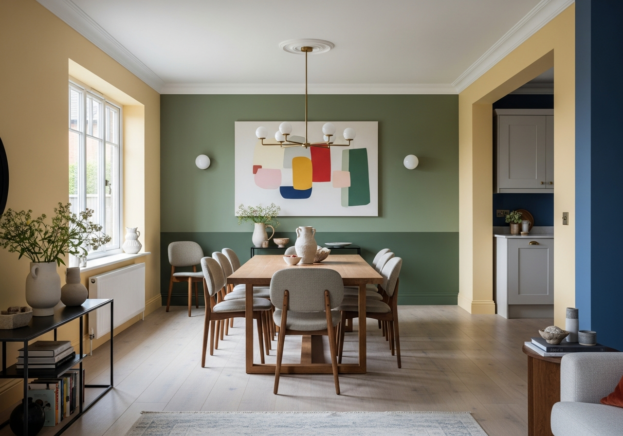
Warm Palettes for Cozy Gatherings
Warm color families—think soft yellows, rich oranges, and deep reds—lend a welcoming vibe to shared kitchen dining spaces. These hues invite conversation and linger on the skin, making meals feel intimate.
A monochrome palette of pale buttery yellow walls with deeper mustard accents helps the combo feel sunny and snug. Burnt orange or brick red accent walls bring warmth without overpowering the senses. Use off-white or cream trims to balance intensity and add brightness.
Cool Tones for Modern Spaces
Cool shades such as icy blues, misty greys, and crisp greens create relaxed, modern environments. These colors open up the room and keep it feeling fresh.
Light grey walls paired with a soft blue accent in the dining nook maintain an airy atmosphere. Incorporating green hues with natural wood furniture further connects the space with nature, promoting calmness through simplicity. White trim and ceilings counterbalance cooler tones to avoid feeling too stark.
Earthy Combinations for Natural Charm
Earth tones inspire grounded, organic designs perfect for kitchen dining combos that blend rustic and contemporary styles. Think terracotta, olive green, warm taupes, and soft browns.
These colors echo nature and harmonize with wood floors or exposed brick. Using a terracotta wall in the dining area with olive kitchen walls creates a gentle contrast that feels both inviting and balanced. Light beige or sand trim pulls the scheme together and reflects light.
| Color Scheme | Key Colors | Mood | Recommended Finish |
|---|---|---|---|
| Warm Palette | Buttery yellow, mustard, burnt orange | Cozy, inviting | Eggshell for walls, semi-gloss for trim |
| Cool Tones | Soft blue, misty grey, crisp green | Fresh, modern, airy | Matte for walls, satin for trim |
| Earthy Combinations | Terracotta, olive, taupe, sand | Natural, grounded | Matte or eggshell |
Conclusion
The best paint colors for kitchen dining room combos are those that create a consistent, balanced look while respecting the function of each space. Whether using neutrals to blend or bold colors to define, the right choice depends on lighting, room size, and existing finishes.
Start by assessing your room’s light sources and flow. Test several paint swatches under different lighting conditions. Match paint tones to your cabinets and countertops for a cohesive feel. Finally, pick finishes that hold up to kitchen wear yet suit your dining atmosphere. Thoughtful planning leads to a space that feels both connected and inviting.