Why Choose Aqua Paint Color for Living Room Spaces
Aqua paint can turn your living room into a peaceful yet lively space. It blends the calmness of blue with the freshness of green, giving any room a balanced feel. The color’s unique mix makes it perfect for a variety of design styles—whether you want a cozy coastal vibe or a sleek modern look. Aqua also has a timeless quality, meaning it won’t feel outdated after a season or two. It keeps your living area feeling bright, calm, and inviting all year long.
The Psychology Behind Aqua in Home Design
Aqua is known to have a soothing effect on the mind. It encourages feelings of relaxation, similar to what you feel when near the ocean or a clear sky. At the same time, aqua carries a slight energy boost because of its green undertones. This balance helps reduce stress while keeping the space lively enough to feel welcoming. For family rooms, this can help create an environment where people want to gather and talk, without feeling overstimulated or tired.
How Aqua Paint Affects Room Perception
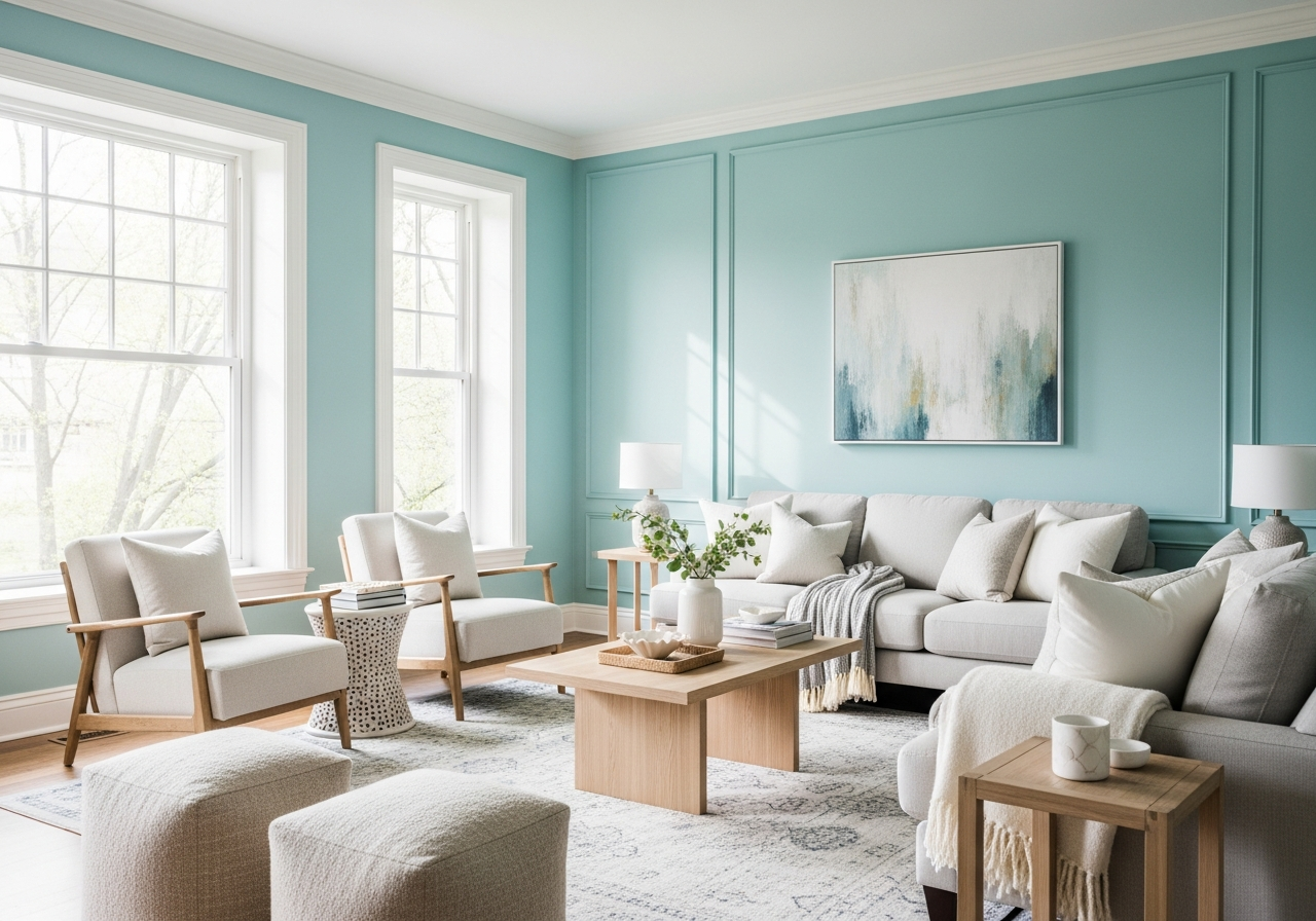
One of the best things about aqua paint is how it interacts with light. It reflects natural sunlight and indoor lighting in a way that opens up small or dark rooms, making them look larger and brighter. The color can soften hard corners and add warmth without overwhelming the space. Because of this, aqua works well in both compact city apartments and spacious family homes. It’s a smart choice when you want to refresh a living room without changing its layout or furniture.
Aqua’s versatility shines in how easily it fits different design styles too. In a coastal theme, it calls to mind the sea and sky. In a modern room, it adds a crisp, clean feel. For traditional spaces, aqua can soften the overall look and add a touch of freshness. This makes it a practical option if you like to change your décor often but want a base color that works year-round.
Top Aqua Paint Colors for Living Rooms
Choosing the right aqua shade for your living room is key to achieving the mood and style you want. Some aqua colors lean toward cool blues, while others have warm green undertones. Each shade can completely change how a room feels, so it’s worth exploring a range before deciding.
Sherwin Williams Rainwashed (SW 6211) for Subtle Sophistication
Rainwashed is a soft aqua with both blue and green hints. It’s light and airy, creating a gentle, inviting space without overpowering the room. This color works well in living rooms with plenty of natural light and fits with both modern and traditional furnishings. It pairs nicely with neutral accents like beige, cream, or light wood tones.
Behr Clear Pond (PPU13-15) for Deeper Aqua Tones
Clear Pond offers a richer, deeper aqua that adds coziness and depth to larger living rooms. Its slightly muted tones give a sophisticated feel, particularly when paired with dark wood furniture or brass hardware. This shade creates a relaxing retreat that’s perfect for family rooms where comfort is key.
Benjamin Moore Quiet Moments (1563) for Gray-Aqua Blend
Quiet Moments mixes aqua with soft gray, offering a modern twist on the traditional aqua color. It has a calming and understated look that fits well with minimalist or Scandinavian designs. This color works great on walls when you want your furniture or artwork to stand out without distraction.
Behr Marquee Aquifer (MQ6-08) for Vibrant Coastal Vibes
Aquifer is bold and bright, evoking the clear blues of ocean water. It’s an excellent choice if you want your living room to feel energetic and refreshing. Use it for accent walls or a full room makeover in beach-inspired homes. The vibrant bluish-green tone pairs beautifully with crisp whites and natural textures like rattan or linen.
Paint Finish Recommendations
When choosing a finish for your aqua paint, it’s wise to consider how the light plays in your room. Eggshell finishes offer a soft, satin-like sheen that hides imperfections well, making it ideal for living rooms with moderate traffic. On the other hand, satin finishes provide a bit more gloss and are easier to clean, which is useful in families with kids or pets. Both finishes enhance the depth and richness of aqua paint without appearing too shiny or dull.
Light Aqua Shades for Small Living Rooms
If your space is on the smaller side, light aqua shades such as Sherwin Williams Rainwashed or softer versions of Benjamin Moore Quiet Moments can make your living room feel open and airy. These lighter hues reflect more light, visually enlarging the area and maintaining a calm atmosphere. Pair them with crisp whites or pale wood accents to enhance that spacious feel.
Bold Aqua Options for Statement Walls
For a striking look, deeper or more vibrant aqua colors like Behr Clear Pond or Behr Marquee Aquifer make fantastic choices for a statement wall. Contrasting these rich tones with neutral furnishings or warm wood can create a balanced yet eye-catching focal point. Statement walls invite personality without overwhelming the room, and aqua adds both freshness and depth to the space.
Perfect Color Combinations with Aqua Paint
Aqua mixes beautifully with several other colors, allowing you to create a wide range of living room styles. The right palette depends on the mood and theme you want, from peaceful and soft to dynamic and bright.
Aqua and White for Crisp Clean Lines
White is a perfect partner for aqua paint. Together, these colors brighten the living room while maintaining a fresh and airy feel. White trim, ceilings, and furniture combined with aqua walls create a balanced space where aqua is the star without feeling heavy. This combination works well in coastal, modern, and classic rooms.
Aqua and Gray for Modern Calm
Gray tones add sophistication when paired with aqua. Light grays complement softer aqua shades, while darker grays add contrast to brighter aquas. This pairing suits living rooms with minimalist designs or monochrome furniture, grounding the aqua while keeping the mood calm and stylish.
Aqua and Beige for Warmth and Comfort
Soft beige or sandy tones warm up aqua’s cool touch, making a living room feel cozy and inviting. This blend is ideal for traditional or coastal-inspired spaces. Beige furniture, rugs, or curtains work nicely to soften aqua walls, adding subtle earthiness without dulling the color.
Aqua and Coral or Peach for Vibrant Energy
If you want a lively living room, pairing aqua with coral or peach tones brings energy and fun. These warm accent colors pop beautifully against aqua, especially on pillows, throws, or art. This combination suits playful or eclectic styles without feeling overwhelming.
Aqua and Natural Wood Tones for Earthy Balance
Natural wood adds texture and warmth when combined with aqua. Light or medium wood floors and furniture bring organic softness to aqua walls, bridging the gap between the indoors and nature. This color match works well in both modern and rustic settings.