How to Choose the Perfect Paint Color in My Room: A Complete Guide
Choosing the right paint color for your room can change everything. It’s more than just picking a shade you like—it’s about how the color fits your space, your style, and even how the room feels. With so many options, it’s easy to feel stuck or overwhelmed. This guide will walk you through the steps, helping you understand your room, choose colors that work, and create a space you’ll love. Let’s start by listening to what your room has to say before making the big choice.
1. Understanding Your Room Before Choosing Paint Color in My Room
Before you grab that paint brush, your room has secrets to tell you about which colors will work best. Let’s decode what your space is really saying.
How Natural Light Changes Paint Colors
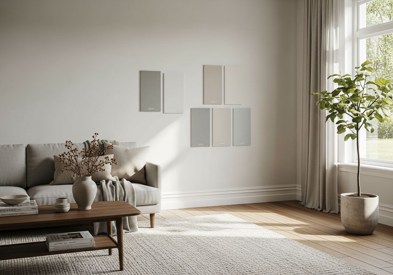
Natural light plays a huge role in how paint looks. Rooms facing north get cooler, softer light. These spaces often make colors look more blue or gray. So, warm colors like soft yellows or warm beiges can help make a north-facing room feel cozy. South-facing rooms get bright, sunny light all day. This makes colors appear warmer and more intense. You might want to use cooler colors here to balance the warmth, like blues or greens. East and west-facing rooms get light that changes a lot through the day. East rooms glow warm and bright in the morning, while west rooms shine in the afternoon and evening. Colors might look different depending on the time of day. Testing a paint sample on your wall and observing it in different light can save surprises later.
Understanding how your room’s light affects color helps you pick shades that will look good all day long, not just in a photo or sample card.
Working With Your Existing Finishes
Your room’s current elements, like flooring, furniture, and trim, set a foundation for your color choices. You don’t want to pick a paint that clashes with what’s already there. For example, if you have warm wood floors, warm paint tones complement them best. Cool gray floors, on the other hand, pair well with cool paint shades.
Don’t forget about your trim color, either. White trim can make colors stand out crisply. Off-white or cream trims create a softer look. When choosing paint, consider how it will interact with these fixed finishes. Sticking to colors that blend nicely with your floors and furniture helps your room feel balanced and put together.
Besides finishes, think about what you use the room for. A bedroom calls for calm, restful colors. Living rooms can handle bold, lively hues. The function of your room guides the mood you want your paint to set.
Measuring your room size and ceiling height also matters. Dark colors in small rooms can feel cramped. Light colors open up space. High ceilings might handle darker, richer colors well, while low ceilings benefit from lighter shades that make the space feel taller.
2. The Color Selection Framework: From Overwhelmed to Confident
Stop scrolling through endless paint swatches online—here’s the exact system pro designers use to narrow down thousands of options to your perfect match.
Finding Your True Comfort Colors
The best paint color is one that feels right to you. Start with colors you naturally enjoy in clothing, decor, or nature. These “comfort colors” are a great base because they reflect your personal taste. Ignore trends at first—they come and go, but your own style lasts. Once you identify your comfort zone, you can think about how to adapt those colors to your room.
Building a Cohesive Color Story
An easy rule designers use to balance color is the 60-30-10 rule. Pick one color to cover 60% of the room, usually the walls. The secondary color takes 30%, such as upholstery or curtains. The last 10% is an accent shade for pillows, art, or small furniture. This rule keeps your space balanced and visually pleasing.
Creating a mood board helps bring everything together. Collect paint chips, fabric samples, pictures of rooms you like, and anything else that inspires you. Seeing your colors side by side helps you understand what works and what doesn’t. It also saves you from costly mistakes at the paint store.
Another helpful tip is the finish hierarchy method. Generally, walls are painted with flat or eggshell finishes for a soft look. Trim and moldings get a semi-gloss or gloss to highlight details. Furniture and décor items often bring in other finishes and textures to add depth.
3. Color Theory Made Simple: Schemes That Always Work
You don’t need an art degree to pick colors that look amazing together. These four proven color schemes take the guesswork out of coordination.
Monochromatic: The Foolproof Choice
Monochromatic schemes use different shades, tints, or tones of one color. This keeps things simple but adds subtle interest. For example, various blues in lighter and darker shades can make a room feel calm and cohesive. This scheme is great for beginners because it’s hard to go wrong.
When to Use Complementary Colors
Complementary colors sit opposite each other on the color wheel—think blue and orange or green and red. When used together, they create vibrant contrast and energy. This scheme works well if you want a room with punch and personality. Use one color as the main tone and the complementary color as an accent to avoid overwhelming the space.
Conclusion
Choosing the perfect paint color in your room means understanding light, space, and your own taste. It involves knowing how your room’s features affect color and using simple color rules to guide you. A well-picked paint color can make your room feel just right.
Start by observing your room’s light and finishes. Next, narrow down colors using your comfort zone and a balanced plan. Try out proven color schemes that fit your style. Keep testing samples and trusting your eyes. Soon, your chosen color will bring your room to life in the best way.