How to Choose the Best Wall Paint Color for Living Room Spaces
Choosing the right paint color for your living room is more than just picking a shade you like. It shapes the way you and your guests feel every time you step inside. The color can make your room feel brighter, cozier, or even larger. With so many options out there, it’s important to find a color that fits your style, the room’s lighting, and the mood you want to create. This guide will help you navigate the choices so your living room paint works with your space, not against it.
1. Why the Best Wall Paint Color for Living Room Matters More Than You Think
Your living room paint color sets the mood for every movie night, family gathering, and quiet morning coffee—yet most people pick colors that work against their space instead of with it. The right color influences more than just how your room looks; it affects your feelings and how you use the space. Some colors can make you feel calm, energized, or even hungry. Others can make your room seem smaller or larger depending on the shade and light.
Also, paint color can affect how much natural light feels in the room. Bright colors reflect light, making a room feel open and airy. Darker colors absorb light, which can create a cozy, intimate space or, if chosen wrong, a gloomy one. Picking a living room color that matches its light and size can balance the space perfectly.
Beyond comfort and style, the color of your living room walls can also impact your home’s value. Neutral, well-chosen colors tend to attract buyers because they make the space look fresh and adaptable. Choosing colors suited for a living area is different from bedrooms or kitchens because this room often hosts visitors and holds most activities, so it needs to appeal to many moods and styles.
The Psychology Behind Living Room Colors
Colors influence our emotions and behaviors in subtle but strong ways. Soft blues and greens bring calm and relaxation, perfect for winding down. Warm tones like beige and soft browns create a feeling of warmth and security, inviting conversation and connection. Bright colors like yellow can spark creativity and lift spirits but might feel overwhelming as a main color. Understanding these psychological effects helps you pick colors that support the mood you want in your living room.
How Paint Colors Change Throughout the Day
Paint colors don’t stay the same all day. The natural and artificial light in your living room shifts how colors look from morning to night. Morning light might highlight cool undertones, while afternoon sun can bring out warmer hints. Artificial lights, such as LED or incandescent bulbs, also change the appearance of your walls after dark. Testing paint colors under different lighting conditions can help you choose a shade that always feels right.
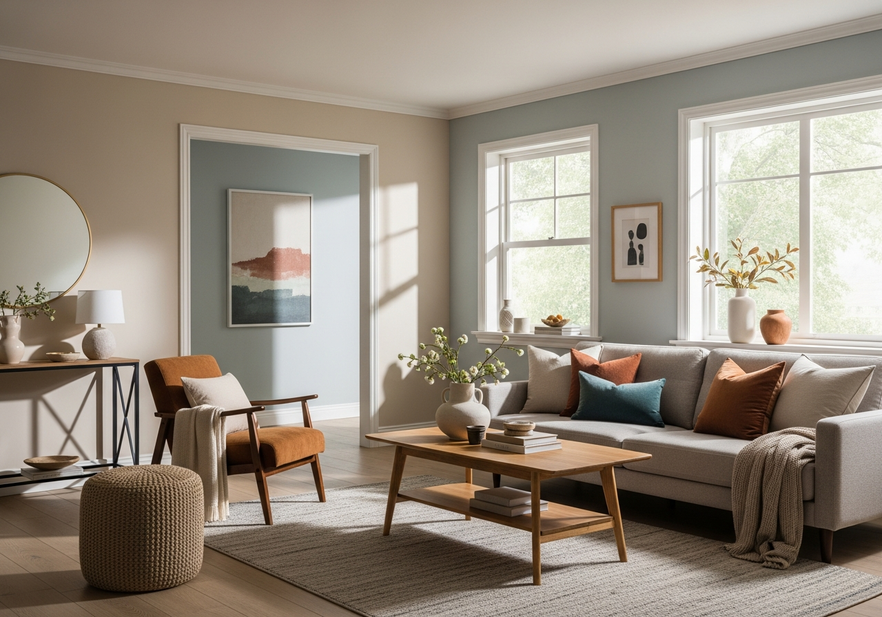
2. Popular Living Room Paint Colors That Actually Work
While trends come and go, certain paint colors consistently make living rooms feel welcoming, spacious, and stylish—here’s what professional designers keep coming back to. Neutral tones remain leaders because they offer flexibility, pairing well with many styles and furniture choices. Bolder colors work wonderfully on accent walls to add personality without overpowering the room. Two-tone paint schemes are also gaining popularity, giving more depth and interest while keeping spaces balanced.
Warm Neutrals That Never Go Out of Style
Warm neutrals like soft beige, creamy white, and gentle taupe provide a cozy, inviting backdrop. These colors keep the room feeling calm and grounded. They also blend well with wood tones, colorful accessories, and various lighting setups. Some top choices with brand names include:
- Benjamin Moore Revere Pewter (HC-172) – a light gray beige that adds warmth and elegance.
- Sherwin-Williams Accessible Beige (SW 7036) – a soft beige that works well in natural light.
- Behr Swiss Coffee (12) – a creamy white that brightens rooms and adds softness.
Cool Tones for Modern Living Spaces
Cool colors like soft blues, gentle greens, and light grays create a fresh, modern feel. These shades often make rooms feel airy and calm, perfect for a relaxed lifestyle. They tend to work best in bright spaces with plenty of natural light:
- Benjamin Moore Gray Owl (OC-52) – a light gray with subtle green undertones.
- Sherwin-Williams Sea Salt (SW 6204) – a soft blue-green that adds a peaceful vibe.
- Behr Misty Coast (N410-3) – a cool gray with a hint of blue for a neutral but modern look.
Statement Colors That Won’t Overwhelm
If you want to make a statement without drowning your space in color, accent walls in rich tones are a good choice. Dark blues, deep greens, or charcoal grays can add depth and interest while balancing with lighter walls:
- Benjamin Moore Hale Navy (HC-154) – a bold navy that feels sophisticated and calming.
- Sherwin-Williams Evergreen Fog (SW 9130) – a soft, muted green that adds warmth and character.
- Behr Carbon (N520-7) – a deep charcoal gray perfect for modern, sleek spaces.
3. How Natural and Artificial Light Changes Your Paint Color
That perfect gray you loved at the paint store might look purple in your north-facing living room—here’s how to predict what colors will actually look like in your space. The direction your living room faces makes a big difference in how paint shows up. North-facing rooms usually get cooler, softer light all day, making warm colors look muted and cool colors pop more. South-facing rooms are bathed in warmer, brighter light, which can bring out yellows and reds in paint, making walls feel sunnier.
Artificial light also plays a big role. LED bulbs often cast a cooler, blue-tinged light, which can make colors feel sharper but sometimes less warm. Incandescent bulbs throw off a softer, yellowish hue that warms up colors but can dull cooler tones. It’s smart to test paint samples under the exact light bulbs you plan to use in the room.
When testing paint samples, try applying small patches on different walls and observe them at different times—morning, midday, and evening. This helps catch color shifts that might surprise you. Also, note the undertones of paint colors, like blue, green, pink, or yellow hints. These undertones can change how the shade appears depending on the light, so knowing them helps you guess how paint will behave.
Conclusion
The best wall paint color for your living room depends on how you want the space to feel and how light moves through it. It’s a balance between mood, room size, lighting, and your personal style. Pick colors that support the mood you want, whether calm and cozy or bright and lively.
Start by examining your room’s natural light and try samples at different times. Consider neutral bases with pops of color for interest. Keep in mind undertones and the paint’s interaction with artificial lighting. Taking these steps helps ensure your living room color feels just right every time you walk in.