Why Your Living Room Paint Choice Sets the Tone for Your Entire Home
Your living room paint does more heavy lifting than any other room’s color—it greets guests, frames family memories, and becomes the backdrop for daily life. Because this space often connects with multiple rooms, its color choice flows beyond walls to influence the whole home. Choosing the right paint color can make your living room feel welcoming and balanced or cramped and chaotic.
Paint is one of the most budget-friendly ways to change a room. A fresh coat can brighten the space or create cozy corners without remodeling. Besides aesthetics, the color you choose has a powerful psychological effect, affecting mood and energy where people gather most.
In addition, paint plays with perception—it can make your living room appear larger, airier, or more intimate depending on the color’s depth and tone. Since living rooms lead to dining areas, kitchens, and hallways, the chosen paint must harmonize visually with adjoining spaces to maintain a comfortable flow throughout your home. Here’s a closer look at the psychology behind color choices and how paint changes how you see and feel a room.
The Psychology Behind Color Choices
Color has a subtle but strong influence on how we feel. Warm tones like soft reds, oranges, and yellows can create energy and excitement, which suits vibrant family spaces. Cooler blues and greens tend to soothe and calm, perfect for relaxing corners in your living room.
Neutral grays, off-whites, and beiges provide a versatile background that allows furniture and artwork to shine. They promote calmness and balance, helping reduce visual noise. But neutrals can also feel cold if overused, so balancing them with texture or accent colors is key.
Bright, bold colors stimulate and uplift but can be tiring if overdone. Subtle shades give your space personality without overwhelming. Think about how you want to feel during your daily living room use and pick colors to match those moods.
How Paint Changes Space Perception
Paint color affects how spacious a room feels. Light colors reflect more light, making a room seem bigger and airier. Whites and pale shades are popular for this reason in smaller living rooms. But too much white can feel stark, so natural or warm undertones soften the effect.
Darker shades absorb light, creating intimacy and coziness, especially in large rooms with many windows. Deep blues or charcoals can add depth and drama but might make a space feel smaller if the room lacks natural light.
Additionally, paint can visually raise or lower ceilings. Lighter ceilings make the room appear taller, while darker ceilings bring a sense of enclosure. Trim colors also play a role; a high-contrast trim can make the walls stand out, while matching tones blend surfaces for smoother transitions.
Choosing the right paint color in your living room is about more than what looks good in the can. It shapes your home’s atmosphere and how connected the entire space feels.
Living Room Paint Inspiration from Trending Color Palettes
While trends come and go, certain color families keep proving they work in real living rooms, not just magazine spreads. Color palettes are evolving to create spaces that feel fresh yet timeless, cheerful yet restful. These palettes show how to balance personality with practicality.
One of the biggest shifts is towards warm neutrals that don’t fall flat. These tones feel inviting without being beige or dull. They perfectly complement natural materials like wood and stone, providing a backdrop that ages well. Warm neutrals also ease the transition between rooms, making your home flow better.
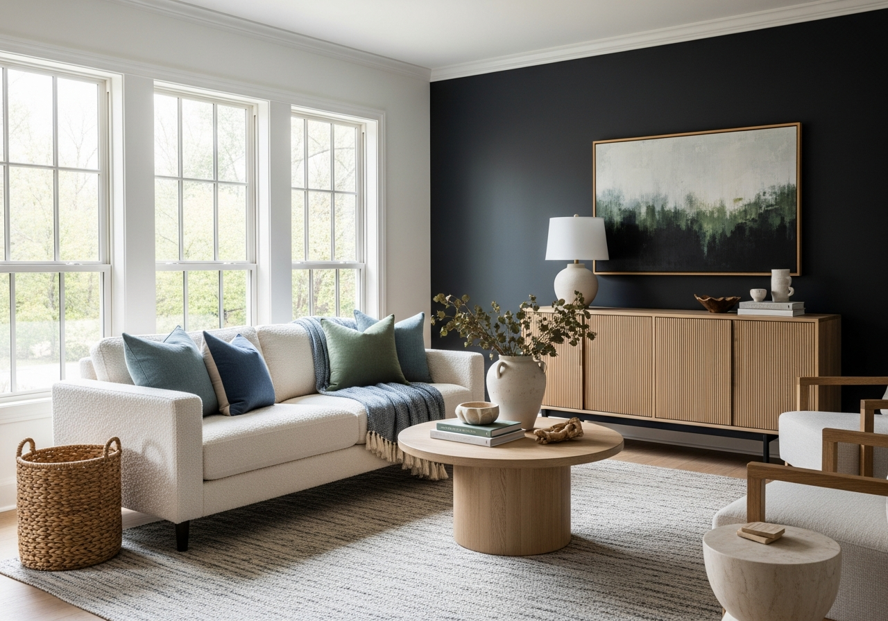
Bold accent walls have made a smart comeback. Instead of painting all four walls, a single wall painted in deep navy, forest green, or charcoal creates impact without overwhelming the senses. This technique highlights architectural features or artwork and adds depth to the room.
Two-tone combinations are gaining popularity, where the lower part of the walls or trims use one color and the upper walls another. This approach adds dimension and breaks monotony. Often, a darker color on bottom grounds the room, while a lighter color above keeps the space feeling open.
Lastly, it helps to consider how colors hide wear and tear. Some shades, especially deeper or warmer tones, better conceal fingerprints, scuffs, and dirt in busy living rooms compared to pale or ultra-light shades. Balancing beauty with function is key when choosing colors for high-traffic areas.
Warm Earth Tones Making a Comeback
Browns, terracotta, soft clay, and muted mustard have returned to favor. These colors feel grounded and timeless. They connect indoor spaces to nature, blending beautifully with organic textures like woven rugs or leafy plants.
Warm earth tones foster a sense of calm and comfort, ideal for spaces used daily by families and guests. When paired with cream or warm white trim, they bring balance and sophistication, avoiding anyone feeling too heavy or dark.
Cool Blues and Greens for Calm Spaces
Blues and greens offer a restful vibe that stays trendy. Soft sage, seafoam, and dusty blue tones provide a quiet atmosphere that’s peaceful and fresh. These hues work well in living rooms meant for relaxation or conversation.
Blue leans toward clarity and focus, while green evokes balance and restoration—both attractive for rooms that serve multiple uses or times of day. Using these cool colors on walls combined with off-whites and natural wood accents keeps the look light and welcoming.
Unexpected Dark Colors That Work
Dark paint used thoughtfully can be sophisticated and modern. Charcoal, navy, and even near-black create drama without intimidation when balanced with light furniture and plenty of light sources.
These tones add depth and a feeling of enclosure where large rooms might otherwise feel cavernous or underwhelming. Dark accent walls behind seating areas or fireplaces bring focus and style. Pairing them with metallics or glass details adds sparkle and freshness.
How Natural Light Changes Your Paint Color (And What to Do About It)
That perfect gray you picked might look purple at noon and brown at sunset—here’s how to work with light, not against it. Understanding the way natural light interacts with paint colors will save you frustration and help you make a choice that suits your home’s lighting conditions.
Your living room’s direction greatly impacts this. North-facing rooms see little direct sunlight, creating cooler, muted tones throughout the day. South-facing rooms flood with warm light, making colors appear brighter and warmer.
Light changes during the day as well. Morning sun is often cooler, midday bright and direct, and evening softer with golden tones. Each shift alters how a paint color looks, so a spot that shines beautifully in the morning may look different later.
Testing Paint Colors Like a Pro
Many mistakes happen when people judge paint by chips or photos alone. Those small pieces don’t capture reflectivity or changes during the day. Instead, paint large patches on multiple walls or poster boards. Look at these samples in morning light, midday, and evening to see the full effect.
Also, observe how your artificial lighting impacts color. Warm bulbs can make paint appear cozier, while the cooler light may tone down brightness. Mixing natural and artificial light creates the final look you live with, so test samples under all the conditions you experience.
By relying on these steps, you can predict how colors behave in your specific space. This reduces surprises and ensures your chosen living room paint works for years.
Conclusion
Living room paint sets the mood and feel of your home’s heart. It shapes first impressions, impacts family comfort, and connects rooms visually. Choosing paint with attention to color psychology, trends, and lighting creates a space that feels right and lasting.
Start by deciding the atmosphere you want: warm, cool, bold, or neutral. Test several paint samples around your room at different times and lighting conditions before buying. Remember how color shifts with light, and choose shades that hide wear if your living room gets heavy use. Thoughtful paint selection transforms your space and enhances daily living for everyone.