Best Sitting Room Paint Colours for a Space You’ll Love
Choosing the right paint colour for your sitting room can transform the entire mood of the space. It’s not just about picking a pretty shade you like on a sample card. How your room receives light, its size, and how you use the space all play a part in selecting the best colour. The sitting room is often where you relax, entertain, or read, so the colour should suit both your lifestyle and the room’s character. This guide will help you find colours that work with your room’s unique traits, not against them.
1. Understanding Your Sitting Room’s Personality Before Choosing Paint
Before you grab a paintbrush, stop and think about what makes your sitting room special. The direction your windows face affects how colours look, while the size and layout can change how paint feels. A bright south-facing room may handle darker shades well, while a north-facing room might need lighter, warmer colours to avoid feeling gloomy. Think about who uses the room and how often. Is it a busy family hangout, or a quiet spot for guests? This will guide your colour choices for durability and mood.
Size matters too. Dark colours can make a large space feel cozy, but in a small room, they might close it in. Lighter shades tend to open up compact rooms. You also want to consider the traffic patterns — hallways leading into the sitting room or how often furniture moves. This affects paint wear and the colours that hide marks best. The furniture and decor you already have or plan to keep should blend well with your paint so nothing fights for attention.
Quick Room Assessment Checklist
- North vs south facing rooms: South facing rooms get warm light, so cool colours can balance the heat. North facing rooms get cooler light and might benefit from warmer paint tones.
- High traffic vs formal spaces: Durable paints in mid-tone colours work better where people and pets move around. Soft or bold colours suit less-used, formal sitting rooms.
- Open floor plans vs closed rooms: Open plans require colours that flow into adjoining spaces, while closed rooms offer a chance to pick bold or unique shades without affecting other rooms.
2. The Best Sitting Room Paint Colours That Actually Work
Some paint colours keep coming back on designer palettes because they simply perform well. They adapt to different lights and styles and stay fresh over time. These reliable choices create inviting atmospheres without overwhelming your sitting room.
Warm & Inviting Options
- Beiges, Taupes, and Greiges: These blend the warmth of brown with a touch of grey, creating a calm, classic backdrop. For example, a beige with a hint of peach adds a gentle warmth that cozy rooms crave.
- Soft Whites with Warm Undertones: Whites that lean slightly yellow or cream can brighten a room while feeling lived-in and welcoming. These work beautifully with wood furniture and natural accents.
Cool & Contemporary Choices
- Modern Grays and Charcoals: Gray is the new neutral. It pairs well with vibrant decor and offers a sleek, modern look. Charcoal shades can ground a room and are great for accent walls that want to make a statement without yelling.
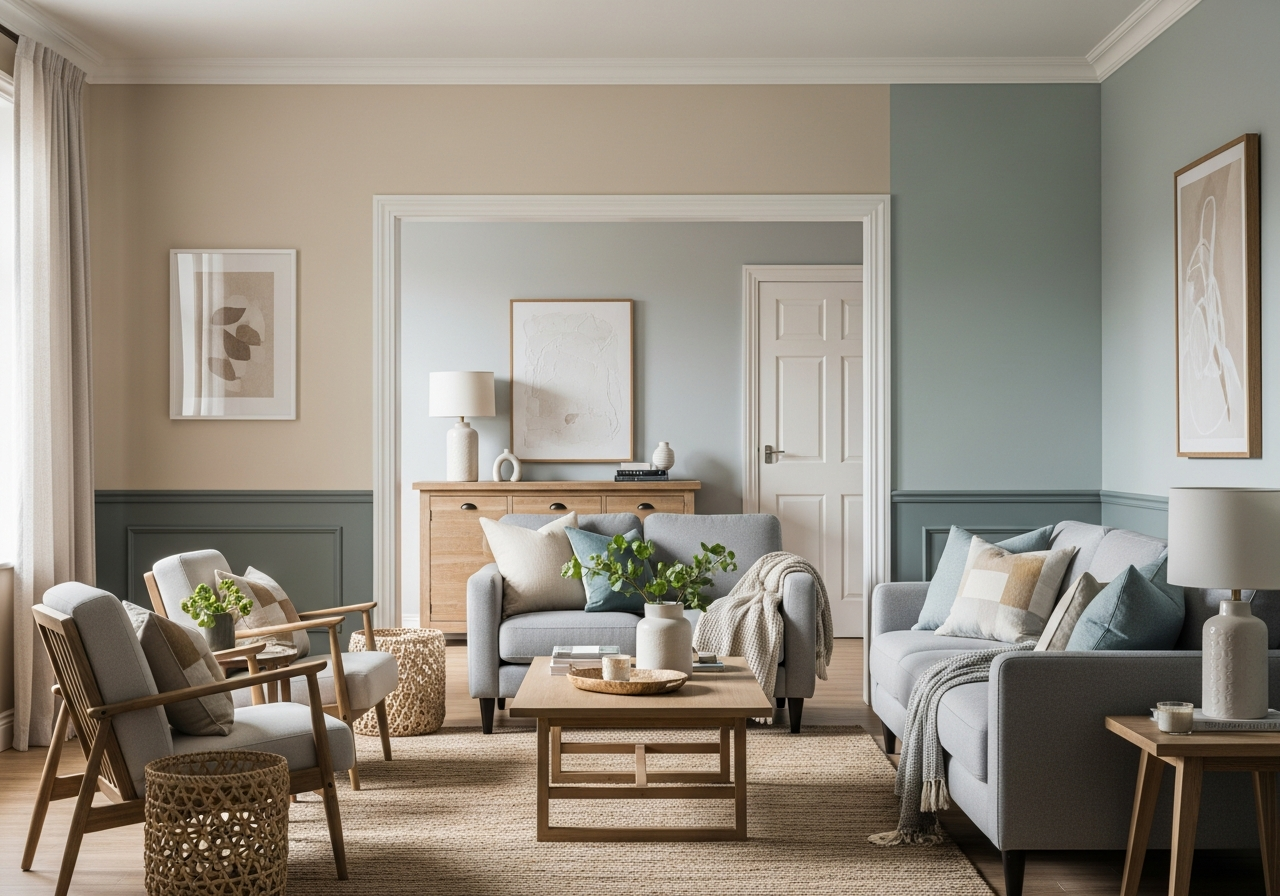
- Calming Blues and Sage Greens: These colours bring a touch of nature inside. Blue hues feel peaceful and open up space, while sage green offers a muted earthiness that blends easily with plants and textures.
Some reliable paint colours and codes include:
| Colour | Tone | Example Brand & Code |
|---|---|---|
| Accessible Beige | Warm Greige | Benjamin Moore 1035 |
| Classic Gray | Soft Warm White | Benjamin Moore OC-23 |
| Repose Gray | Cool Gray | Sherwin-Williams SW 7015 |
| Iron Ore | Charcoal | Sherwin-Williams SW 7069 |
| Sea Salt | Sage Green | Sherwin-Williams SW 6204 |
| Silver Lake | Soft Blue Gray | Benjamin Moore 1618 |
3. How Natural and Artificial Light Changes Your Paint Color
That paint swatch you loved might surprise you once on the wall. Colours change as light changes. Morning sunlight is cooler, often pushing shades toward blue. Evening light is warmer, making colours lean yellow or red. Artificial lights add another layer of change. LEDs can make whites crisp but sometimes harsh. Incandescent bulbs add warmth that softens colour edges and deepens warm tones.
Window size and where they sit matter too. A large wall of south-facing glass floods rooms with intense light. Paint there looks sharper and brighter. Small or shaded windows reduce light, softening colours and sometimes making them dull. All these factors mean it’s worth testing paint over a few days.
The 24-Hour Paint Test Method
- Paint a few large patches of your chosen colours on different walls.
- Observe these patches during the morning, afternoon, and evening.
- Note changes with your room’s main lights on and off.
- Take photos or jot down your thoughts for comparison.
Conclusion
Choosing the best sitting room paint colours means matching your room’s light, size, and use to paint tones that feel good every day. Warm neutrals or cool grays and blues are often safe choices that work across many spaces.
Start with a quick room assessment to know how light and layout affect your colour. Try a 24-hour test with paint samples in your actual space. Use reliable, proven colours as a base, and adjust from there to suit your style and lifestyle. This approach makes your sitting room a space you’ll enjoy for years.