

Best Paint Color Combinations for Living Room Spaces That Transform Your Home
Your living room is where you relax, host friends, and make memories. The right paint colors can change everything—making a small room feel open or turning a cold space cozy. But choose the wrong colors, and you might feel uncomfortable in a room you should love. Finding the best paint color combination for your living room helps create a space that reflects your style while feeling just right every day. This guide breaks down simple rules and shows you popular combos so you can pick colors with confidence.
1. Understanding Paint Color Combinations for Living Room Success
Picking paint colors isn’t just about picking what looks good on a paint chip. Colors influence how you feel and how big or small a room feels. The right balance of colors can transform your living room from dull to inviting. Handling colors well means looking at how they work in your space and with your light.
The Psychology of Living Room Colors
Colors affect mood in surprising ways. Warm colors like reds, yellows, and oranges can make a room feel cozy and lively. Cool colors such as blues and greens help create calm and relaxation. Using a mix of warm and cool tones cleverly can balance energy and peace in your living room. Colors also affect how spacious a room feels: lighter colors often make a space seem larger, while darker tones add intimacy and depth.
Understanding this helps you design a room that feels just right for you—whether you want it bright and cheerful or calm and serene.
How Natural Light Affects Your Paint Choices
Lighting changes everything about paint colors. Natural light shifts during the day—from blueish morning light to warm afternoon sun. A color that looks bright in the morning might look muted by evening. Rooms with lots of sunlight can handle darker or more vibrant colors because the light helps keep the space balanced.
Rooms with little natural light might benefit from light, warm tones to avoid looking gloomy. It’s helpful to test paint samples on your walls at different times. This way, you can see how colors change before you commit.
Mixing paint colors with your space’s natural light creates not just style but comfort and happiness.
The 60-30-10 rule helps keep color balance simple. Use one color for 60% of the room, usually the walls, a second for 30%, like furniture or large accents, and the last 10% for small details like cushions or art. This keeps the room from feeling too busy or too plain.
Knowing warm vs. cool undertones in paint also aids in picking seamless combinations. Warm undertones have hints of yellow, red, or orange. Cool undertones lean toward blue, green, or purple. Mixing undertones carefully avoids clashing or dullness.
2. Classic Neutral Combinations That Never Fail
Neutral colors might seem simple, but they can create some of the most elegant and welcoming living rooms. Using neutrals well is about layering and texture, not just picking plain beige walls.
Warm Neutrals for Cozy Spaces
Warm neutrals add softness and comfort. Mixing a warm white with greiges—a blend of grey and beige—creates a welcoming, true neutral base. Warm neutrals look great with natural wood and creamy textiles. For example, pairing Benjamin Moore’s Natural Linen with a soft off-white brings a gentle, glowing warmth. Using multiple shades of warm neutrals adds depth and makes the room feel larger than it is.
Cool Neutrals for Modern Elegance
Cool neutrals lean toward subtle greys and blue-greys. They help make modern, clean spaces feel fresh and calm. For instance, Benjamin Moore’s Steam AF-15 combined with crisp white trims creates a beautiful cool backdrop. You can build on these hues with textured fabrics or shiny finishes to give the room interest without overwhelming the space.
Layering neutrals, whether warm or cool, gives your living room flexibility. You get spaces that evolve with your style and easy updates with furniture or art over years.
3. Bold Color Combinations for Statement Living Rooms
If you want a living room with character and impact, bold colors give you that feeling without chaos. These combinations use strong, confident hues curated with care.
Dark and Dramatic Combinations
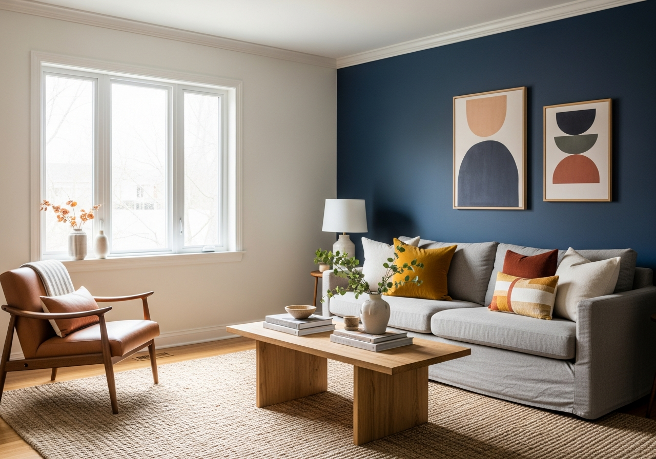
Navy blue walls paired with cognac leather furniture offer a timeless, rich look that feels grounded but inviting. The warmth of the leather balances the deep blue, creating a lively but sophisticated space. Jewel tones work well in pairs too: emerald green alongside sapphire blue forms a striking, elegant palette that feels both regal and cozy.
Deep teal mixed with brass accents makes a room feel luxurious and modern. The cool richness of teal and the shine of brass together glow no matter the lighting. Another bold choice is oxblood red combined with marigold yellow. This unusual mix catches the eye and brings energy, perfect for rooms where creativity and conversation flow.
Conclusion
The best paint color combination for living rooms depends on how you want your space to feel and how light interacts with your walls. Understanding color psychology, lighting, and balance helps you make choices that create comfort and style. Whether you choose timeless neutrals or bold accents, your living room can become a space where you love to spend time.
Start by evaluating the light in your room and testing colors at different times. Use the 60-30-10 color rule to mix hues smoothly. Don’t be afraid to try samples and see how they feel over several days before painting. With patience and care, you can find colors that both look great and feel right for your home.