Best Neutral Paint Colors for Your Living Room: A Complete Selection Guide
Choosing the best neutral paint color for your living room sets the stage for your entire space. Neutral colors create a calm, balanced backdrop that lets your furniture and decor shine. But unlike just picking any off-white or beige, finding the right neutral means understanding how subtle tones can change a room’s mood and feel. This guide breaks down everything you need to know to pick a neutral shade that works perfectly in your living room — from what makes a color neutral to how lighting changes the look once paint hits your walls.
1. Understanding Neutral Paint Colors for Living Rooms
Picking a neutral paint color isn’t just about choosing “white” or “gray.” Neutral colors come with a range of undertones and levels of brightness that affect a room’s warmth and openness. For living rooms, neutral colors are the safest way to design a flexible space that feels fresh — yet cozy enough for everyday life.
What Makes a Paint Color “Neutral”?
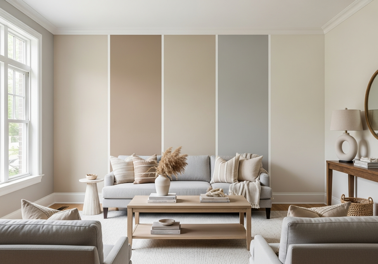
Neutral colors typically don’t lean too far toward a bright or bold hue. Instead, they sit in the middle of the color spectrum, acting as a balanced background for other design choices. Examples include shades of gray, beige, taupe, and soft off-whites. Unlike plain white, neutrals blend well with various colors and textures, allowing your furnishings and accents to stand out without clashing.
It’s important to note that neutral doesn’t mean “colorless.” Every neutral has hints of color under the surface. These subtle shades help give neutrals their distinct character, which can be soft and warm or cool and crisp depending on the undertone.
Reading Undertones in Paint Samples
Undertones are the hidden hues within a paint color that affect how it looks in different lighting and next to other colors. There are three main types:
- Warm undertones: These tend to have hints of yellow, red, or orange. Warm neutrals feel cozy and inviting, great for spaces that want a touch of softness.
- Cool undertones: These carry hints of blue, green, or purple. Cool neutrals offer a crisp, modern vibe that can make a room feel spacious and clean.
- True neutrals: These have very subtle or no discernible undertones, staying balanced without leaning warm or cool, which helps when matching with various furnishings.
Spotting undertones often means looking at a paint sample in several lights or against other colors. For example, a beige with pink undertones will look different than one with a yellow undertone even if they seem similar at first glance.
Light Reflective Value (LRV) is another key factor. This number shows how much light a paint color reflects, ranging from 0 (pure black) to 100 (pure white). Living room walls with higher LRV make spaces feel brighter and larger, while lower LRV colors add depth and coziness.
2. How Lighting Affects Neutral Paint Colors
That neutral you love in the store might turn into a different shade once it’s painted on your walls. Lighting plays a big role in this change, making it crucial to understand how natural and artificial light will affect your living room paint.
Best Neutrals for North-Facing Living Rooms
North-facing rooms tend to get cooler and softer light, often with a blue cast throughout the day. This light can make neutral colors appear colder or dull. To combat this, choose neutrals with warm undertones. Beige, creamy taupe, and greiges with a slight yellow or red tint brighten the space and keep the feel inviting without overwhelming the cool light.
Working with South and West Light
Rooms facing south or west get stronger, warmer sunlight during the day, making colors warmer and sometimes more intense. Neutral walls in these rooms may lean toward golden, peach, or even pink tones under natural light. Cool neutrals work well here—they balance the warm daylight and keep your living room feeling fresh. Soft greys, muted blues, and off-whites with blue or green undertones perform beautifully.
Testing Paint Colors Before Committing
Always test paint colors in your actual living room, not just the store. Paint a large swatch on different walls and watch it at various times of day—morning, noon, and evening—to see how light shifts the color.
- Use a piece of white poster board next to the swatch to compare how the color changes.
- View the paint under your room’s artificial lighting in the evening, including LED or incandescent bulbs.
- Remember that colors often look darker on large walls than samples or swatches.
This testing helps you avoid surprises and ensures the neutral you pick fits your space exactly as you want.
3. Top Neutral Paint Colors by Category
Neutrals come in many shades, from warm to cool to pure whites. Below are some favorites organized by category that designers return to again and again for living rooms.
Warm Neutrals That
Warm neutrals are comforting and grounding. They pull in golds, soft browns, and creamy beiges, making any living room feel snuggly and calm.
- Beige: A classic warm neutral that pairs beautifully with wood furniture and earth tones.
- Taupe: A blend of gray and brown, taupes bring subtle depth without feeling too cool.
- Greige: A mix of gray and beige, greiges give a modern update to warm neutrals with just a touch of gray’s calmness.
Popular warm neutral paint examples include soft shades like “Accessible Beige,” “Agreeable Gray,” and “Revere Pewter” from major brands.
Cool Neutrals
Cool neutrals tend toward gray, soft blue, and muted green undertones. They bring a clean, restful feel to living rooms, enhancing modern and minimalist designs.
- Light Gray: Soft gray tones create a sleek look and work well with both cool and warm accents.
- Soft Blue-Grays: These cool tones add a hint of color while still feeling neutral and calm.
- Greens with Gray Undertones: Muted sage or seafoam shades balance nature-inspired calmness with a neutral base.
Examples include “Silver Strand,” “Passive,” and “Sea Salt” from various respected paint lines.
White and Off-White Options
Whites and off-whites offer the purest neutral backdrop. They make living rooms feel airy and spacious, ideal for showcasing art or minimalist decor.
- True White: Bright white without color tints, perfect for modern, clean looks.
- Warm Off-White: Whites with cream or beige undertones soften the space.
- Cool Off-White: Whites with blue or gray undertones keep rooms feeling crisp others will call “bright” or “soft” whites.
Look for shades like “Chantilly Lace,” “Simply White,” and “White Dove.”
Conclusion
The best neutral paint color for your living room is one that balances undertones, lighting, and your style, creating a backdrop where everything else fits. A neutral isn’t just an absence of color but a subtle base with warmth or coolness under the surface.
Start by identifying the natural light in your room and testing paint samples on several walls. Pay close attention to undertones and how they shift throughout the day. Finally, choose a neutral that complements your furniture and design vision, ensuring your living room feels inviting and balanced.