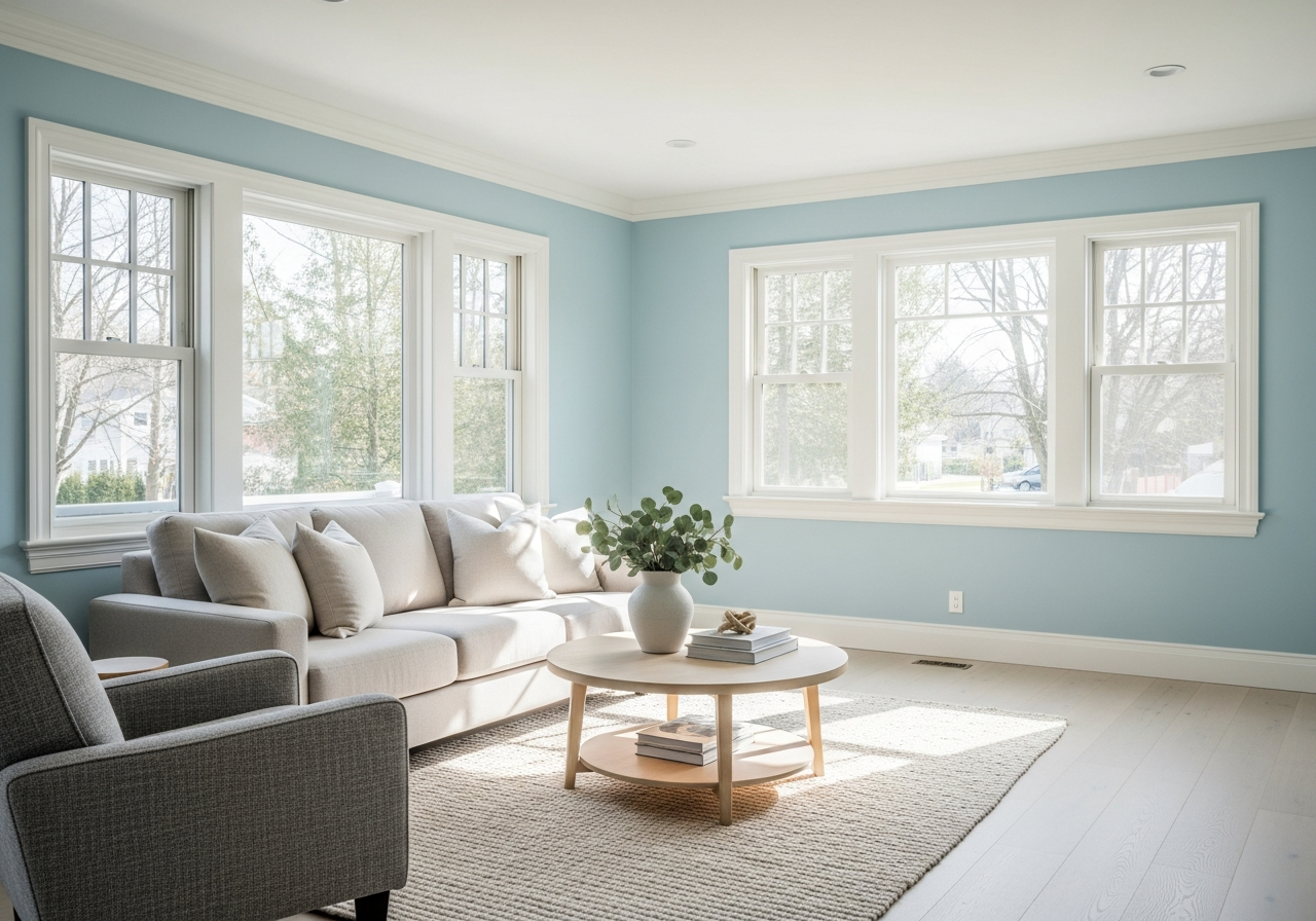
1. Why Light Blue Paint for Living Room Walls Creates Magic
Light blue paint has a unique way of transforming a living room that other colors often struggle to match. It opens up small spaces, making them feel larger and more inviting. At the same time, it instills a soothing calmness that helps busy families and individuals relax after a long day. These effects come from a blend of psychological, physical, and natural influences that make light blue a perfect choice for living room walls.
The color blue is widely recognized for its calming effects. It slows the heart rate and reduces stress, making it easier to unwind in a peaceful environment. Light blue, in particular, mimics the sky and clear water, both symbols of tranquility and vastness. By echoing these elements of nature, light blue helps create a serene mood that can soften tensions and invite peaceful moments inside the busiest rooms. This connection to the outdoors has a subtle but powerful impact on our well-being.
Moreover, light blue paint reflects natural light better than darker colors. This means that rooms painted in soft blue tones often feel brighter and airier. The enhanced brightness tricks the eye into perceiving more space, which is especially useful in smaller or darker living rooms. Unlike deeper or dull blue shades, light blue avoids the risk of making a room feel closed in or heavy.
One of the reasons light blue is so versatile is its ability to pair well with many decor styles. Whether your home has a modern, traditional, coastal, or farmhouse look, light blue provides a flexible base. It enhances natural wood tones, contrasts nicely with white trims, and blends effortlessly with soft neutrals and bold accents. Its adaptability makes it a favorite among designers and homeowners who want a fresh but timeless look.
The Science Behind Blue’s Calming Effect
Scientists have studied how color impacts mood and behavior extensively. Blue light wavelengths stimulate receptors in the eye that can reduce feelings of anxiety and even lower cortisol, the body’s stress hormone. This helps explain why scenes dominated by blue—the sky, ocean, lakes—are so often used in calming environments like spas and hospitals. Light blue, because of its gentle and cool undertones, activates this calming response without overwhelming the senses.
Apart from physiological effects, blue also encourages a sense of mental clarity and focus. These traits can contribute to improved relaxation and productivity, making a living room more than just a resting space but also somewhere to gather thoughts or enjoy quiet activities.
How Light Blue Makes Rooms Feel Bigger
Physical perception of space is influenced by how light interacts with colors on walls. Light colors, especially light blue, tend to bounce light around the room, creating reflections that add depth and dimension. This interplay of light diffusion tricks the mind into believing a room extends further than it does.
In contrast to bold or dark hues, light blue also reduces visual boundaries or stark contrasts. It helps walls fade slightly into the background, which prevents a boxed-in feeling. The result is a subtle expansion effect that can make living areas feel more comfortable and less claustrophobic. This is ideal for urban apartments or older homes with limited space.
In summary, light blue paint delivers both calming psychological benefits and practical spatial improvements, making it a top pick for refreshing any living room.
2. Choosing Your Perfect Light Blue Paint Shade
Not every light blue shade will create the feeling you want in your living room. Choosing the right one takes some careful consideration because light blue can range widely—from warm, green-tinged hues to cooler grayish or slightly purple tones. Picking a shade that doesn’t fit your space can make it feel cold, washed out, or even dull instead of bright and welcoming.
Reading Undertones Like a Pro
Undertones are subtle hints of color lurking beneath the surface of a paint shade. For light blues, common undertones include green, gray, or purple. Each undertone shifts the mood and temperature of the room in subtle ways. Green undertones in blue offer a fresher, more natural vibe that works well in homes with plants or wood accents. Gray undertones make the color feel more modern and neutral, blending smoothly with grays, whites, and blacks. Purple undertones add warmth and softness, giving the space a gentle hint of color without overwhelming it.
Understanding these undertones helps avoid surprises once the paint is on the walls. For example, a light blue with a strong gray undertone may look cool in the afternoon sun but turn too cold by evening.
Top Light Blue Paint Colors by Brand
Some popular light blue shades from leading paint brands offer a great starting point to explore:
- Benjamin Moore’s “Palladian Blue”: A soft, fresh blue with green undertones. It works well in both classic and coastal interiors.
- Sherwin-Williams’ “Sleepy Blue”: Calm and powdery with a hint of gray, this shade leans toward a cool, restful ambiance.
- Behr’s “Light Blue Glass”: A crisp, clear blue that feels modern yet airy, complimenting minimalist and Scandinavian styles.
- Farrow & Ball’s “Borrowed Light”: A pale, soft blue with a subtle gray undertone that feels timeless and elegant.
Trying paint colors from well-known brands is a good way to rely on tested formulas that display consistent color and quality.
Testing Samples Before You Commit
It’s critical to test paint samples on your actual walls before buying large quantities. Paint chips or digital images rarely show the full story. Put up several sample patches in different spots of your living room—near windows, on walls facing north or south, and close to artificial light sources.
Observe how the color changes throughout the day and evening. Take notes on mornings versus afternoons, cloudy days versus sunny ones. This testing helps you notice undertones you might have missed and choose the blue that fits your lighting and style best.
Don’t rush the decision. Painting a small area and living with the color for a few days is one of the easiest ways to avoid costly mistakes and ensure your light blue walls create exactly the welcoming atmosphere you want.
3. Natural vs Artificial Lighting: How It Changes Your Blue
The way your light blue walls look depends heavily on the kind of lighting your living room gets. Sunlight and indoor lighting can change how blue appears, making a shade that looked perfect in the store appear off once on your walls.
Rooms facing north typically receive cooler, less direct sunlight. This can make blue hues seem deeper or more muted. South-facing rooms, on the other hand, enjoy warm, bright natural light for most of the day. Light blue in these spaces tends to appear warmer and more vibrant.
Artificial lighting also plays a big role. LED lights come in a range of temperatures. Cool white or daylight LEDs bring out blue’s crispness and brightness. Warmer bulbs tend to shift blue toward the green or gray side, softening its intensity but potentially making it feel less fresh.
Even the time of day alters perception. Morning light is more diffuse, making colors look cooler, while afternoon sun is stronger and warmer. In the evening, incandescent and warm LEDs soften blue tones considerably. Knowing this helps you pick a paint that adapts well to your living room’s unique lighting cycle.
Conclusion
Light blue paint for living room walls is a great way to bring calm, brightness, and a spacious feel to your home. Its psychological benefits and versatility make it ideal for creating a peaceful and welcoming space. The key is to carefully select a shade that complements your home’s style and lighting conditions.
Start by testing samples in various lighting throughout the day. Pay attention to undertones and how they interact with your furniture and flooring. Consider how natural and artificial light will shift the color, and choose a shade that remains soothing and bright all day long. With these steps, you can create a living room that feels open, fresh, and just right for relaxing or entertaining.