Popular Nice Colors to Paint Your Room Right Now
Picking the right paint color doesn’t need to be stressful. Some shades come up again and again because they just look good in any space. Starting with these popular options can help you choose confidently.
Neutrals That Never Go Out of Style
Warm neutrals like beige, greige, and soft taupe are timeless. They create a cozy, inviting atmosphere without feeling bland. These colors work well on walls because they blend easily with many decor styles and furniture choices. Beige offers a sandy warmth that feels soft and natural. Greige, a mix of gray and beige, adds a subtle modern touch while staying neutral. Soft taupe brings a bit more depth without overpowering a room. These tones are favorites because they serve as a gentle backdrop, allowing other elements like art or textiles to shine.
Colors That Make Small Rooms Feel Bigger
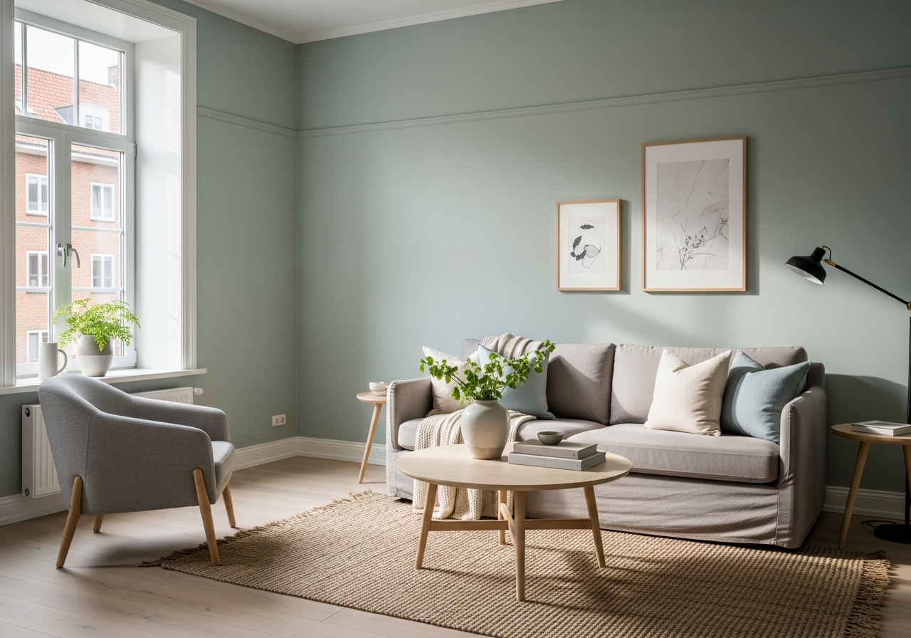
Cool, calming tones such as sage green, soft blue, and lavender have a way of opening up small spaces. Sage green has just enough earthiness to feel fresh but also grounding. Soft blue offers a peaceful vibe that visually expands the walls, making a room feel airier. Lavender adds a quiet, subtle hint of color that brightens without overwhelming. These colors reflect light well, which helps avoid the cramped sense that darker or overly bright colors might cause. They work well for bedrooms, small living rooms, and even bathrooms where a light, peaceful climate is welcome.
If you want a splash of drama, bold accent colors like deep navy, charcoal, or terracotta are also popular. These rich tones add personality without being overpowering, especially when used on an accent wall or in larger rooms. Deep navy brings a calm, classic feeling that pairs well with whites and metallics. Charcoal adds sophistication and depth without feeling heavy. Terracotta brings warmth and an earthy richness that matches well with natural decor. These colors have long-lasting appeal because they can create a strong but tasteful statement.
These popular paint colors remain favorites because they balance comfort, versatility, and style. Warm neutrals and cool calming tones offer a restful backdrop, while bold accents provide options for personality and flair. These palettes suit a variety of tastes, making it easier to match your space without worrying about trends fading quickly.
How Room Function Affects Your Color Choice
Choosing the best color doesn’t just depend on what looks nice. It depends on what you use the room for. A color that helps you sleep might not help you get work done. Matching a room’s tone to its main purpose makes the space feel right.
Colors for Rest and Relaxation
Bedrooms need colors that encourage calm and rest. Soft blues, gentle greens, and muted lavenders are all great choices. These hues ease the mind and body, promoting better sleep and relaxation. Avoid loud, bright colors in the bedroom since they can feel stimulating and interfere with falling asleep. Warm neutrals also work well here, creating a cozy environment free from distraction.
Colors for Work and Productivity
For home offices, colors that boost focus are best. Cooler, clearer shades like crisp whites, soft grays, or muted blues can help keep your mind sharp. These tones are clean and minimal, helping reduce visual clutter. Avoid overly bold colors like bright reds or oranges, which can be distracting or tiring over long work periods.
Colors for Social Spaces
Living rooms and dining areas are where people gather, so colors should encourage comfort and conversation. Warm neutrals, soft yellows, and earthy tones like terracotta make spaces feel inviting. These colors provide energy without overwhelming. In kitchens, bright and cheerful colors—such as butter yellows or soft greens—can stimulate appetite and make the space feel lively. Bathrooms benefit from fresh, clean colors like pale blues or subtle greens to evoke a spa-like atmosphere.
Matching paint colors to how you spend time in a room supports the mood you want. Restful tones help you recharge. Cool neutrals aid concentration. Warm, lively hues bring people together. Understanding this helps avoid choosing colors based on pure aesthetics alone, and ensures your space works as hard as you do.
Working with Natural and Artificial Light
Paint colors don’t look the same all day long. Light can change the way a color feels completely. A shade that looks perfect in bright, natural sunlight might seem dull or oddly tinted under artificial light.
North vs South-Facing Room Considerations
North-facing rooms get cooler, softer light, which means colors may appear bluer or darker. Choosing warm tones in these spaces can offset that coolness, making the room feel more inviting. South-facing rooms enjoy bright, warm sunlight most of the day. This means colors often appear truer or warmer than they would elsewhere. In these rooms, cooler tones work well to balance the warmth and prevent spaces from feeling too intense.
How LED Bulbs vs Warm Bulbs Change Colors
The kind of light bulbs you use changes how colors look after sunset. LED bulbs tend to be bright and cooler, sometimes washing out colors or muting warmth. Warm bulbs make colors feel softer and more saturated, but they can also cast a yellow or orange tint. Consider the color temperature of your bulbs and test how the paint looks under them to avoid surprises.
Testing Paint Samples at Different Times of Day
Always test paint samples in your actual room before committing. Apply patches on multiple walls and observe the color morning, afternoon, and night. Notice how shadows, direct light, and artificial lighting alter the shades. Testing like this helps you understand what a color will really look like on your walls, so you won’t feel disappointed once the painting is done.
Using light to your advantage means selecting colors that complement your room’s natural qualities. Pull warmer colors into cooler rooms. Opt for cooler tones in bright spaces. Adjust choices to your lighting setup. This awareness creates harmony between your painting and lighting design, enhancing the whole room’s feel.
Conclusion
Nice colors to paint your room depend on popular, timeless shades and the function of each space. Warm neutrals, calming cool tones, and bold accents offer many options that work well and look inviting. Matching color choice to room use and understanding natural and artificial light are key to a successful paint job.
Start by considering how you want each room to feel and what activity takes place there. Test paint colors in natural and artificial light at different times to see the true shades. Choose tones that complement your room’s natural lighting and personal style. These steps help you create a space that feels right every time you walk through the door.