Why Red Paint Colors for Living Room Walls Create Bold Impact
Red walls do something special to a living room—they turn a simple space into one that feels alive and inviting. But picking the right shade of red plays a big role in whether the room feels cozy or overwhelming. Red is a color that grabs attention and stirs emotion, making it a strong choice for living rooms where energy and warmth are welcome.
The Psychology Behind Red Walls
Red is tied to warmth and passion. It’s often linked to excitement, love, and energy, which can encourage conversation and liveliness in a living room. This color can boost your mood and create a sense of comfort, but used too intensely, it may feel aggressive or tiring. Because red increases heart rate and stimulates senses, it works well in social spaces but may need balance with calmer elements.
The feeling red creates depends a lot on the shade. Dark reds bring a sense of richness and sophistication, while brighter reds add vibrancy and fun. Understanding the mood you want helps you pick the right tone for your living room’s vibe.
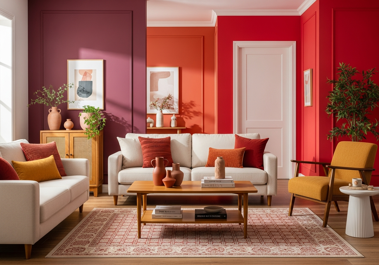
Warm Reds vs Cool Reds: What’s the Difference?
Not all reds are the same. Warm reds, like brick and terracotta, have hints of orange or yellow. They tend to create a cozy and welcoming atmosphere, which makes rooms feel snug and comfortable. These hues pair nicely with earth tones and wood furnishings, creating balance and harmony.
Cool reds, such as burgundy or cranberry, lean toward blue or purple undertones. They give a more elegant and calm feeling. Although less fiery, cool reds often evoke luxury and depth. Using them can make a room feel more refined, especially when combined with soft grays or creams.
Knowing when to use red is just as important as choosing the shade. Red works best in spaces with plenty of natural light and where the goal is to energize and gather. On the other hand, in small or dim rooms, strong reds might feel too intense. It’s smart to experiment with lighter or muted reds in such settings to keep the room inviting without overwhelming.
Top Red Paint Colors That Work in Any Living Room
From deep burgundy to soft terracotta, these red shades have changed countless living rooms with their charm and presence. Each one brings its own personality, so you can match your mood and decorating style perfectly.
Deep Reds for Drama
Deep reds like burgundy and wine offer a rich and timeless look. They add a sense of drama and coziness that’s perfect for large living rooms or those with classic decor. These tones work well with gold accents and dark wood furniture, enhancing warmth and elegance.
Popular choices include “Rich Burgundy” (a deep, dark red) and “Wine Cellar,” which has subtle brown undertones. These shades hide imperfections too, making walls look smooth and plush.
Soft Reds for Subtle Warmth
Soft reds bring a gentle warmth without overpowering the senses. Colors such as terracotta and rust show earthy qualities that feel grounded and natural. These reds are great for creating relaxed and welcoming atmospheres.
Terracotta paints often have orange or brown hues mixed in, giving the walls a sun-kissed glow. Rust shades lean toward brown-red, which pairs beautifully with natural fibers and plants. For something lighter, coral and salmon hues add a slight blush, perfect for spaces that need a touch of color but want to keep things light.
Bright Reds for Energy
Bright reds like cherry and crimson inject energy and personality. These reds wake up a room with vigor and match well with modern, minimalistic styles. They draw eyes instantly and work as feature walls too.
Certain paint brands have nailed these tones with names like “Cherry Red” or “Crimson Blaze.” These colors work well in lively households or spaces meant for social gatherings. If you choose bright reds, consider pairing them with white trims or neutral furniture to balance the intensity.
| Shade Category | Examples | Feel | Best For |
|---|---|---|---|
| Deep Reds | Burgundy, Wine Cellar | Rich, Cozy, Elegant | Large rooms, classic decor, dramatic statements |
| Soft Reds | Terracotta, Rust, Coral, Salmon | Warm, Earthy, Relaxed | Casual spaces, natural elements, cozy vibe |
| Bright Reds | Cherry, Crimson | Energetic, Bold, Modern | Feature walls, lively areas, contemporary styling |
How Natural and Artificial Light Changes Your Red Paint
The red you bring home from the store can look very different once it’s on your walls. Light has a big say in how red paint appears, so thinking about lighting is key to making the right choice.
North vs South-Facing Room Considerations
Rooms facing north get cool, indirect light for most of the day. This can make reds appear darker or more muted, especially if the red leans toward cool tones. In these rooms, warm reds with some orange or yellow undertones often perform better by adding warmth and brightness.
South-facing rooms enjoy warmer, direct sunlight. Reds show up fresher and more vivid here, especially bright shades like crimson or cherry. However, intense sunlight can sometimes make reds look too bright or even washed out during midday, so testing the paint is essential.
How LED Bulbs Affect Red Tones
Artificial lighting changes the way red paint behaves after sunset. LED lights vary widely in color temperature, from cool white to warm yellow. Cooler LEDs can make red paint appear slightly bluish or less warm, while warmer LEDs enhance the cozy, orangey side of red.
Choosing bulbs labeled as “warm white” (around 2700K to 3000K) can keep red walls feeling inviting and rich. Bulbs that are too cool (5000K+) might cause reds to look harsher and less natural.
Morning vs Evening Color Shifts
Red paint changes throughout the day. In the morning, softer light with a blue tint makes reds feel cooler and more muted. As the sun moves and light warms up in the afternoon and evening, reds deepen and glow warmly.
These natural shifts can add interest to your living room, but if you prefer a consistent color, look for reds that balance warm and cool undertones.
Using Test Patches in Different Light Conditions
Tapping a sample patch on all your planned walls is a simple step that pays off. Observe the color during daylight, midday, and after dark with indoor lights. This will show how your chosen red paints live in your specific space and help avoid surprises.
Window Treatments That Complement Red Walls
Window coverings also affect red walls’ appearance. Light curtains soften natural light and can temper strong reds. Heavy drapes make reds feel deeper and more intense by blocking light. For vibrant reds, sheer or neutral-colored curtains help balance the brightness.
Dark or patterned curtains can either clash or complement reds, depending on choices. Keep in mind the overall mood: simple, light fabrics promote openness, while rich textures add drama.
Conclusion
Red paint colors for living room walls bring boldness, warmth, and personality that few other colors can match. They shape mood and space through their deep psychological and visual effects. By choosing the right shade and minding the light, red walls can transform your living room into a lively, inviting place.
Start by picking a red tone that fits your room’s size and lighting. Test patches in different conditions help see the true color. Balance intense reds with the right lighting and window treatments to keep the room comfortable. With these steps, red can make your living space feel unique and welcoming.