1. Why 2 Tone Living Room Paint Ideas Work So Well
Two-tone paint schemes give your living room instant personality without breaking the bank. This simple paint trick can make small rooms feel wider and more open, while large rooms gain a sense of coziness and balance. Instead of plain, monotone walls that fade into the background, two-tone walls add depth and a fresh look, making your space more eye-catching and dynamic.
One major advantage of two-tone paint is its ability to provide visual interest without overwhelming the space. Instead of clutter or heavy furniture, color alone can create rhythm and focus on different parts of the room. It is also a budget-friendly alternative to expensive wallpaper or wall treatments, allowing for quick refreshes without major investment.
Plus, two-tone paint helps define natural zones in open living areas. For rooms that combine dining, seating, and entertainment, different colors can give each space its own personality while keeping the flow intact. You can even make your ceilings look higher or lower depending on the placement of colors. Lighter shades on upper walls or ceilings lift the room’s height, while darker colors added above or below can anchor the room visually.
Another bonus is that two-tone walls bring attention to architectural details. Picture a chair rail dividing the upper and lower wall or a painted built-in bookcase in contrast to the wall color—it highlights those features instead of letting them blend in.
The Psychology of Two-Color Rooms
Colors affect how you feel and interact with a space. Using two colors cleverly can balance energy and calmness in your living room. For example, warm tones like soft yellows and oranges invite conversation and warmth, while cooler blues and grays promote relaxation and focus. The contrast between two colors can stimulate creativity or create harmony, depending on your choices.
When paired well, different colors also help segment emotions. A bright, lively lower wall grounded by a calm upper wall can energize a room without making it chaotic. This subtle emotional cue guides how people behave in the space.
Before and After Impact
Imagine walking into a living room with plain, flat beige walls. Now picture the same space with the lower third painted a deep navy and the upper part a soft, warm white. The room instantly feels more anchored and elegant. The two colors provide clear lines that add structure and style, often without rearranging furniture.
Another example is applying a dark charcoal on the lower half of a tall wall and a light gray on top. This visually lowers the ceiling, making an overly tall room feel more intimate and welcoming. The difference doesn’t require changes to decor; just paint transforms the mood and perceived size instantly.
Two-tone paint offers an affordable way to give your living room a fresh personality while improving its overall look and feel. This simple design strategy has a big impact without much fuss.
2. Popular 2 Tone Living Room Paint Ideas and Color Combos
The right color pairing can make or break your two-tone design. A well-chosen combination works every time, setting the tone for your entire living space. Whether you want a calm, classic look or something bold and modern, some color pairs stand out as reliably beautiful and easy to live with.
Starting with timeless neutral combinations is a smart choice. Gray and white together offer balance and sophistication. The coolness of gray contrasts softly with crisp white molding or upper walls, fitting most interior styles from minimalistic to rustic. Similarly, beige and cream create a warm, soft atmosphere without feeling dull or overused.
If you prefer bold contrast pairs, navy blue with white is a standout. Navy adds drama and depth, while white keeps the feel fresh and bright. Black paired with natural wood tones also makes a striking statement, where the darkness of the black enriches the warmth of soft wood furniture and floors.
Consider balancing warm and cool colors for a room that feels both inviting and refreshing. For example, a warm terracotta on the lower walls with a cool mint on top can create an energetic yet balanced vibe. This technique also helps delineate space and brings visual layers.
Monochromatic schemes are another popular option for two-tone painting. Using different shades of the same color, such as light sky blue paired with navy or soft taupe matched with chocolate brown, offers harmony with subtle contrast. The room stays unified but gains depth through tonal variation.
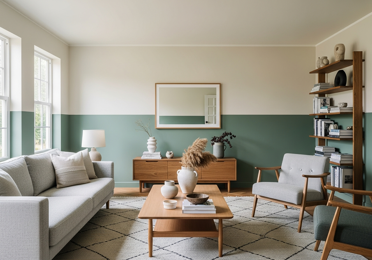
There are two main ways to apply two-tone colors in living rooms. The accent wall technique paints one wall in a contrasting color, drawing attention to a focal point like a fireplace. The split wall technique divides each wall horizontally, with one color on top and another on the bottom, often separated by a trim or chair rail for a classic look.
Timeless Neutral Pairings
Neutral color pairs have stood the test of time for good reason. Light gray and warm white is one of the most versatile, working well with nearly any furniture style or palette. Beige and cream give a cozy, traditional feel that complements wooden furniture beautifully. These colors help rooms feel spacious and clean while allowing other features like rugs and art to shine.
Statement Color Combinations
If you want more drama, navy and white is a perfect choice. It works well in both small and large rooms and can look elegant or casual depending on accents. Black and natural wood is another trend gaining ground. Though bold, black paint does not feel oppressive when balanced with warm wood tones that soften and ground the space.
Trendy Colors That Actually Last
Colors like sage green, muted terracotta, and soft blues have gained popularity because they feel fresh yet timeless. Pairing soft sage with off-white adds a calm, earthy feel. Muted terracotta mixed with light gray lends warmth and personality without feeling dated. These shades suit many decorating styles and tend to age well, making them smart investments.
3. How to Choose Your Two Paint Colors (Decision Framework)
Picking two colors that work together starts with understanding your room’s natural light and what you already own. Approaching color choice step by step helps you avoid combinations that look great in theory but fall flat in your space.
First, assess the direction your room faces. North-facing rooms get cooler light, so warm tones like beiges, soft yellows, or warm grays generally look better and keep the space inviting. South-facing rooms see bright, warm sunlight, so cooler tones such as blue-greys or soft greens help balance out the warmth.
Next, match the undertones in both colors you consider. Each paint color has underlying hues—blue, yellow, pink, or gray—that affect how they blend. For example, pairing a blue-gray with a warm beige might clash because of different undertones. Identifying these helps create harmony. Swatches at the store or online product pages usually list undertones.
Think about your furniture and flooring colors when choosing paint. Your wall colors should complement these permanent elements. For instance, warm wood floors often pair well with creams, taupes, or warm greens. Dark gray upholstery benefits from lighter or contrasting colors to keep the room balanced.
Testing paint samples is critical before committing. Paint two large patches on opposite walls and observe them at different times: morning, midday, and evening light. Colors change dramatically throughout the day, so this step can prevent unwanted surprises and ensure you love the look at all hours.