Why Paint Colors Matter in Small Rooms
The right paint color can transform a cramped room into a space that feels twice its actual size—but pick wrong, and you’ll feel like the walls are closing in. Small rooms challenge us to balance function and comfort within tight walls, and color plays a huge role in unlocking their potential. Sound choices can make a modest space breathe with light and openness, while poor color decisions amplify tightness and darkness.
One key factor in this transformation is how paint colors interact with light. Colors that reflect more light trick our eyes into seeing a larger area. When sunlight or artificial bulbs bounce off pale, reflective walls, the room seems to stretch beyond its boundaries. Conversely, deep or matte shades absorb light, shrinking the perceived size. The way paint finishes catch or scatter light also shifts how roomy a place looks.
Color impacts our emotions, too. Soft and soothing tones reduce visual clutter and stress, making confined spaces feel comfortable rather than claustrophobic. Bright, intense colors can energize but might overwhelm a small area if overused, causing a closed-in effect. Choosing colors with the room’s function in mind helps balance comfort and energy within limited square footage.
Many people assume dark colors are off-limits in small rooms, fearing they make spaces feel boxed. This is a misconception. While deep tones can indeed cozy up a room, if used thoughtfully on accent walls or paired with adequate lighting, they add depth and richness without shrinking the space. It’s about strategic application, not complete avoidance.
The Science Behind Color and Space Perception
Perception of space is tied closely to how light interacts with colors. Lighter hues bounce light back into the room, enhancing brightness and creating an illusion of openness. Darker pigments absorb light, drawing walls inward visually. Our brains interpret high contrast areas as boundaries, so uniform, light colors reduce these visual breaks, making edges appear farther away.
Studies in color psychology reveal that cool colors—blues, greens, and some purples—often make spaces feel larger by giving a sense of calm distance. Warm colors like reds and oranges tend to feel closer and more stimulating, which can crowd a small room unless balanced carefully. The emotional response combined with light reflection defines how spacious or cramped a room feels.
How Natural vs Artificial Light Changes Everything
Natural light varies during the day and changes how paint colors appear on walls. A soft morning glow can magnify warm neutral tones, while bright midday sun enhances cooler shades. Rooms with large windows or good daylight exposure benefit from versatile palettes that evolve smoothly through daily light shifts.
Artificial lighting types—such as incandescent, fluorescent, or LED bulbs—also alter color perception. Warm bulbs bring out golden or beige undertones making rooms feel snug, while cooler bulbs highlight blues and grays, amplifying spaciousness. Mixing natural and artificial lighting requires choosing paints that maintain their intended effect regardless of the source.
In all, selecting paint for small rooms means thinking beyond color and focusing on light quality, finish, and mood. The interplay between these factors guides the eye and shapes how cozy or open a room feels.
Best Light and Neutral Paint Colors for Small Rooms
Light neutrals aren’t boring—they’re your secret weapon for creating an airy, spacious feel that works with any decor style. These colors brighten walls, reflect natural light, and provide a gentle backdrop that blends with furnishings instead of competing. In small rooms, their ability to visually enlarge and unify space can’t be overstated.
Flawless whites and off-whites offer the purest reflection of light. Clean whites like Benjamin Moore’s “Chantilly Lace” or Sherwin-Williams’ “Extra White” have subtle undertones that prevent glare. Off-whites such as “Alabaster” or “Swiss Coffee” introduce slight warmth or coolness, helping to soften edges and add comfort without dimming light.
Undertones play a big role in how a neutral feels. Warm undertones lean toward cream, beige, or peach—great for rooms needing coziness. Cool undertones carry hints of blue, gray, or green, ideal for creating calm in spaces that get ample sunlight or have modern decor themes. Knowing your room’s lighting and style helps decide which undertone will keep it feeling open.
Greige—gray-beige blends—are popular alternatives for small rooms because they add depth without overwhelming darkness. Shades like Sherwin-Williams’ “Repose Gray” or Benjamin Moore’s “Edgecomb Gray” offer a neutral that’s neither cold nor warm, enabling versatile color pairings and maintaining an airy feel.
Whites That Work: Beyond Basic White
White can be stark or inviting depending on its undertone and finish. To avoid a sterile look, choose whites with soft undertones. For instance, “Decorator’s White” by Benjamin Moore carries a hint of warmth that adds subtle softness, while “Pure White” is crisp enough for a bright, clean backdrop. Using matte or eggshell finishes on walls helps reduce light glare, making whites easier on the eyes.
White ceilings paired with slightly warmer whites on walls can visually lift ceilings without creating a boxed feeling. This layering of whites adds interest and dimension to small rooms without compromising on brightness.
Soft Beiges and Warm Neutrals
Soft beiges bring warmth and approachability to confined rooms. Colors like “Accessible Beige” from Sherwin-Williams or Benjamin Moore’s “Manchester Tan” provide a grounding, natural feel. These tones work well in rooms with cooler lighting or northern exposures, as they add a welcome glow that combats dullness.
Warm neutrals are especially good in living rooms or bedrooms where comfort matters most. Their inviting hues feel like a quiet embrace, expanding space through a cozy, balanced atmosphere.
Gray-Based Colors for Modern Spaces
Grays in lighter shades are excellent for adding sophistication without closing in a room. For example, “Pale Oak” by Benjamin Moore is a warm gray that reads as neutral with a hint of softness. Cooler grays like Sherwin-Williams’ “Passive” have blue undertones to pull a room toward brightness and openness.
Pairing gray walls with white trim and ceiling enhances the room’s lines, drawing the eye upward and outward. These shades work well in minimalist, Scandinavian, or urban styles where clean, uncluttered spaces feel most expansive.
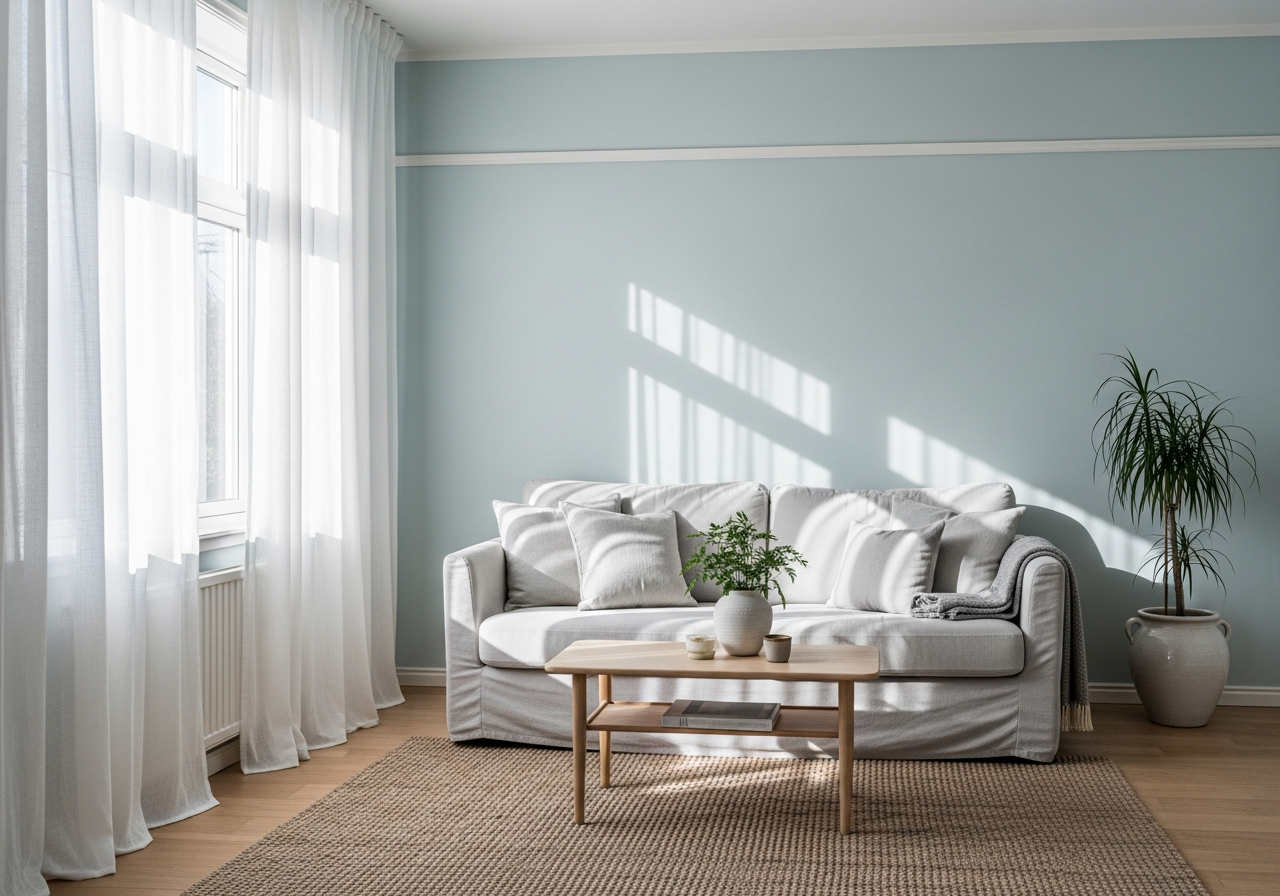
Cool Colors That Open Up Small Spaces
Cool tones trick your eyes into seeing walls as further away than they actually are, giving you instant visual square footage. Blues, greens, and even soft purples cool the air inside a room, pushing walls back and creating a restful atmosphere that balances openness with calm.
Light blue variations evoke the sky or sea, lending infinite depth and quiet. Pale aqua or icy blue shades make bathrooms and bedrooms feel fresh and roomy, especially when paired with clean white trim. Greens tap into nature’s calming effect, offering a soothing link to the outdoors that expands space psychologically. Soft lavenders add a touch of softness and subtle color without overwhelming small walls.
The direction a room faces plays a large role in which cool hues work best. Northern light is cooler and dimmer, so warmer cool colors like blue-greens or periwinkles complement the space by adding warmth without losing the brightening effect. Rooms with southern or western exposure get stronger, warmer sunlight—here, icy blues or sage greens maintain a refreshing balance that keeps rooms from overheating visually.
Blues for Bathrooms and Bedrooms
Bathrooms and bedrooms benefit from tranquil blues, which reduce stress and help relaxation. Shades like Benjamin Moore’s “Palladian Blue” or Sherwin-Williams’ “Sea Salt” inject color without crowding the space. Their subtle vibrancy opens walls and balances well with white tile, fixtures, and natural wood.
In bedrooms, these blues can help cool down the color temperature, making the space feel larger and more restful. Pair with light layered rugs and soft textiles to enhance the airy vibe.
Greens That Create a Natural Escape
Green hues connect a home to nature, lending balance and openness. Light shades such as Sherwin-Williams’ “Clary Sage” or Benjamin Moore’s “Soft Fern” keep the mood fresh and breathing. Because green naturally calms, it prevents small rooms from feeling chaotic or stifling.
Greens also work well with wood accents and plants, further blurring boundaries between outdoors and indoors. This connection tricks the eye into seeing more space and serenity.
Soft Lavenders and Pale Purples for Subtle Depth
Lavender and soft purples offer a gentle cool tone with a hint of warmth. Shades like Benjamin Moore’s “Silver Lilac” or Sherwin-Williams’ “Inspiration” add personality to small rooms without overwhelming them. These tones balance mood, making a room feel open yet cozy.
Lavender is especially suited for bedrooms or sitting areas where subdued, inviting color is desired. Combined with light furnishings, it helps the space breathe even when the room’s footprint is modest.
Conclusion
Choosing the right paint colors for small rooms means focusing on shades that reflect light and create a restful, open feel. Light neutrals and cool tones are particularly effective because they visually expand space and provide calming, versatile backdrops. Dark colors can be used strategically but need careful placement and lighting to avoid shrinking the space.
Start by assessing the room’s natural and artificial light sources before picking a palette. Test samples on multiple walls and observe how colors shift throughout the day. Use finishes that enhance light reflection, such as satin or eggshell, and consider how color undertones match your room’s mood and furnishings. Thoughtful choices make even the smallest room feel like a welcoming, airy retreat.