
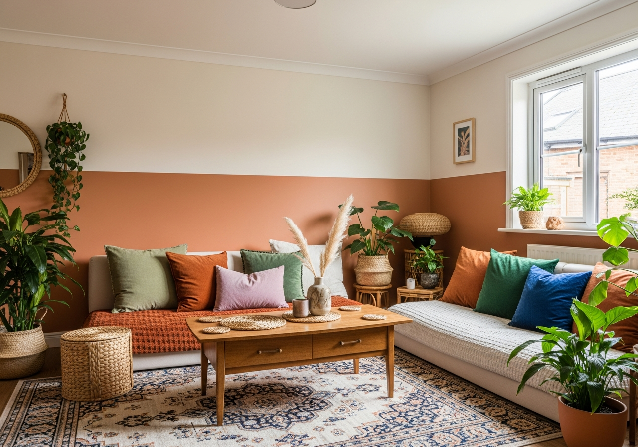

Boho Paint Colors for Living Room: Create Your Perfect Free-Spirited Space
Boho style brings a free-spirited, artistic vibe to any living room. At its heart, it’s a blend of colors and textures drawn from nature and cultures around the world. Choosing the right boho paint colors makes all the difference in setting a warm, inviting tone. The palette balances earthy, grounded shades with lively, surprising pops of color. This mix helps express personality without feeling cluttered or chaotic. Whether you want soft neutrals or bold jewel tones, the right colors transform your living space into a relaxed haven filled with character and charm.
1. What Makes Boho Paint Colors for Living Room Spaces Special
Boho style breaks all the rules—and that’s exactly why it works so well in living rooms where personality matters most. Boho paint colors are anything but ordinary. They pull from rich earth tones and global inspirations, creating a space that feels lived-in and unique. Warm hues like terracotta and rust blend perfectly with creamy neutrals, offering a balanced backdrop. Bright color accents add surprises without overwhelming the room. This freedom to combine and layer makes boho living rooms stand out.
The core of boho palettes centers on natural and earthy colors. These shades ground the space and connect it to the outdoors. Warm tones like ochre, deep oranges, and olive greens mimic natural landscapes such as deserts and forests. They bring warmth and comfort to a room. At the same time, cool blues or subtle mauves add depth and calm, balancing the warmer shades. A typical boho color combo mixes these elements thoughtfully rather than randomly.
The Psychology Behind Boho Colors
Colors in boho design reflect a sense of adventure, openness, and creativity. Earthy colors like terracotta and moss create feelings of stability and comfort. These tones soothe the mind and make spaces feel welcoming. Vibrant pops of jewel tones such as emerald green or sapphire blue inspire imagination and optimism. By combining warm and cool shades, boho palettes evoke both energy and relaxation at once. This emotional balance is a big reason the style resonates with so many.
Mixing Warm and Cool Tones Successfully
Mixing warm and cool tones requires attention to balance. Start with a neutral or warm base layer on walls or larger furniture pieces. Warm bases, like creamy beige or soft rust, create a cozy atmosphere that feels inviting. Then add cooler shades in accents—think pillows, rugs, or one bold wall. These cooler colors can include soft blues, dusty mauves, or muted greens. The two temperature groups play off each other, giving your living room dimension. It’s the dance between warmth and coolness that makes boho paint colors exciting and harmonious.
2. Top 12 Boho Paint Colors That Transform Living Rooms
From dusty terracotta to sage green, these specific paint colors nail that relaxed boho vibe every single time. Boho living rooms feel like a creative sanctuary, and the right paint colors help get you there. Here are twelve standout shades that bring cozy earthiness and unexpected depth to your space.
Warm Earth Tones
- Dusty Terracotta: This soft, muted red-orange shade adds warmth without feeling too bright. Perfect for accent walls or paired with wooden décor.
- Rust Orange: Deep and earthy, rust creates a grounded base that pairs beautifully with both neutrals and jewel tones.
- Burnt Sienna: A rich, reddish-brown that recalls desert clay, offering cozy warmth on larger surfaces.
- Moss Green: A muted earth green that evokes forest tranquility while maintaining a warm undercurrent.
Soft Neutrals as Your Base
- Warm Cream: A creamy off-white providing a soft, warm background that complements any boho accent.
- Beige Linen: Light and airy, this color keeps things neutral while enhancing texture and natural light.
- Soft Taupe: Earthy but understated, taupe works well with deeper accents and natural wood tones.
Bold Accent Colors
- Emerald Green: Deep and jewel-like, emerald adds a vibrant hit without overpowering the earthy palette.
- Desert Rose: A muted pink inspired by flower tones seen in arid climates, offering subtle warmth and freshness.
- Sapphire Blue: Intense but calming, this blue brings in the feel of vibrant global textiles.
- Olive Green: Slightly yellow-toned and earthy, olive brings nature indoors with steady energy.
| Color Name | Description | Example Paint Brand & Code |
|---|---|---|
| Dusty Terracotta | Soft muted red-orange, warm and cozy | Behr – “Rustic Red” (S-H-230) |
| Rust Orange | Deep earthy orange, grounded and rich | Sherwin-Williams – “Cavern Clay” (SW 7701) |
| Warm Cream | Creamy off-white, soft and inviting | Benjamin Moore – “White Dove” (OC-17) |
| Emerald Green | Vibrant jewel tone, bold and fresh | Farrow & Ball – “Drawing Room Green” (No. 81) |
| Desert Rose | Muted pink with warmth and softness | Behr – “Desert Blush” (M160-2) |
3. How to Choose Your Perfect Boho Color Combination
Picking boho colors isn’t random—there’s a method that guarantees your living room looks cohesive instead of chaotic. A good starting point is the 60-30-10 rule. This means 60% of your room should be a dominant color, like a warm neutral on walls. Next, 30% includes secondary colors in furniture or larger accents. The final 10% is for bold colors, such as pillows or artwork.
Begin by looking at your largest furniture pieces. Their colors set the tone for what paint hues to choose. For example, if your sofa is a deep earth tone, balance it with lighter warm walls. Or if you have natural wood floors and trim, pick colors that complement their undertones. This ensures everything feels connected, not clashing.
Testing paint samples on your walls before making a final decision is key. Lighting changes throughout the day can shift how colors look. Paint swatches let you see how each shade works in your specific living room. Try pairing samples with your furniture and décor to feel the full effect. Once you find a mix that feels balanced and personal, you’ll have a perfect boho palette to start with.
Conclusion
Boho paint colors for living rooms combine earthy warmth and lively accents to create cozy, creative spaces. They reflect a balance of natural tones and bold touches that bring personality to a room. To choose your perfect palette, use the 60-30-10 rule, consider your furniture and flooring, and test paint samples. Starting with these steps helps you craft a free-spirited living room that feels both relaxed and inviting.