Best Paint for Sitting Room: Designer-Approved Colors and Selection Guide
Picking the best paint for your sitting room changes how the space feels and looks. It sets the mood of your home’s most-used room. The right color can make a room feel larger, warmer, or more elegant. But a poor choice might make you want to repaint quickly. Knowing how light, room size, furniture, and paint finish all play into your decision helps you pick a color you’ll love for years. This guide breaks down expert advice to help you choose the perfect paint for your sitting room.
1. How to Choose the Best Paint for Sitting Room Spaces
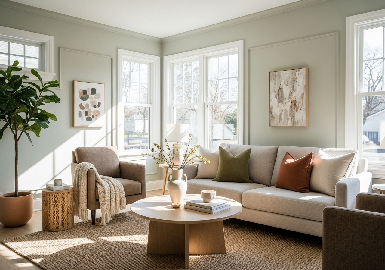
Choosing paint for your sitting room shapes the room’s atmosphere. Think about how daylight and lamps affect colors on your walls. The same shade can look bright and fresh in the sun or dull and muted under artificial light. Also, the size of your sitting room and ceiling height make a difference. Smaller rooms may need lighter colors to feel open, while tall ceilings can handle deeper tones that add coziness.
Your furniture and decor matter too. The paint should complement the style and color of your sofas, rugs, and curtains. If you have bold furnishings, neutral walls help balance things. But if your furniture is simple, you might want on-trend colors to make the walls pop. Finally, pick a paint finish based on how much wear your walls get. Matte finishes hide blemishes well, eggshell offers a soft sheen, and satin is easy to clean.
Understanding Your Sitting Room’s Natural Light
Natural light changes color throughout the day. Rooms facing south get warm, bright sunlight, making colors appear warmer and more vibrant. East-facing rooms have cool morning light that softens colors before afternoon shadows. North-facing rooms get indirect, cooler light all day, so warm tones keep the room feeling cozy. West-facing rooms shine with strong afternoon light, which can highlight imperfections and deepen colors. Observe your sitting room at different times and test paint samples on the walls before deciding.
Matching Paint to Your Lifestyle Needs
How you use your sitting room influences paint choices. If the space is for relaxing and reading, calming pastels or soft neutrals work best. Families with kids might prefer durable satin or semi-gloss finishes that stand up to cleaning. Entertaining areas look stylish with deep jewel tones or warm neutrals that create inviting vibes. Also, think about how often you want to repaint. Durable finishes and timeless colors can save effort down the road.
2. Top Designer-Recommended Paint Colors for Every Sitting Room Style
Designers lean on a handful of paint colors that look good in many homes. These colors adapt to various styles and lighting, giving you a safe but stylish choice. Warm neutrals like beige and taupe create a classic, inviting feel that suits traditional rooms. Cool grays bring a peaceful modern look and pair well with minimalist furniture. Bold jewel tones such as sapphire or emerald add drama in quick doses, often used on accent walls or shelves. Soft pastels like blush pink or pale green bring a gentle calmness that fits shabby chic or coastal themes.
Classic Neutrals That Never Go Out of Style
Neutrals have wide appeal because they act as a flexible backdrop. Warm beige tones invite comfort and blend well with wood furniture and natural textures. Taupe, a mix of gray and brown, offers a timeless choice that doesn’t overpower. These shades work with almost any accent color and style, from country to urban loft.
Statement Colors for Bold Personalities
If you want your sitting room to stand out, jewel tones provide a rich look. Deep navy blue adds an elegant depth that pairs well with gold or brass accents. Emerald green brings lush, natural energy, making the room feel vibrant yet sophisticated. These tones work well on feature walls, fireplaces, or cabinetry, giving visual interest without covering the whole room.
Trending Colors for 2024-2026
For fresh ideas in the coming years, many designers recommend colors inspired by nature and calmness. Soft sage green reflects a growing love for eco-friendly spaces and pairs beautifully with natural wood. Muted terracotta brings warm earthiness that feels organic and welcoming. Gentle blues with gray undertones are also gaining popularity, offering a modern twist on traditional blue shades.
3. Paint Colors That Make Small Sitting Rooms Feel Bigger
Small sitting rooms can feel cramped without the right colors. Lighter paints reflect more light and open up the space visually. Whites and soft off-whites help expand the room, making walls seem farther apart. A clean white ceiling can also add height. Cool colors like pale blue or soft lavender push walls back visually, giving the impression of extra depth. Accent walls in a slightly darker shade create a focal point without shrinking the room.
Using glossy or satin finishes in small spaces allows light to bounce around, brightening corners and edges. Avoid too many dark shades or overly busy patterns, as they can make small rooms feel even smaller.
Conclusion
The best paint for a sitting room depends on its lighting, size, furniture, and how the room is used. Choosing the right color and finish can change the room’s feel from small and plain to open and stylish.
Start by testing paint colors in your actual space at different times of day. Match colors with your furniture and lifestyle. Pick a finish that suits your room’s traffic and maintenance needs. This approach helps you pick a wall color that you will enjoy every day.