Best Paint Colors for Drawing Room: Transform Your Space with Perfect Shades
Your drawing room is more than just a space; it’s where first impressions happen. The right paint color sets the mood and welcomes guests warmly. Whether you prefer sleek modern vibes or cozy traditional looks, your paint choice can make a world of difference. Understanding how colors fit your style and space helps you create a room that feels just right. Let’s explore the best paint colors that suit your drawing room and your tastes.
1. Best Paint Colors for Drawing Room Based on Style
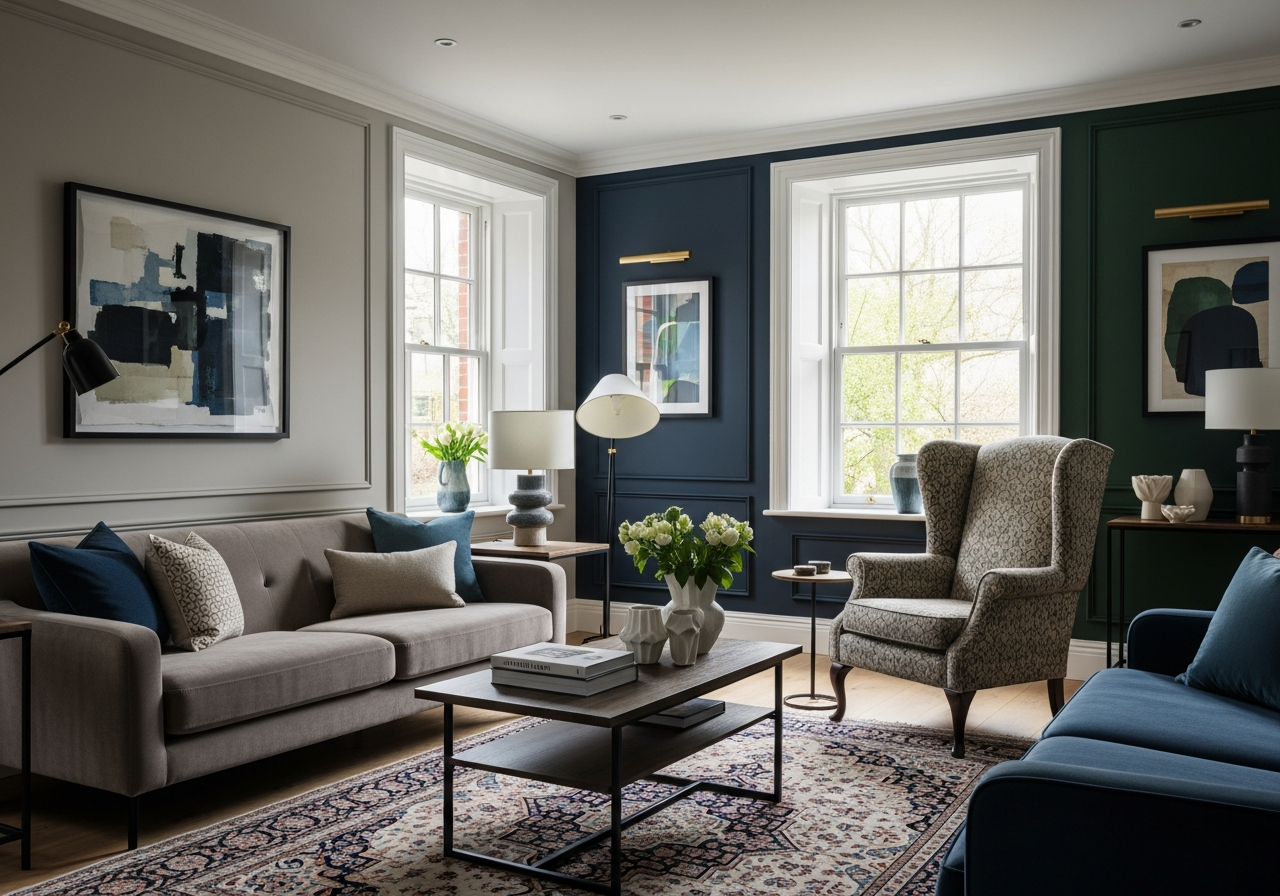
Your drawing room shows off your style, so choosing the right paint colors can help you express it clearly. Modern minimalist rooms favor simple, clean palettes like whites, grays, and soft blacks. These shades keep the room feeling open and calm. Traditional spaces often lean into warmth with beiges, taupes, and soft browns that make the room feel inviting and classic. For a bold statement, contemporary choices like navy, emerald, and charcoal add rich drama without overwhelming the space. Transitional colors blend styles and work well in rooms that mix different design ideas.
Colors for Small vs Large Drawing Rooms
Small drawing rooms feel larger with light colors. Whites and pale grays reflect light, opening up the room and keeping it airy. These shades prevent the walls from closing in on you. In bigger rooms, dark colors create a cozy, intimate atmosphere. Deep navy or charcoal can make a large room feel warm and inviting rather than vast and empty.
North vs South Facing Room Colors
North-facing drawing rooms get cooler light, so warm paint colors like soft beige or creamy taupe help warm up the space. These tones balance out the natural coolness. South-facing rooms get plenty of warm sunlight, which means cooler colors like gentle grays or muted blues will look fresh and avoid feeling too hot or bright.
2. How Natural and Artificial Light Changes Paint Colors
Colors don’t look the same all day long. A paint that feels perfect in bright daylight might look dull or odd under artificial light. Understanding how light works in your drawing room helps you pick colors that shine both day and night.
In the morning, light is cooler and blue-toned, which can make warm colors feel softer and cool colors a bit stronger. Evening light is often warmer and richer, making cool colors look muted and warm tones pop. Artificial light also changes the way paint appears. LED bulbs tend to be cooler, while incandescent bulbs give off a warm glow. These differences can make the same color look very different after sunset.
Window direction influences the light color entering your room. East-facing rooms catch the morning sun’s cool light, while west-facing rooms get warmer evening light. South-facing rooms often stay bright most of the day, and north-facing rooms have a steady, soft light that is cooler.
The 3-Day Paint Test Method
Before committing to a color, try the 3-day paint test. Paint a sample area or a board and place it in your drawing room. Observe it at different times each day—morning, afternoon, and evening—and look at it from various angles. This helps you see how the color shifts with changes in light and decide if it suits the room all day long.
Fixing Color Problems with Lighting
If a color looks off, adjusting the light source can help. Changing bulb color temperature can warm or cool a room to fit your paint. Adding layers of lighting such as overhead lamps, floor lamps, and accent lights helps soften or highlight colors. This layered lighting ensures your drawing room feels balanced no matter the hour.
3. Coordinating Paint with Your Existing Furniture and Flooring
Your paint color should complement the furniture and floors you already have. For example, a rich brown leather sofa pairs well with warm tones like beige or taupe. These colors enhance the natural warmth of leather without clashing. Oak or hardwood floors usually work best with versatile colors in neutral shades or soft greens. These tones highlight natural wood grains and keep the room feeling grounded.
If you prefer bold paint colors, balance them by choosing neutral furniture or flooring. A navy wall looks striking when paired with light gray or cream furniture and wood floors. On the other hand, if your furniture and floors are dark, lighter paint colors help open up the space and prevent it from feeling heavy.
Think about textures and patterns too. Paint colors that work well with smooth leather might not suit rough wood or patterned rugs. Keeping your furniture and flooring in mind ensures the drawing room feels cohesive and welcoming.
4. Popular Paint Shades and Their Effects on Mood
Paint colors do more than decorate; they influence how you feel in a room. Soft blues and greens create calm, peaceful environments, perfect for relaxation. Warm tones like peach, cream, and gentle gold spark comfort and warmth. Bold colors like deep reds or emerald green bring energy and creativity, making the space lively but not overwhelming.
Neutral colors like beige, gray, or white offer a clean slate and balance. These shades work well in social spaces because they allow furniture and accessories to pop. Colors with the right undertones also affect the mood: blues with gray undertones feel cooler, while those with green undertones feel fresher and more natural.
5. Trends and Timeless Paint Choices
Trends in paint colors often cycle, but some shades stay timeless. Soft grays and warm whites remain popular because they fit many styles and adapt easily over time. Exotic greens and deep blues are gaining attention now for adding depth and life to rooms. Matte finishes are trendy for their subtle elegance, while satin finishes keep walls easy to clean and slightly reflective.
When picking a paint color, balance style trends against your personal taste and how long you want the color to last. A timeless hue can save you from repainting too often, while a trendy color can freshen your drawing room with a modern touch.
Conclusion
The best paint colors for your drawing room depend on your style, room size, and lighting. Matching colors to your furniture and understanding how light changes paint helps you pick shades that work all day long. Warm tones suit cozy spaces, while cooler colors keep bright rooms fresh.
Start by testing colors in your room throughout the day. Think about how your furniture and floors interact with paint choices. Use layered lighting if needed to enhance your color’s true look. This approach lets you transform your drawing room into a welcoming space with colors that feel just right.