
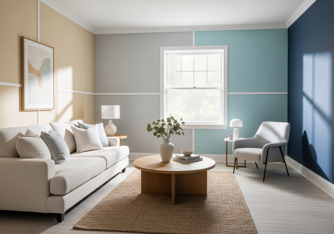

Popular Living Room Paint Color Ideas for Every Style
Your living room sets the tone for your entire home, and the right paint color can make all the difference between a space that feels cramped and one that feels inviting. The colors you choose have the power to influence mood, light perception, and even the feeling of space. Whether you lean toward cozy, fresh, or bold styles, there’s a paint color option that fits your vision.
Warm neutrals like beiges, taupes, and warm grays offer a welcoming background that pairs well with many décor styles. These shades gently brighten the space without overwhelming it, creating comfort and versatility. If you prefer a cooler vibe, contemporary blues and sage greens provide a calming atmosphere and modern edge. They evoke feelings of serenity, perfect for unwinding after a long day.
Bold accent walls create a focal point without overpowering the room. Rich jewel tones or deep charcoal shades on a single wall can breathe life into the space, highlighting architectural details or artwork. Finally, timeless whites and off-whites remain popular because of their clean, refreshing look. They make rooms appear larger and more open while serving as a neutral canvas for colorful accessories.
Neutral Paint Colors That Never Go Out of Style
Neutral paint colors remain a popular choice because of their adaptability. Shades like warm beige, soft taupe, and gentle gray create a balanced backdrop that welcomes different furniture styles and accessories. These colors don’t compete with other elements in the room, so you can switch out your décor over time without repainting.
Warm neutrals, in particular, add a subtle softness that makes living rooms feel inviting and warm. Beige and taupe hold golden undertones that mimic natural sunlight, enhancing the cozy vibe. Warm grays can unify modern and traditional elements, giving the room a sophisticated edge without feeling cold or sterile.
Bold Colors for Statement Walls
Using bold colors on one wall is a great way to make a statement without overwhelming your living room. Deep navy, forest green, and charcoal gray serve as dramatic backdrops, emphasizing features like a fireplace or a large piece of artwork. Vibrant colors like burnt orange or rich plum add warmth and personality when paired with neutral walls.
Accent walls work best when balanced with lighter hues elsewhere in the room, ensuring the bold color stands out as a feature rather than a distraction. This approach adds depth and dimension, drawing attention to key design points and making living spaces feel dynamic.
Soft Pastels for Calming Spaces
For those wanting a serene and relaxing living room, soft pastels offer gentle, soothing colors without being overpowering. Light blues, dusty pinks, and muted lavenders create an airy ambiance that promotes calmness. These hues pair well with light wood furniture, neutral rugs, and minimal décor.
Pastels tend to reflect light softly, which helps rooms feel open and peaceful. They are especially effective in smaller rooms where darkness or heavy colors might make the space feel cramped. Choosing pastels can give your living room a timeless charm that’s both subtle and stylish.
How Natural Light Changes Your Paint Color Choice
That gorgeous gray you picked at the store might look purple in your north-facing room—here’s why light direction matters more than you think. The way natural light enters your living room dramatically alters how paint colors appear throughout the day. Taking light into account can save you from regret and disappointment after painting.
The orientation of your room determines the color temperature of the sunlight it receives. North-facing rooms get cooler, softer light all day, which can make warm colors look muted or even dull. South-facing rooms enjoy bright, warm sunlight that enhances warm tones and sharpens cool colors.
East-facing rooms get direct morning sunlight, which can highlight cool colors early but shift toward golden tones as the day progresses. West-facing rooms bask in warmer, richer afternoon light that can deepen color hues and create shadows.
Reading Your Room’s Natural Light
Spend time observing your living room at different times of day and note how the sunlight changes. Look for areas where light hits directly versus shaded corners. This helps reveal how paint colors will shift and whether you might need to adjust your choices to suit the room’s particular lighting.
Remember that sunlight is cooler in shade and warmer in direct beams. Paints with red undertones will appear stronger in warm light, while blues and greens show their truest shades under cooler light. Balancing the direction and intensity of light can improve your color selection significantly.
Paint Testing Tips Before You Commit
Always test paint samples on your walls, not just a small chip or swatch. Apply a few large patches of your favorite colors and observe them at different times—morning, afternoon, and evening. This reveals how natural and artificial lighting affect each shade.
Also, look at the sample colors alongside your furniture and décor. Paint can look one way in isolation but change completely once paired with textures and materials. Don’t rush the process; live with your samples for a few days before making a final decision.
Using humid and cool artificial lights can help fine-tune colors during nighttime. Get bulbs that mimic daylight to see how your paint will appear when the sun isn’t shining.
Matching Paint Colors with Your Existing Furniture
Before you fall in love with that trendy paint color, check if it plays nice with your brown leather couch and oak coffee table. Your furniture sets the foundation for your living room palette, so coordinating paint color is key to creating harmony. Colors should complement, contrast, or both to avoid visual clashes.
Start by assessing the tones of your wood furniture. Warm woods like cherry and oak pair beautifully with warm paint colors such as golden beige, creamy whites, or soft terracotta. Cooler toned woods like walnut and ash often look great beside cool grays, blues, and muted greens.
Fabric colors and patterns also influence paint choice. If your upholstery features bold patterns or vibrant hues, opt for more muted wall colors to avoid overwhelming the space. Conversely, if your fabrics are neutral, you might introduce a stronger color on the walls to add personality.
Paint Colors for Dark Furniture
Dark furniture pieces demand thoughtful wall color choices to prevent the space from feeling heavy or boxed in. Light neutrals, soft pastels, and cool grays create a bright contrast against dark woods or leather, enhancing their richness without making the room feel closed off.
If you prefer deeper wall colors, balance the darkness by adding lighter accessories, ample lighting, and reflective surfaces such as mirrors or metallic décor. Dark colors on both furniture and walls can work, but you’ll need to manage lighting carefully to keep the space inviting.