Best Paint Color for Sitting Room: Transform Your Space with the Perfect Shade
The sitting room is more than just a space to sit—it’s where you relax, chat with friends, and unwind after a long day. Picking the right paint color is key to shaping the mood and feel of this space. The perfect shade can make the room feel cozy, bright, spacious, or calm. On the other hand, a bad choice could leave the room feeling cramped or cold. This guide helps you find colors that suit your sitting room’s size, lighting, and social vibe so you can create a room that welcomes everyone.
1. What Makes a Great Paint Color for Sitting Rooms
Your sitting room is often smaller and more intimate than a living room, so the paint color has a bigger role in setting the right atmosphere. It’s a space designed for quiet talks or light gatherings, so colors that encourage calm and connection work best. The psychology of color is especially useful here—some tones make people feel relaxed and open, while others can lift energy or calm nerves. Also, paint colors can play tricks on how big or small your room feels. Light colors can open up a small space, while darker shades bring warmth but might shrink the room visually.
Color Psychology for Social Spaces
Colors affect how we feel and act in a room. Warm shades like soft reds and yellows tend to boost energy and encourage conversation, while cool colors such as blues and greens calm the mind and reduce stress. Neutral colors, such as beige or greige, create a balanced backdrop, allowing personalities and furnishings to shine without overwhelming senses. In a sitting room, the goal is usually to find a color that invites people to relax but still feels lively enough for social interaction.
How Room Size Affects Color Choice
The size of your sitting room matters when picking a color. Small rooms can feel cramped with dark or overly bold colors. Light and muted tones reflect more light and make the space appear larger. If your room is large and feels empty, darker or richer colors add coziness and hold the space together. Remember, paint has the power to trick your eyes—cool colors tend to recede, making walls look farther away, while warm colors advance, making the room feel more intimate.
2. Top Paint Colors That Work Every Time
There are classic paint choices that never go out of style. These colors create sitting rooms that feel inviting no matter the season or current trends. Timeless tones offer flexibility too, pairing well with many furniture styles and décor. Below are some favorites, along with references to popular paint brands to help you choose exactly the right shade.
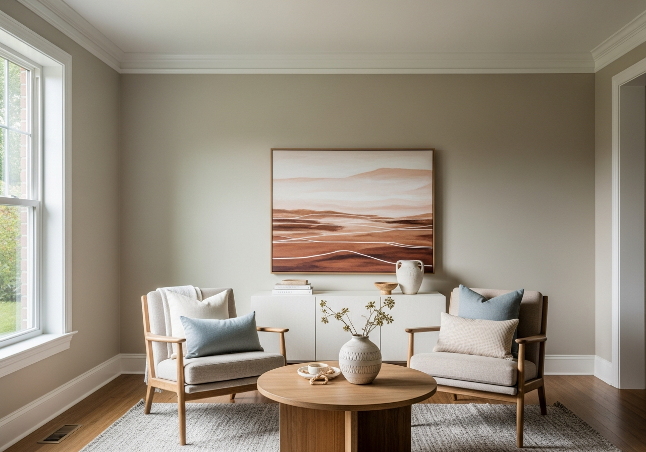
Neutral Champions: Beiges and Grays
Warm neutrals like beige, greige (a mix of gray and beige), and taupe are trusted winners for sitting rooms. They provide warmth without overpowering the space. These shades act as gentle backdrops that complement colorful furniture or art. For example, Benjamin Moore’s “Revere Pewter” (HC-172) is a soft greige that works beautifully in most lighting conditions. Sherwin-Williams’ “Accessible Beige” (SW 7036) offers a cozy beige with warm undertones, making it perfect for inviting vibes.
Cool Colors for Calm Spaces
Soft blues and greens bring a serene atmosphere to sitting rooms. These colors encourage relaxation and peaceful conversations. Lighter blues like Behr’s “Summer Rain” (MQ3-21) mimic clear skies and open spaces, while sage greens calm the senses without feeling dull. These cool tones work wonderfully in rooms with lots of natural light, enhancing the soothing effect.
Bold Yet Sophisticated Options
If you want a sitting room that feels warm and cozy, rich earth tones deliver sophistication and depth. Deep terracotta, burnt orange, or olive green add character and a sense of grounding. These colors can be more daring but work well with natural wood furniture or leather accents. Farrow & Ball’s “Mahogany” (No. 33) is a bold red that warms up any room while keeping an elegant feel. Pairing these shades with soft lighting keeps the space cozy and inviting.
3. Natural vs Artificial Light: Why It Changes Everything
The way paint looks in a store or sample chip rarely matches how it appears on your sitting room walls. Light is the biggest factor in this difference. Natural sunlight varies throughout the day and changes the appearance of colors. Artificial lights, especially LED bulbs, also shift how paint shows up. For these reasons, testing paint samples at home under your room’s actual lighting is vital.
Reading Your Room’s Natural Light
North-facing rooms get cooler, indirect light, making colors look bluer and slightly muted. Soft warm tones like creamy beiges and muted yellows work well here, preventing the space from feeling cold. South-facing rooms get warmer, brighter light for most of the day. Colors look warmer and richer here, so cooler tones like blues and greens can balance the warmth. East-facing rooms get morning sun, making colors appear brighter early on, while west-facing rooms get warm afternoon light that deepens and intensifies hues in the evening.
Artificial Lighting and Its Effects
LED and fluorescent bulbs emit light that can change how paint colors appear. Cool white LEDs highlight blues and greens, while warm white bulbs enhance reds and yellows. Mixing light types in the same room can create odd color shifts throughout the day. Using bulbs with a high Color Rendering Index (CRI) helps colors look more natural. Test your paint swatches with your typical bulbs to avoid surprises.
Tips for Testing Paint Samples
- Paint large swatches on different walls to see how light hits them from various angles.
- Observe samples at morning, midday, and evening to catch lighting changes.
- Consider window treatments like curtains and blinds. They can filter daylight and change the color’s look.
- Compare how colors look with your furniture and décor in place to ensure harmony.
Conclusion
The best paint color for a sitting room depends on the room’s size, lighting, and the mood you want to create. Warm neutrals, soft cool tones, and rich earth colors remain top picks for inviting, timeless spaces. Adjust your choices based on how natural and artificial light play in your sitting room to get the look just right.
Start by examining your room’s light sources and size. Next, test paint samples on different walls and view them throughout the day. Finally, choose a shade that feels comfortable and complements your furniture. These steps will help you create a sitting room where people want to stay a while.