

What Makes the Best Painting Choice for Your Living Room
Your living room paint sets the mood for your entire home. The right color and technique can make a small room feel spacious or turn a bland space into something special. The color you pick can lift your spirits or calm your nerves, shaping how you and your guests feel every day. It also plays a big role in your home’s value. A fresh, stylish paint job can make your living room stand out to visitors and buyers alike.
Living rooms often receive more attention than other rooms because they are your home’s social hub. This means choosing paint that’s both beautiful and practical is key. Unlike a bedroom or bathroom, your living room faces constant use—from kids playing games to adults entertaining friends. So, the paint must last and keep its good looks over time.
Paint colors carry emotional meanings that influence the room’s atmosphere. Warm tones like reds and yellows can create an inviting, energetic vibe. Cool colors such as blues and greens bring calm and relaxation. Finding the right balance between warmth and coolness can make your living room feel just right for everyone.
Paint Types That Work Best in High-Traffic Areas
Durability matters in a living room. You need paint that resists scuffs, stains, and fading. For this, many experts recommend paint with a satin or semi-gloss sheen since they are easier to clean. Matte paints look nice, but they show marks more easily and are harder to wipe down.
Acrylic latex paints are popular for living rooms because they dry quickly and are water-resistant. They also allow walls to breathe, reducing mold problems. Picking a paint with a high scrub rating means you can clean smudges without damaging the finish. This keeps your walls looking newer longer, even with children or pets around.
Color Psychology for Living Spaces
Colors affect how people feel and interact in a room. For example, warm colors like soft reds or oranges encourage conversation and energy. They’re great for lively families or social homeowners.
On the other hand, cool colors such as pale blue or light green help people relax. If you want your living room to be a peaceful escape or quiet retreat after a busy day, these hues are better choices.
Your guests also pick up on these feelings. Warm tones might make your living room feel welcoming and friendly. Cool tones can give an impression of calm sophistication. Matching the paint color to your lifestyle helps ensure your living room makes the right statement and feels comfortable for everyone who enters.
Popular Living Room Paint Colors That Never Go Wrong
Some paint colors just work in living rooms, year after year. These trusted choices offer confidence when you’re standing in the paint aisle, unsure what to pick. They create timeless spaces that feel fresh regardless of shifting trends.
Neutral colors are a safe bet for many homeowners. They create a clean canvas that allows furniture and décor to shine. Neutrals also make rooms feel larger and brighter, which can be helpful for smaller spaces.
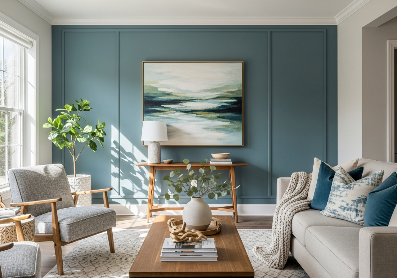
For those ready to take a risk, bold accents walls can add personality without overwhelming a room. Deep blues or rich greens make strong statements that invite attention and admiration. Pairing these with softer neutrals balances the look and keeps it tasteful.
Two-tone combinations continue to grow in popularity. This approach lets you have the best of both worlds—a subtle main color with a richer shade adding depth to trims or one wall. It creates layers and interest without complexity.
Classic Neutrals That Sell Homes
Some classics never fail. Colors like off-white, warm beige, soft gray, greige, and light taupe top many real estate experts’ lists. They appeal to buyers because they are versatile and easy to decorate around.
- Off-White: A crisp, clean choice that reflects light and expands rooms.
- Warm Beige: Adds a cozy feel without making rooms feel dark.
- Soft Gray: Modern and calming while keeping things neutral.
- Greige: A blend of gray and beige for subtle warmth and style.
- Light Taupe: Earthy and elegant, perfect for casual or formal styling.
These colors often come in popular brands with well-known codes, such as Benjamin Moore’s “Simply White” or Sherwin Williams’ “Accessible Beige.” Before and after photos commonly show how these hues open rooms and create inviting atmospheres.
Statement Colors for Brave Homeowners
For homeowners who want to stand out, bold colors like deep navy, forest green, or charcoal gray make living rooms feel rich and cozy. These shades add drama but should be used thoughtfully to avoid overpowering.
Balancing these bold choices usually means pairing them with plenty of natural light or light-colored furnishings. For instance, a dark green wall could contrast beautifully with white trim and neutral sofas, creating a lively yet grounded space.
Using bold colors on a single accent wall or inside built-in shelves is also a clever way to experiment. It gives energy without dominating the entire room.
How to Choose Paint Based on Your Living Room’s Natural Light
That perfect gray you picked might look purple at night. Light changes everything about how paint looks on your walls. Understanding how your living room receives light helps you pick the paint that looks best at any time.
Living rooms with lots of natural sunlight need different approaches than cooler, shaded rooms. Sunlight can highlight undertones in paint that aren’t obvious in the store. It can also make dark colors look lighter or cause shiny finishes to reflect too much.
Artificial lighting at night can shift paint colors. Incandescent bulbs cast warm yellow light making colors look softer and warmer. Fluorescent lights tend to be cooler and might make the paint seem dull or bluish.
North vs. South-Facing Room Considerations
North-facing rooms tend to get cooler, indirect light all day. Colors in these rooms can feel colder and darker. Warmer paint tones, like soft yellows or warm greys, often brighten such spaces. Avoid cool colors that can increase chilliness.
South-facing rooms enjoy bright, warm natural light for much of the day. Cooler colors like blues and greens shine here, keeping the space fresh and airy. These rooms also let you use darker or bolder shades because sunlight prevents them from feeling heavy.
How Artificial Lighting Affects Paint
When natural light fades, the type of bulbs used in lamps or ceiling lights greatly affect how your paint looks. Warm lights enhance reds, oranges, and yellows, making rooms feel cozy. Cooler LED lighting may mute these shades but brighten blues and greens.
For mixed lighting, consider testing paint samples at different times—morning, afternoon, and evening—to get a full picture. This practice helps avoid surprises and ensures your living room feels welcoming all day.
Conclusion
The best painting for your living room depends on your space, lifestyle, and personal style. It means choosing colors and finishes that suit daily use, lighting, and the mood you want to create. Your paint can make your living room more inviting, comfortable, and visually appealing.
Start by examining your lighting and room layout. Select paint types that stand up to wear and keep looks fresh. Pick colors that balance warmth and calm, while reflecting your personality. Try samples on your walls before committing to a final shade to see how light changes its look throughout the day.