Popular Dining Room Paint Color Ideas for Every Style
Your dining room is more than just a place to eat. It’s where friends gather, family shares stories, and memories are made. Choosing the right paint color helps set the mood and defines your space’s personality. The right shade can make your dining room feel larger, warmer, or more elegant with just a few coats.
There’s a wide range of colors that work well for dining rooms, each bringing its own atmosphere. Warm neutrals soften the room, creating a welcoming space for any occasion. Rich jewel tones add sophistication and drama, perfect for making an impact. Classic whites and off-whites keep things clean and timeless. Moody darks, like deep blue or forest green, add cozy elegance. For a gentle, vintage touch, soft pastels offer a subtle, nostalgic charm.
Warm Neutrals
Shades like beige, taupe, and warm gray are reliable choices for any style. They create a calm backdrop that lets your furniture and artwork shine. These colors also reflect light softly, making your dining room appear inviting without overwhelming other decor. Warm neutrals suit both traditional and modern interiors and feel especially cozy in rooms with fireplaces or wooden floors.
Bold Jewel Tones
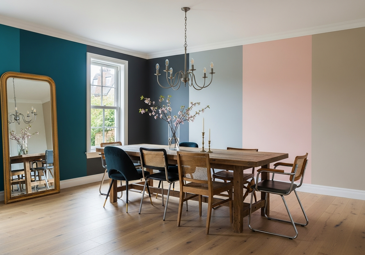
Emerald greens, sapphires, and burgundy reds bring a rich, vivid quality to your dining area. These shades create a dramatic vibe perfect for formal dining or evening dinners. Jewel tones pair beautifully with gold or brass accents and dark wood furniture, giving the space a polished, luxurious feel. Don’t be afraid to use these colors on all walls for a bold statement, or just as an accent wall to add character without overpowering.
Classic Whites and Off-Whites
White and off-white tones offer unmatched brightness and flexibility. They make your dining room feel spacious and clean, providing a perfect canvas for colorful art or vibrant table settings. Though simple, these shades range from crisp whites with a cool undertone to warm creams that add softness. Whites fit well with nearly any dining furniture style and can easily adapt as your taste evolves.
Moody Darks
Charcoal gray, navy blue, and forest green create intimate dining spaces that feel stylish and dramatic. These colors absorb light, which makes your room more cozy and enclosed—ideal for large spaces that need grounding. Moody hues work well with metallic elements, like chrome or brushed nickel, and offer a striking contrast to light or colorful furnishings.
Soft Pastels for Vintage Charm
Gentle hues like pale pink, mint green, and powder blue add a nostalgic yet fresh vibe. Often found in vintage or shabby-chic designs, pastels soften the overall look and create an airy atmosphere. These colors complement white furniture, floral textiles, and antique accents. Pastels are especially suited for dining rooms with lots of natural light, enhancing their delicate beauty.
Best Colors for Small Dining Rooms
Smaller dining rooms benefit from lighter and warmer colors that open up the space. Soft warm neutrals and light pastels help reflect light and create an illusion of roominess. Avoid very dark or overly saturated hues as they can close in the space. If you want to add some color, consider a single accent wall with a jewel tone or muted dark to bring personality without overwhelming. For very tight spaces, whites and off-whites with a bit of warmth keep everything bright and airy.
Colors That Make Large Dining Rooms Feel Cozy
In large dining areas, deeper shades help bring comfort and intimacy. Warm grays, moody blues, dark greens, and rich jewel tones pull the space in, making it feel more inviting. These colors pair well with layered lighting to avoid a cavernous feel. You can balance dark walls with lighter furniture or colorful textiles to keep the room lively and balanced. Another tip is to add warm metallic accents that reflect light and soften moody shades.
How Natural and Artificial Light Changes Your Paint Color
Paint colors rarely look exactly the same under all lighting conditions. What seems like the perfect beige in midday sun might shift to a pinkish hue at sunset, or a gray could look bluish in a room with northern exposure. Understanding how natural and artificial light affects your paint color helps avoid surprises and ensures your dining room looks great at every hour.
North-Facing vs. South-Facing Room Differences
Rooms facing north typically receive less direct sunlight. This means colors often look cooler and dimmer, leaning into bluish or gray tones. Warm colors like reds and yellows can appear muted here. In contrast, south-facing rooms get bright, direct light most of the day. This sunlight warms up colors, making cooler shades look more balanced and warm tones brighter. If your dining room faces north, warmer neutrals or soft pastels help keep the space inviting. For south-facing spaces, cooler shades or bold colors perform well without becoming too intense.
Testing Paint Samples at Different Times of Day
It’s smart to test paint colors on your dining room walls before committing. Apply samples on multiple spots and observe them at morning, afternoon, and evening. Note how the color shifts and how it looks under artificial lighting in the evening. This simple step saves trouble and helps you choose a color that works in all lighting conditions. It also highlights if a color picks up unwanted undertones during a particular time of day.
How Warm vs. Cool Bulbs Affect Color Appearance
Artificial light temperature plays a big role in how paint looks. Warm bulbs (2700K to 3000K) add a yellowish glow that enhances reds, oranges, and warm browns, making your dining room feel cozy. Cool bulbs (4000K and above) produce a bluish light that brings out blues, greens, and grays, giving a crisp, modern vibe. Choose bulbs that complement your paint color and the mood you want. For mixed-use rooms, combining warm overhead lighting with cooler accent lights is a flexible approach.
Using Multiple Light Sources to Balance Color
A single light source can cast harsh shadows or cause uneven color perception. Layer your lighting with ceiling lights, wall sconces, and lamps to create even illumination and highlight different areas. This prevents paint colors from looking flat or overly shadowed. Multiple light sources also allow you to control room ambiance. Dimmer switches and bulbs with adjustable warmth help keep your dining room paint color looking its best from daytime meals to evening dinners.
Quick Light Test Method
To quickly check light effects on your paint, tape a few painted sample cards to walls near windows and light fixtures. Observe each in natural daylight, artificial light when the room lights are on, and under dimmed conditions. Take photos at different times and compare. This test clearly reveals undertones and shifts, helping you decide if a color holds up or feels off. It’s an easy habit that greatly reduces guesswork.
Choosing Bulb Temperature for Your Paint
Select light bulbs with color temperatures that enhance your dining room hues. If your paint has warm undertones like beige or terracotta, go for warm white bulbs around 2700K for a soft, cozy glow. For cooler shades like gray or blue, bulbs near 3500K to 4000K offer neutral, balanced light without yellow tint. Avoid overly cool or daylight bulbs above 5000K as they can make spaces feel sterile and alter color perception sharply.
Matching Paint Colors with Your Dining Room Furniture
Your dining room’s furniture sets much of the tone and style. Choosing paint colors that complement your tables, chairs, and accents helps everything flow. When walls and furniture work well together, the room feels balanced rather than visually crowded or chaotic.
Dark Wood Furniture Pairings
Dark wood brings depth and richness to your dining space. Paint colors that contrast with dark woods highlight their natural beauty. Light- to medium-tone warm neutrals, off-whites, or soft pastels keep the room bright and airy. Jewel tones like emerald or sapphire can add drama without competing. Avoid dark walls in small spaces with dark wood, as it can overwhelm and shrink the room visually.
Light Wood and White Furniture Combinations
Light woods and white furniture lend a fresh, modern feel. These work well with a wide range of colors. Cool grays, muted blues, and pastel shades create calm, sophisticated spaces. Warm neutrals and soft yellows add a soft, inviting mood. Because light furniture makes a room feel open, you can consider using deeper colors on one wall for contrast without closing the space. Balance is key to avoid an overly sterile look.
Working with Mixed Metals (Brass, Chrome, Black)
Metal accents in your dining room lighting fixtures, handles, or decor influence paint choices. Brass and gold tones pair beautifully with warm neutrals, rich jewel tones, and moody darks, enhancing their warmth. Chrome and silver elements suit cooler paint colors like gray or navy, forming sleek, modern contrasts. Black metals enhance bold color schemes and contrast with lighter walls. When mixing metals, a versatile neutral wall color like soft gray can unify different finishes without visual clash.
Coordinating with Upholstered Chairs
Upholstered dining chairs offer another chance to complement or contrast your paint. Chairs in vibrant fabrics work best against neutral walls that allow them to pop. If your chairs have subtle or patterned upholstery, richer wall colors can set an elegant stage. Consider fabrics’ undertones—warm fabric hues match warm walls, cool fabrics look better with cooler paint colors. When in doubt, neutral walls and patterned textiles create flexible and timeless pairings.
Conclusion
Dining room paint colors set the mood and style of your space. Choosing hues that suit your room size, lighting, and furniture helps create a balanced and inviting atmosphere. Light colors open small rooms, while rich shades warm large spaces. Testing colors under various lights and considering furniture materials ensures harmony between walls and decor.
Start by identifying your room’s natural light and furniture tones. Sample paints on walls and observe their shifts throughout the day. Adjust lighting to complement your chosen color. Finally, choose paint that makes you feel comfortable and happy during every meal and gathering.