Best Colour Paint for Sitting Room: Transform Your Space with the Perfect Shade
The color you choose for your sitting room has a big impact on how the space feels. It can make a small room seem larger or a large room feel more inviting. The right paint can set the mood—calm and cozy or bright and energetic. Choosing the best colour paint may seem tricky with so many options, but focusing on a few key factors will help you pick the perfect shade. From natural light to existing furniture and your lifestyle, these elements guide you to a paint color that truly transforms your sitting room.
1. How to Choose the Best Colour Paint for Your Sitting Room
Picking paint colors feels overwhelming when you’re staring at hundreds of swatches, but the right approach makes it simple. Your sitting room’s paint sets the mood for everything from morning coffee to movie nights. Start by thinking about the size of the room and the height of the ceiling. Light colors can open up a small space, while darker shades can add warmth to a large, tall room.
Natural light plays a big role too. If your sitting room gets a lot of sunlight, paint will look different in the morning than in the evening. Make sure to test how your paint samples change throughout the day. Also, look at your furniture and any decor you want to keep. The paint should complement those pieces and not clash with them. Decide what mood you want—should the room feel cozy and warm or fresh and lively? Try out small paint samples on the walls before painting the whole room.
Start with Your Room’s Natural Light
The direction your sitting room faces affects how paint color appears. North-facing rooms get cooler, softer light that can make colors look dimmer or bluer. These rooms often benefit from warmer paint tones to balance the light. South-facing rooms get stronger, warmer sunlight that can brighten up color. Paint may show truer shades here but can also fade faster in direct light.
Understand that the time of day shifts the light’s warmth. Morning light casts cooler hues, while afternoon sun brings more golden tones. Test paint samples at different times to see how your chosen colors change. This helps avoid surprises once the walls are painted.
Match Paint to Your Lifestyle
If your sitting room is a high-traffic area used by family and guests, durability matters. Choose paints labeled as washable or scrubbable to keep walls looking fresh. Consider finishes that hide marks well, especially if kids or pets are around. Softer sheens like eggshell offer a nice balance—they resist scuffs but don’t shine too much.
For homes with pets, avoid paints prone to trapping odors or easily showing scratches. Some brands offer pet-friendly formulas designed to stand up to wear without harsh chemicals. Picking the right paint for your lifestyle keeps your sitting room beautiful and practical.
2. Top Paint Colors That Work in Any Sitting Room
Some paint colors just work, no matter your style or decor. These tried-and-true shades give you a gorgeous foundation that won’t go out of style next year. Warm whites and off-whites create clean, bright walls that go with everything. They brighten dark rooms and act like a blank canvas for your personal touches. Soft grays add subtle depth without feeling cold or sterile, blending well with most furniture.
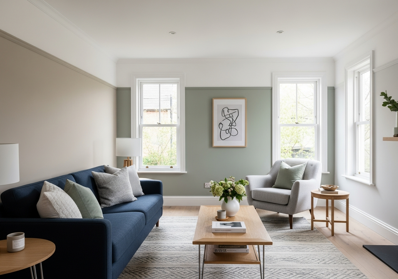
Warm neutrals like greige and taupe have a timeless charm. They bring warmth while staying understated. Navy blue has become a new neutral—it pairs beautifully with metallic accents or light woods, adding a sense of calm sophistication. Sage green is gaining popularity for its fresh, natural vibe. It’s a gentle color that pairs well with both warm and cool tones.
Classic Neutrals That Never Fail
Benjamin Moore’s warm whites like “Simply White” and “White Dove” are favorites for sitting rooms. They brighten spaces while keeping a cozy feel. Sherwin-Williams offers “Alabaster” and “Accessible Beige,” which work well as soft, warm neutrals that blend with many styles.
These shades provide flexibility when accessorizing and allow you to easily swap out decor over time without repainting.
Bold Colors That Still Feel Timeless
Deep blues like navy or indigo add drama without overwhelming the room. They work as accent walls or for full-room color if you want a striking, cozy space. Rich greens such as forest or olive echo nature and bring a calming, grounded energy.
Terracotta and clay tones bring warmth and an earthy feel to sitting rooms. These colors pair well with natural materials like wood and stone. They are bold choices but remain timeless through their connection to nature’s palette.
3. Paint Finish Options for Sitting Rooms: Which Sheen Works Best
The wrong paint finish can make even the best color look dull or cheap. Choosing the right sheen affects how much light the walls reflect and how easy they are to clean. Flats and mattes hide imperfections best but aren’t as washable. Satin offers a soft glow that’s easy on the eyes and balances durability with appearance. Semi-gloss is shiny and tough, usually used for trims rather than full walls.
Eggshell finish is the most popular for sitting rooms. It reflects just enough light to keep walls lively but hides marks and bumps better than shinier paints. It strikes a nice mix between style and practicality, especially in family spaces.
4. Painting Tips to Get the Best Results
Before painting, prepare your walls by cleaning and filling any holes or cracks. Use painter’s tape on edges to keep lines sharp. Applying a primer helps the paint stick better and creates a more even finish. Use quality brushes or rollers for smooth coverage. Two coats of paint are usually needed for rich, even color.
Let each coat dry fully before adding the next. Paint in daylight if possible to catch any missed spots early. Finally, remove tape carefully to avoid peeling wet paint.
5. Combining Colours and Creating Accent Walls
Using more than one paint color can add personality and depth. Accent walls are a great way to try bold or darker colors without overwhelming the space. Pick a wall that naturally draws attention, such as behind the fireplace or sofa.
Pair neutrals with a single bold shade for balance. For example, soft gray walls with a navy blue accent create contrast and style. Or use a warm taupe with terracotta accents for a cozy touch. The key is to keep most walls light and harmonious to maintain flow in the room.
6. Common Mistakes to Avoid When Choosing Paint Colours
Avoid choosing paint based only on a small chip or under poor lighting. Colors can look very different on walls and in various lighting conditions. Not testing paint samples on multiple walls and during different times of day often leads to regret. Don’t ignore your furniture—painting a wall a color that clashes can throw off the whole room.
Going too dark in a small room can make the space feel cramped and gloomy. Lastly, avoid rushing the painting process or skipping prep work. Poor prep leads to peeling or uneven paint and wastes time and money.
Conclusion
The best colour paint for a sitting room is one that matches your room’s light, size, decor, and the mood you want. It should look great at all times of day and stand up to your lifestyle needs.
Start by testing samples in your natural light. Consider neutrals or timeless bolds based on your style. Pick a finish that balances durability and appearance. Prepare your walls carefully and apply paint in even coats. This approach will help you create a sitting room painted in a color that truly transforms your space.