Why the Best Color Paint for Living Room Choices Matter More Than You Think
Choosing the right paint color for your living room does more than just decorate the space. It affects how you feel every day and shapes the atmosphere where you spend time with family or guests. The color you pick can brighten a dull corner, make a room feel larger, or help you relax after a busy day. It can even influence how much potential buyers see the value of your home.
Living rooms often get more attention than other rooms when it comes to color because they serve multiple purposes. They are where you unwind, entertain guests, and sometimes work or play. The right color can adapt to all these uses and make the room invite you to stay a little longer.
The Psychology Behind Living Room Colors
Colors can trigger feelings without you even realizing it. Warm shades like soft yellows or creamy beiges tend to create a cozy, welcoming environment. Cool colors, such as light blues or greens, often encourage calm and focus. On the other hand, bright or very dark colors can boost energy or sometimes feel overwhelming. Picking a paint color that matches how you want to feel in your living room is a smart way to create balance and comfort.
For example, a pastel blue might help reduce stress, making it a great choice for relaxing evenings. Warm tones like terra cotta or peach can encourage social interaction, perfect for spaces made for gatherings. Choosing colors based on these emotional impacts is more than just style—it’s about shaping your quality of life.
How Paint Color Changes Your Space Perception
Paint isn’t just about looks; it changes how you view the size and light of your living room. Lighter colors, such as whites and pale grays, reflect more light and open up smaller rooms, giving a sense of airiness. Darker tones absorb light and make large spaces feel more intimate and grounded.
Color can also influence how much natural or artificial light the room feels like it has. Some colors make a sunny room feel extra bright, while others add warmth to shady rooms. By thinking about your living room’s size and lighting before choosing paint, you can make the space feel just right for your needs.
Top Paint Colors That Transform Living Rooms Right Now
Colors come and go in popularity, but certain paints consistently make living rooms feel fresh, balanced, and inviting. These top picks work for many styles and moods, helping you pick a timeless look or something with a bit more personality.
Neutral Colors That Never Fail
Neutrals create a calm, elegant backdrop that suits many furnishings and decorations. Shades like off-white, soft beige, and light taupe provide warmth while keeping the mood relaxed. These colors bring out the best in natural light, making the space feel open but cozy at the same time.
Soft greiges—grey mixed with beige—have become especially popular because they add a subtle modern edge without feeling cold. They match well with wood tones and metal finishes, making them versatile for any design plan.
Statement Colors for Brave Homeowners
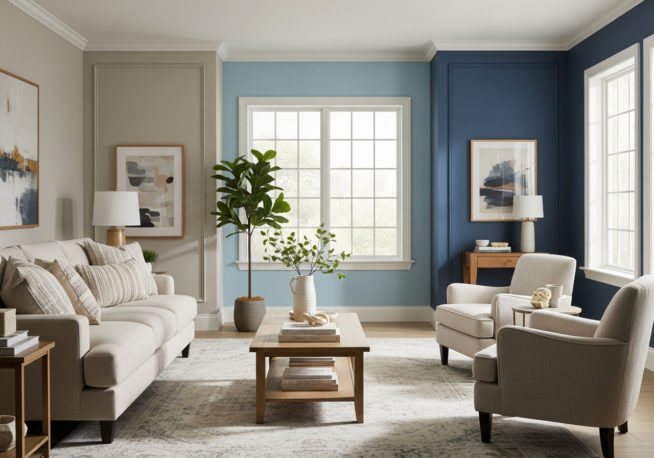
If you want your living room to stand out, bold accent walls are a popular choice. Rich navy blues, deep forest greens, or burnt oranges add personality and depth without overwhelming the entire space. Pairing these darker colors with lighter neutral shades on other walls allows you to create contrast and highlight architectural details or artwork.
Bold colors work best in rooms with lots of natural light or where you want to create a cozy, dramatic effect. They can inspire conversation and make the room feel unique. Just be careful to keep furnishings and accessories simpler so the color remains the main focus.
Timeless vs Trendy: Making the Smart Choice
Some colors, like classic creams and warm grays, have lasted through design fads because they offer flexibility. Trendy colors can be fun and fresh but may look dated quickly. If you plan to live in your home for years or consider resale value, investing in colors with long-term appeal is wise.
However, trendy colors don’t have to mean bright or flashy. Muted tones like dusty rose or soft sage add a modern vibe while still feeling approachable. The key is balancing personal style with a shade that works for the room’s natural lighting and your lifestyle.
Colors to avoid generally include overly bright neons or very dark shades that make a room feel smaller or closed off. These extremes can tire the eyes or clash with everyday use and furniture choices, so sticking with balanced tones is often best.
How Natural Light Changes Everything About Your Paint Choice
The paint color that looks perfect beside a sample card can look very different when applied on your walls because of the way light hits the room. Understanding how your living room’s light works helps you make a color choice that truly shines in the space.
Reading Your Room’s Natural Light Pattern
Every room has a unique light pattern based on which way the windows face and how much sun they receive throughout the day. North-facing rooms, for example, usually get softer, cooler light, so warm colors can add a cozy glow. On the other hand, south-facing rooms have bright, direct sunlight, making them ideal for cool or neutral tones that prevent the room from feeling too hot or glaring.
North-facing Room Color Strategies
Rooms that face north get less direct sunlight, so colors can look cooler or dull. Warm neutrals like creamy beige, soft peach, or muted gold bring warmth to balance the chilly light. Avoid cool blues and grays as they often feel cold in these spaces.
South-facing Room Best Practices
In a south-facing room, the sunlight is strong throughout the day, which can intensify bright or dark colors. Soft blues, light greens, and balanced neutrals like pale gray work well because they stand up to the brightness without overwhelming the eye. If you prefer darker, richer tones, keep in mind that they may appear lighter in this lighting.
East vs West Light Considerations
East-facing rooms get gentle morning light that fades by afternoon. This means lighter shades that reflect early light, like lavender or soft yellow, can energize the space. West-facing rooms, catching stronger afternoon sun, often suit warmer tones—burnt orange, gold, or deep red add vibrancy as the light dims.
How to Test Paint in Different Light Conditions
To avoid surprises, try painting test patches on different walls and observe them at various times of the day. Look at the color in natural daylight and with your room’s usual artificial lighting. This gives a better sense of how the paint reacts to changing light, helping you pick a color that feels right all day long.
Artificial Lighting Adjustments
Light bulbs influence color perception too. Warm LED bulbs highlight reds and yellows, making a space feel cozy, while cool white bulbs enhance blues and greens creating a crisper feel. Match your paint with your lighting plan so the living room looks balanced no matter the source of light.
Conclusion
The best color paint for a living room is one that fits your mood, space, and light conditions. It affects how the room feels and functions, creating a space where you can relax or entertain with ease. Choosing the right shade balances personal style with practical needs, enhancing both comfort and value in your home.
Start by evaluating your living room’s natural light and size. Try sample paints on different walls and check them throughout the day. Consider how you want the room to feel—whether calm, energetic, or warm—and select colors that suit that mood. With thoughtful choices, your living room will be a space that truly feels like home.