Why Your House Paint Color Living Room Choice Matters More Than You Think
The paint color you choose for your living room sets the mood for your entire home—it’s where memories are made and guests get their first real impression. Your living room color influences how you feel throughout the day and can even affect how spacious or cozy the room feels. It’s not just decoration; it’s a foundation that shapes daily life and the way people experience your home.
Colors play a big role in how we process emotions. A calm blue might make you feel relaxed, while a bright yellow gives energy and cheerfulness. These emotional effects are especially important in living rooms, where families gather, relax, and entertain. The right color can create a welcoming, comforting atmosphere that encourages connection.
Paint color also affects how large or small a living room feels. Light shades tend to open up a space, making it feel airy and more expansive. Darker colors can close in the room, creating a sense of intimacy or drama. Understanding this can help you balance style and comfort, especially in smaller spaces.
Finally, your paint choice can influence home value. Neutral, appealing colors help potential buyers imagine themselves in your space. Bold or unusual colors can limit appeal. A thoughtful paint job has the potential to boost your home’s marketability.
The Science Behind Color and Emotion
Colors affect our brains in measurable ways. Different hues can boost moods, lower stress, or energize the mind. Warm colors like reds and oranges often energize and stimulate conversation—ideal for lively gatherings. Cooler colors like blues and greens tend to calm and refresh, which is helpful for relaxing after a busy day.
These effects happen because colors influence hormones and neural activity. For example, looking at blue can decrease heart rate and encourage peaceful feelings. That’s why many designers choose shades of blue or green for spaces meant for unwinding.
Beyond mood, cultural associations also guide color reactions. Red might suggest warmth and passion in one culture but caution or danger in another. Your personal experiences will play a role in how you react to paint colors, making the choice highly individual.
How Paint Colors Change Throughout the Day
Paint colors don’t stay the same as the sun moves across the sky. A warm beige might seem golden under morning light but cooler and muted in the afternoon. This effect happens because natural light shifts in color temperature—from blueish tones early in the day to warmer, reddish tones near sunset.
Indirect sunlight from windows can also impact colors, making them appear softer or more shadowed. At night, artificial lighting changes things again. A paint color that looks bright and clear under daylight bulbs could seem dull or overly yellow under incandescent lights.
To really know how a color will behave, you need to pay attention to your living room’s unique lighting setup at different times. This shifting appearance is normal, but it can be surprising if you don’t plan for it.
Popular House Paint Color Living Room Trends That Actually Work
While trends come and go, some living room colors have staying power because they simply work with how we live. These shades balance style and comfort, blending well with different furniture and lighting. Knowing current favorites can give you helpful ideas without forcing you to follow fleeting fads.
Warm neutrals continue to be a popular choice. Colors like soft taupe, creamy beige, or warm gray create a cozy backdrop that complements both modern and classic homes. Their versatility is key—these shades let you change your room’s accessories over time without repainting.
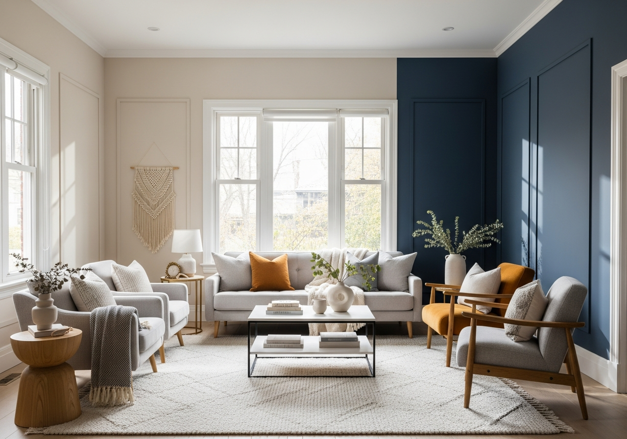
Accent walls have made a strong comeback. Painting one wall in a strong color adds personality and depth without overwhelming the space. Bold colors like navy blue, forest green, or deep terracotta make living rooms feel rich and layered. If a full-room color feels too intense, an accent wall balances impact and subtlety.
Earth tones are also enjoying renewed popularity. Browns, rusts, olives, and muted greens connect indoor spaces to nature. These colors bring warmth and groundedness, which many homeowners find soothing. Earth tones mix nicely with natural materials like wood, stone, and linen textiles.
Cool grays have shifted to warmer beiges and greiges that feel more inviting. Pure gray can sometimes feel cold or stark, but adding a hint of beige softens the color. This trend reflects people’s desire for neutral colors with warmth, striking a balance that lasts beyond seasons.
Colors That Make Small Rooms Feel Bigger
Light and pale colors are best for making small living rooms feel larger. Whites with a hint of gray or blue open up walls, allowing light to bounce freely. Soft pastels like pale peach or mint also add subtle color without closing in the space.
Avoid very dark or bold colors on all walls in small rooms, as they tend to absorb light and shrink the appearance of the space. Instead, use deeper colors as accents or on one wall to create interest without reducing openness.
Timeless vs. Trendy: Making Smart Choices
Trendy colors can be fun but often have short-lived appeal. Timeless shades tend to be softer neutrals or muted tones that work with a variety of furnishings and decoration styles. Choosing timeless colors gives your living room a longer “fresh” look and protects your investment.
If you love bold or trendy colors, pair them with more neutral tones or use them sparingly in decor or accent walls. This way, you can update your room as trends evolve without needing a full repaint.
Consider your lifestyle and how often you want to repaint. A classic paint shade offers flexibility and fewer risks, while trendy hues are better for those who enjoy frequent style changes.
How Natural and Artificial Light Changes Everything
That perfect gray you saw at the store might look purple in your north-facing living room—light direction and type completely transform paint colors. Understanding how lighting affects paint perception helps you choose colors that look great at all times.
North-facing rooms receive cooler, indirect light all day. Colors here often appear bluer or cooler. Warm colors like reds or yellows might lose their warmth, while cool colors like blue or gray can feel dull. South-facing rooms get more sunlight, which enhances color warmth and brightness.
Testing paint samples at different times of day is crucial to see how colors shift. Morning light is softer and cooler, afternoon light is bright and direct, and evening light is warm and soft. These changes affect the same paint in ways that surprise many homeowners.
Artificial light also plays a strong role. LED lights often cast a cooler, bluish tone. Warm incandescent bulbs create a yellowish glow. Choosing lighting that complements your paint color or vice versa improves harmony. Window treatments like sheer or heavy curtains change the amount and quality of light, altering how paint appears.
The 24-Hour Paint Test Method
One of the best ways to see how paint behaves is the 24-hour test. Paint a large swatch on your living room wall and observe it throughout a full day. Note how it looks in morning, noon, afternoon, and night lighting.
This method reveals unexpected color shifts and helps avoid surprises. It also allows you to compare different lighting conditions with how your furniture and décor reflect the color. The 24-hour test gives the best real-world preview before you commit.
Fixing Color Problems with Lighting Solutions
If a color looks off in your light, adjusting your lighting can help fix it. Warmer bulbs soften cool tones, making a gray wall feel less cold. Cooler bulbs reduce the warmth in beige walls for a fresher look.
Using multiple light sources—overhead, lamps, and accent lights—creates a balanced effect that keeps colors true and prevents harsh shadows. Window treatments that filter or diffuse sunlight also control how natural light interacts with paint.
Sometimes changing your lighting setup is simpler and less expensive than repainting. Pay attention to bulb temperature and direction to improve color harmony in your living room.
Conclusion
Your living room paint color choice shapes the mood, space feeling, and even the value of your home. It influences emotions, changes with light, and sets the tone for how people experience your space. Choosing wisely means considering color psychology, room lighting, and your lifestyle.
Start by testing colors in your actual living room lighting at different times. Use simple tests like painting sample patches or observing how lights affect your chosen hues. Think about timeless colors for flexibility, and use accents to add personality without overwhelming. Finally, consider how your furniture, decor, and lighting will work with your paint to create a balanced, inviting space.