Understanding Your Living Room’s Personality Before Choosing Paint
Your living room tells a story about who you are, and the paint color you pick becomes the backdrop for every memory you’ll make there. Before settling on a shade, it’s wise to take a closer look at your room’s unique traits. Several factors can change how paint looks and feels, so understanding your living room’s personality helps you choose colors that truly fit.
One of the biggest influences is the size of your living room. Small rooms often feel cozier with lighter, softer colors that make the space seem bigger and airier. In larger rooms, darker or more intense shades can bring warmth and depth without overwhelming the space. Choosing the right color with size in mind prevents the room from feeling cramped or cold.
Furniture style also guides your paint selection. Traditional furniture pairs well with classic hues, while modern or minimalist styles often look best with clean, neutral tones or bold, graphic colors that make a statement. The color you pick should complement your furniture, not clash with it.
Consider how you use your living room too. If it’s a busy family spot with kids running around, you might want durable, stain-resistant paints in colors that hide dirt well. For formal living rooms or areas used mostly for entertaining guests, elegant colors with smooth finishes can add a touch of sophistication.
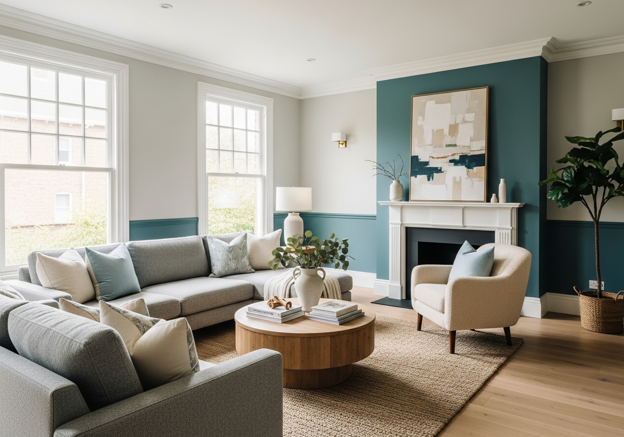
Architectural features are another important part of your living room’s personality. Crown molding, built-in shelves, fireplaces, or exposed beams can become focal points by the color choices you make. Sometimes painting trim or architectural details a contrasting color enhances their impact and adds dimension.
Reading Your Room’s Natural Light
Natural light shapes how paint colors appear throughout the day. A room that faces north tends to have cooler light, which can make colors look more muted or blue-toned. South-facing rooms receive warmer, brighter light that amplifies yellow and red undertones in paint. Knowing your room’s direction helps you avoid colors that might feel off or dull.
Window size and placement also matter. Large windows flood the room with light, making colors look brighter and more vibrant. Rooms with smaller or fewer windows will show paint colors as darker or more subdued. You might select softer colors to keep the space feeling bright if natural light is limited.
Matching Paint to Your Living Style
How you live in your space influences which paint colors work best. For family-friendly rooms, warm neutrals and eye-pleasing soft tones often create a cozy, inviting atmosphere while hiding wear and tear. These colors make it easy to add colorful accessories or upgrade the look with minimal effort.
If your living room is a formal space used mostly for special occasions, richer and deeper colors can bring drama and elegance. Sophisticated grays, muted blues, or even darker taupes create a refined, timeless vibe.
For those who frequently entertain, colors that encourage conversation and warmth, like lively warm neutrals or tasteful accent walls, help set the tone. Two-tone or color-blocking techniques can create zones within the room for different functions, enhancing flow and visual interest.
Paint Choices for Living Room Walls: Popular Colors That Work
The best living room paint colors aren’t just trendy—they’re the ones that make you smile every time you walk through the door. Choosing colors for your walls means balancing what’s timeless with what makes you feel comfortable. Knowing which shades have stood the test of time and which bold hues can bring fresh energy helps you make an informed choice.
Warm neutrals like beiges, taupes, and greiges offer a cozy base that pairs with various furnishings and decor. These colors create a soft, calming atmosphere and suit many living room styles. They also work well under different lighting conditions, adapting throughout the day to look warm and welcoming.
Cool neutrals, including grays and soft whites, bring a clean and modern feel without being stark. Light grays in particular provide a sleek backdrop that complements almost any color accent. Soft whites brighten rooms and reflect light beautifully, expanding the sense of space.
Some homeowners choose bold accent walls to add a punch of personality while keeping other walls neutral. This approach lets them experiment with color without overwhelming the room. Accent walls in deep blues, greens, or jewel tones can add drama and richness.
Two-tone painting or color blocking is growing in popularity as it adds dimension and style. Painting the bottom half of the wall in a darker tone and the upper half in a lighter shade visually breaks up the space and creates a modern look. It’s a smart way to give a room character without loud patterns or wallpaper.
Classic Colors That Never Go Out of Style
Timeless whites and creams make any living room feel fresh and clean. These shades are versatile, fitting nearly any style from farmhouse to modern minimalist. Because they brighten the space and allow furnishings and art to pop, they are a favorite among homeowners who like to change decor often.
Sophisticated grays range from cool slate to warmer charcoal shades. Grays provide a neutral base that works with both warm and cool colors, making it easy to switch up accessories or add bold accents later. These colors give a living room an elegant, relaxing feel while still offering a subtle depth not found in plain white walls.
Bold Colors for Brave Homeowners
Deep blues and greens have gained popularity as accent or full-room colors because they bring calmness and a touch of luxury. Navy blue, for example, works beautifully with gold or brass details and pairs well with light neutrals for contrast.
Rich jewel tones like emerald, sapphire, and amethyst create a cozy, dramatic vibe perfect for rooms where homeowners want to showcase personality and style. These colors pair well with plush fabrics and metallic accents, adding richness without feeling heavy if balanced correctly.
How Paint Finish Affects Your Living Room Look
Picking the right paint finish can be the difference between walls that wow and walls that fall flat—literally. Paint finish changes how light plays on your walls and how easy they are to clean, which can dramatically affect how your living room feels and functions.
Flat or matte finishes have little to no shine and do a great job hiding surface imperfections. They’re perfect for older walls or rooms with uneven textures. However, flat paints are harder to clean, so they may not be the best choice for busy family rooms.
Eggshell finishes offer a subtle softness with slight sheen. They reflect just enough light to keep walls looking fresh but still hide minor flaws. Eggshell is popular for living rooms because it balances elegance and practicality, especially in rooms with moderate traffic.
Satin finishes have a soft shine that’s more durable and easier to clean. They resist stains and scuffs well, making them ideal for high-traffic living rooms or spaces where kids and pets play. Satin walls give a polished look without being too shiny.
Semi-gloss finishes offer noticeable shine and are highly washable. They’re commonly used for trims, moldings, and accent walls where durability and easy cleaning are essential. While semi-gloss paint can highlight imperfections on large wall surfaces, it works well on doors and architectural details.
Choosing the right finish depends on how much wear your living room walls will endure and the look you want. If durability is key, satin or semi-gloss is smart. If a soft, understated feel suits your style and the walls are smooth, eggshell or flat finishes can be beautiful choices.
How to Coordinate Your Living Room Colors with Other Rooms
Color flow through your home creates a sense of harmony. When picking living room paint, consider the colors used in adjacent spaces like the hallway, kitchen, or dining room. Smooth transitions tend to make a home feel larger and more connected.
One way to coordinate is by using similar undertones across rooms. For example, if your living room has warm beige walls, carrying that warmth into the kitchen with coordinating backsplash tiles or cabinet colors ties the spaces together.
Another approach is through intentional contrast. A soft gray living room next to a rich navy dining area can set off each space without clashing. Using a neutral palette throughout with pops of color repeated in accents also maintains unity.
Think about the sightlines between rooms. A bold living room color might look great in isolation but appear jarring when you see it from the hallway or stairwell. Testing paint samples on walls visible from other rooms helps avoid surprise clashes.
Common Mistakes to Avoid When Choosing Paint for Your Living Room
Many people rush into choosing a paint color without fully understanding how their space will look once the paint is up. One common misstep is picking colors solely based on paint chips or online images. These can be misleading because lighting and surroundings drastically influence how paint appears.
Another mistake is ignoring paint finish and how it fits the room’s use. Choosing a flat finish in a high-traffic living room leads to walls that show dirt and scuffs quickly, requiring frequent repainting.
Overmatching paint with furniture or carpet can also result in a dull, lifeless space. You want contrast and balance rather than everything blending too close on the color wheel.
Finally, skipping sample testing—painting large swatches on your walls at different times of the day—can lead to regret. This simple step highlights how the color interacts with your lighting, helping you avoid costly mistakes.
Conclusion
Paint choices for living room walls shape the room’s mood and feel. Understanding your room’s personality, selecting colors that work with your lifestyle, and choosing the right finish ensures a space you’ll enjoy for years.
Start by examining your living room’s size, natural light, and furniture style. Test paint samples on your walls to see how colors play with your room’s light throughout the day. Consider coordinating colors with neighboring rooms for smooth transitions. Finally, pick finishes that suit how you live in the space, balancing beauty and practicality.