1. Why Paint Colors Make or Break Your Media Room Experience
The right paint color can turn your media room from a basic TV space into a cinema-quality escape. But pick wrong, and you’ll battle glare, eye strain, and washed-out pictures every movie night. Paint affects how your screen looks, your comfort, and the room’s atmosphere in ways many don’t realize.
How paint affects screen visibility and contrast: Light colors reflect more light, which can cause unwanted glare on your screen and reduce contrast. Darker colors soak up light, helping images appear sharper and colors deeper. This creates a better viewing experience, especially when watching movies or shows with rich visuals.
Impact on eye comfort during long viewing sessions: Bright or reflective walls cause your eyes to adjust constantly between the bright room and the darker screen. This can lead to eye fatigue and headaches. Dark or matte paint tones reduce reflections and harsh contrasts, which lets your eyes relax more comfortably over time.
Creating the right mood for entertainment: Color influences mood and focus. Dark blues, grays, and rich earth tones create a cozy, immersive vibe that helps block distractions. This lets you sink into the story unfolding on screen. Light or overly bright colors can feel too clinical or distracting for movie watching.
Light absorption vs reflection basics: Matte and flat paints absorb more light than glossy finishes, minimizing glare. Semi-gloss or satin finishes reflect more light, so they are not usually ideal for media room walls. Choosing the right combination of color and sheen ensures you control the way light behaves in your entertainment space.
The Science Behind Dark Colors and Screen Performance
Dark colors help screen images pop by reducing ambient light reflection. When light bounces off pale walls, it hits your screen again, washing out colors and lowering contrast. Dark paint absorbs this bounce-back light, maintaining deeper blacks and vibrant colors on screen.
This is why most professional theaters use deep grays, navy, or black on their walls. The effect isn’t just aesthetic; it’s a functional choice that improves picture quality. Plus, darker colors keep your focus on the screen rather than the surroundings.
Paint Sheen Matters More Than You Think
The paint’s sheen refers to its finish, ranging from flat to high gloss. Flat or matte sheens are crucial for media room walls because they diffuse light rather than reflecting it. This reduces distractions and unwanted glare on your TV or projector screen.
Higher sheen paints like semi-gloss or gloss reflect a lot of light, which can cause hotspots or mirror effects near your screen. Even a subtle sheen can become noticeable during dark scenes, pulling attention away from the content.
Keep the ceiling at a low-sheen finish to reduce light reflection from overhead lights. Trim and moldings can use a satin finish for easy cleaning, but avoid shiny finishes anywhere near the screen wall.
2. Top Media Room Paint Ideas by Room Size and Layout
Your room’s size and window placement matter a lot for choosing the perfect paint color. Small rooms call for a different approach than large dedicated theaters. Light from windows and ceilings also changes how paint shades appear.
Best colors for rooms under 150 square feet: Smaller rooms can feel cramped with very dark colors. Instead, deep but rich shades like charcoal gray, navy blue, or forest green work well. They create coziness without overwhelming the space. Use matte finishes to avoid glare but keep light-absorbing benefits.
Paint choices for multi-purpose media spaces: Rooms that serve more than one function—like a living room or guest space—need versatile paint. Medium-toned grays, taupes, or muted blues balance comfort with practicality. These colors don’t distract during viewing but also match furnishings and daily activities.
Working with basement vs above-ground rooms: Basements often have lower natural light and cooler temperatures. Warm, dark tones like chocolate brown or deep burgundy add warmth and make the room inviting. Avoid overly warm reds or oranges, as they can affect screen color perception. Above-ground spaces with ample sunlight benefit from cooler dark colors to control light reflections.
Dealing with rooms that have multiple windows: Managing light is challenging in rooms with many windows. Use blackout curtains, but also think about paint. Medium to dark neutral colors work best to keep reflections low but avoid dark colors that make natural light feel too heavy and reduce balance.
Small Room Solutions That Don’t Feel Cramped
For tight spaces, aim for colors that open the room without compromising contrast. Choose muted blues or soft charcoal with a matte finish. These shades reflect less light than whites but keep the space from closing in.
Adding an accent wall behind your screen in a slightly darker shade creates depth. Use lighter trim and ceilings to maintain a spacious feel. If your room is under 100 square feet, avoid very dark tones on all walls to prevent a boxed-in sensation.
Open Concept Media Spaces
Media areas integrated into larger rooms need balance. Pick a main paint color that flows with the adjacent living areas but switch to darker tones on the screen wall. Use area rugs, curtains, and furniture to visually define the media zone.
Gray-based blues or warm grays serve well for the main walls, while a matte black or navy accent wall anchors the space behind the screen. This layered approach keeps the media section cozy without isolating it.
Dedicated Theater Room Colors
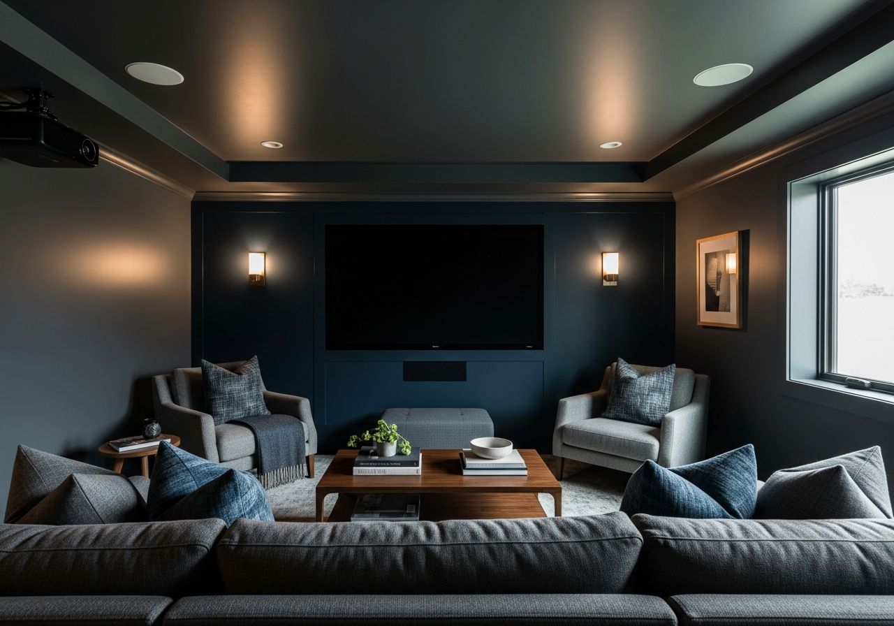
Dedicated theaters offer more freedom to use rich, dark colors. Classic choices include black, midnight blue, dark olive, or charcoal gray. These maximize light control and improve screen contrast.
Because these rooms are made solely for media, you can adopt deep tones on every surface, including the ceiling, for a true cinema feel. Combine this with blackout curtains and soft LED lighting for the best results.
3. Creating Your Media Room Color Palette
A single paint color rarely works alone. Smart homeowners use layered palettes that balance drama with comfort. This involves mixing main wall colors, accents, ceilings, and trims for a unified look.
Choosing your main wall color: Pick a neutral or dark tone that absorbs light and complements your screen. Charcoal grays, deep blues, or espresso browns are popular choices. This color forms the backdrop of your media room and needs to feel calm and grounded.
Accent wall strategies for screen walls: The wall behind your screen should be the darkest and most matte. This highlights the picture and minimizes distractions. You can go nearly black or a very deep color in this spot, even if the other walls are lighter.
Ceiling color considerations: Ceilings catch reflected light, so avoid whites or bright shades that can bounce light back to your screen. Soft grays or the same dark shade as the walls work well to keep reflections low and avoid eye strain.
Trim and molding color coordination: Trim usually needs to be a bit lighter or glossier than walls for visual definition. A satin or semi-gloss finish in medium gray or an off-black pairs nicely with dark walls while resisting scuffs or dust buildup.
Working with existing furniture colors: Your paint palette should complement your furniture and décor. If your seating is neutral, you can afford bolder walls. If you have brightly colored chairs or bold patterns, keep wall tones muted and simple to avoid overwhelming the space.
The 60-30-10 Rule for Media Rooms
This decorating rule helps create balanced color schemes. Use 60% of your main wall color, 30% for secondary walls or ceiling, and 10% for accents like trim, furniture, or an accent wall behind the screen.
In media rooms, this might mean:
- 60% rich charcoal gray on most walls
- 30% a slightly lighter gray on the ceiling and one or two secondary walls
- 10% an accent of matte black or navy on the screen wall and some decor pieces
This method keeps the room visually interesting without distracting from the viewing experience.
Matching Paint to Your Seating
Comfortable seating is the heart of your media room. If you have dark leather or fabric chairs, lighter walls can help balance the space so it doesn’t feel too heavy. If your seats are light or neutral, deeper walls make them stand out beautifully.
Consider fabric tones and textures when picking paint too. Smooth leather pairs well with matte walls that contrast in texture, while plush fabrics can handle more muted, cozy wall colors.
Conclusion
Choosing the right paint colors transforms your media room into a comfortable, immersive space that enhances your viewing. Dark, matte colors improve screen contrast and reduce glare, creating the ideal environment for entertainment.
Evaluate your room’s size, natural light, and purpose to pick tones that fit your needs. Use layered palettes with accent walls, ceilings, and trim to add depth. Finally, match your paint to your seating and furnishings for a welcoming, balanced space.
Start by testing dark matte samples in your room during different lighting times. Consider blackout curtains and subtle lighting to control reflections further. Thoughtful paint choices combined with smart layout and décor will ensure your media room is a true retreat for every movie night.