Choosing the Right Paint for Your Sitting Room
Your sitting room sets the tone for your entire home, and the right paint color can make the difference between a space that feels cramped and one that feels like a warm embrace. Picking the right paint involves more than just choosing a pretty color; it requires understanding your room’s size, lighting, and the finish of the paint. These choices shape how your sitting room feels and functions every day.
Understanding Your Space and Lighting
Room size affects how paint colors appear. Lighter colors often make a small sitting room feel larger and brighter, while darker shades can add warmth and coziness in a bigger space. But lighting plays a major role, too. Natural light changes throughout the day and impacts how a paint color looks on the walls. A north-facing sitting room might feel cooler with less direct sunlight, so warmer shades can add needed charm. Meanwhile, a south-facing room bathes in natural light, allowing you to play with richer or cooler hues without the space feeling dim.
Test your paint samples in different parts of the room and at different times of day. Observe how shadows, sunlight, and artificial light affect the color. This trial helps you avoid surprises after the job is done.
Paint Finishes for Sitting Rooms
Paint finishes are about both how a surface looks and how it stands up to wear. Matte finishes offer a soft, non-reflective surface that hides wall imperfections well. However, they are less durable for active areas of the sitting room where walls might get bumped or cleaned frequently.
Eggshell finish is a popular middle ground. It has a slight sheen, is easier to clean, and is durable enough for rooms used daily without looking shiny. Satin finish goes a step further in durability and moisture resistance while offering an elegant soft glow. It’s especially good if your sitting room opens into a kitchen or offers high foot traffic.
Choosing the right finish depends on your lifestyle and how much wear your sitting room sees. For most homes, eggshell or satin provide the best blend of appearance and practicality.
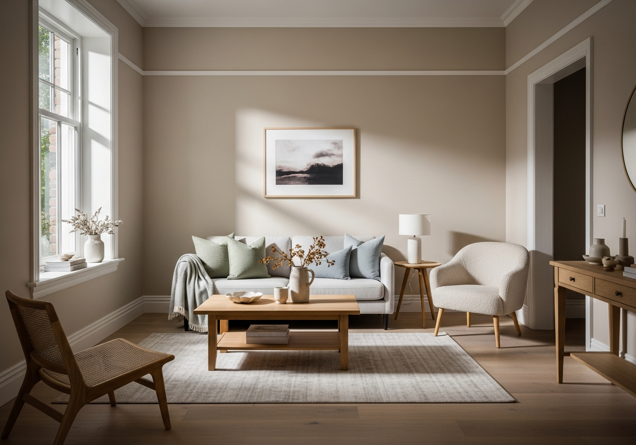
Warm Neutral Paint Colors for a Cozy Sitting Room
Warm neutrals create that perfect backdrop where every guest feels instantly at home, and your morning coffee tastes just a little bit better. These colors bring comfort and versatility, helping your sitting room feel inviting without competing with your furniture or decor.
Top Warm Neutral Picks
Shades like beige, taupe, and greige are timeless warm neutrals that add subtle depth to your walls. Beige tones bring a lighthearted, airy feel, perfect for smaller or dim sitting rooms. Taupe adds a slightly richer, earthier vibe without overwhelming the space. Greige, a mix of gray and beige, balances warmth with modern sophistication. These colors serve well as foundations because they work with many wood tones and accessories.
Warm whites bring brightness without the starkness of cool whites. Look for whites with undertones of cream, yellow, or even soft peach to avoid the hospital-white feel. These choices lift the sitting room’s mood gently.
Pairing Warm Neutrals with Furniture
Warm neutrals play beautifully with wooden furniture ranging from light oak to rich mahogany. Light beige walls pair well with darker woods and vibrant textiles, creating a nice contrast. Taupes and greiges offer a softer backdrop for mid-century modern or Scandinavian-style furnishings, where natural textures and clean lines shine.
Layering textures also enhances the cozy effect—think chunky knit throws, woven rugs, and linen cushions in complementary hues. These details make the neutral space feel lived-in and personal, not bland.
Cool-Toned Paint Options for a Calm Atmosphere
Cool colors bring a sense of peace to your sitting room, creating a retreat where stress melts away the moment you sink into your favorite chair. They calm the mind and open up the space, perfect for unwinding or quiet conversations.
Blues, Grays, and Sage Greens That Work
Soft blues remind us of clear skies and calm waters. Pale blue paint can brighten a sitting room that gets little natural sunlight. Deeper blues, like navy or slate, add sophistication and pair well with crisp white trim and natural wood furniture.
Grays are modern classics, versatile and subtle. Cool grays with blue undertones avoid feeling cold. Light gray walls create a neutral backdrop that enhances colorful throws or art pieces. For a bolder look, medium-tone grays provide a rich setting for plush fabrics and metallic accents.
Sage green is a top choice for a peaceful sitting room. It mixes gray with soft green undertones, bringing balance between warmth and coolness. Sage pairs beautifully with natural wood and plants, creating an indoor oasis. It works well with other muted colors and off-whites for a layered, relaxed atmosphere.
Balancing Cool Tones with Warm Accents
Cool walls can sometimes feel a bit stark. Adding warm-colored accessories like copper lamps, terracotta pots, or soft yellow cushions can bring warmth back into the room. Textured fabrics like wool or velvet add a layer of softness against the cooler paint, preventing the space from feeling too sterile.
Keeping the lighting warm—such as bulbs with soft yellow tones—also helps balance cool colors, creating a cozy yet calm vibe that welcomes people in after a long day.
Conclusion
The best paint for a sitting room depends on the atmosphere you want to create and the conditions of your space. Warm neutrals offer a cozy and inviting feel, while cool tones promote calm and relaxation. Consider the size, lighting, and how you use the room when choosing your paint color and finish.
Start by trying samples on your walls at different times of day. Think about the furniture and textures around the room to ensure harmony. Choose a durable paint finish that suits your lifestyle to keep your sitting room looking fresh for longer. With these steps, your paint choice will transform your sitting room into a true haven.