Popular Blue Paint Colours for Living Room Walls
Choosing the right shade of blue for your living room can change how the space feels and looks. Blues can range from light and airy to deep and moody, each bringing a different mood to your walls. Picking the right blue often depends on how you want your room to feel and how much light it gets. Here is a look at some popular blue paint colours frequently chosen for living rooms, their impacts, and how to best use them.
Soft Blues for Small Spaces
Soft blues like powder blue, sky blue, and pale aqua are ideal for smaller rooms. These light shades reflect more light, making the room feel larger and more open. They also bring a gentle calmness, perfect for a relaxing living area. Such shades work well with matte or eggshell finishes, which avoid too much shine and keep the ambiance soft and inviting. Brands like Benjamin Moore’s “Palladian Blue” (HC-144) or Sherwin-Williams’ “Sky High” (SW 6504) are favorites in this category because they provide subtle hints of blue without overwhelming a room.
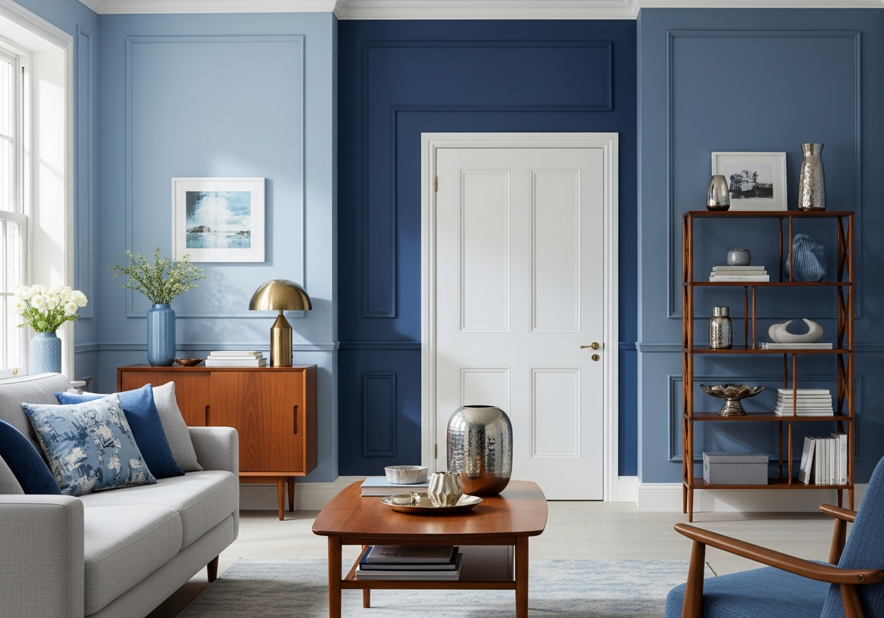
Bold Navy and Deep Blues
On the other side of the spectrum, bold navy and deep blues add drama and sophistication. Navy blue, for example, works great in larger living rooms or spaces with plenty of natural light. It creates a cozy, rich feel and pairs beautifully with white trim or metallic accents. Deep blues tend to visually reduce a room’s size, so they are better suited to bigger spaces or feature walls. Satin or semi-gloss finishes are recommended for these tones to highlight their intensity without appearing flat. Popular choices include Farrow & Ball’s “Hague Blue” (No. 30) and Sherwin-Williams’ “Naval” (SW 6244).
Trending Blue-Grey Neutrals
Blue-grey shades have gained popularity due to their versatility and modern appeal. These colours balance the softness of blue with the neutrality of grey, fitting a variety of decor styles. They work well in both small and large spaces, often acting as a neutral backdrop with more character than plain grey. Paints like Benjamin Moore’s “Silver Lake” (1586) and Dulux’s “Blue Smoke” create a comfortable, stylish atmosphere. They are best paired with a matte finish for a smooth, contemporary look. These tones blend beautifully with natural materials and warm accents, making them perfect for transitional and modern living rooms.
When choosing between light and dark blues, consider the size of your room and lighting conditions. Light blues open up space and reflect sunlight, while dark blues offer depth and drama. Meanwhile, the right finish will enhance the blue’s qualities—matte and eggshell for softness, satin and semi-gloss to amplify vibrancy.
How to Choose Blue Paint Colours for Your Living Room Style
Your living room style plays a big role in selecting the best blue paint colour. Different architectural details, furniture styles, and the overall design vibe influence which blue hue will look most natural and appealing. Understanding how to marry your space’s style with the right blue helps you create a harmonious and attractive room.
Blues for Traditional and Heritage Homes
Older homes with classic architecture often feature detailed moldings, fireplaces, and hardwood floors. For these spaces, traditional blue tones with a vintage feel work best. Think dusty blues, muted indigos, or a soft cornflower blue. These colours complement woodwork and classic furnishings without overpowering the room. Matte or low-sheen finishes preserve the historical charm, while slightly darker blues can highlight architectural features gracefully. Testing shades in natural and artificial light will help capture how the blue sits against antique furniture or window frames.
Modern and Contemporary Blue Options
Modern living rooms typically have clean lines and minimal details. They pair well with cooler, crisper blue tones like blue-greys, steely blues, or saturated cerulean. These colours keep the space feeling fresh and uncluttered. Glossy or satin finishes add a subtle shine that suits contemporary design. When selecting a blue for a modern room, consider how it works with metals, glass, and streamlined furniture that are often found in these interiors. This creates a cohesive and sleek look with a bold colour statement.
Coastal and Casual Living Spaces
For spaces inspired by beachside cottages or casual retreats, soft, sun-washed blues bring a carefree, gentle vibe. These blues often have green or grey undertones that reflect the sea and sky without being too bright. A few examples include aqua, teal blue, and powder blue shades. Pairing these blues with natural fibers, rattan or wicker furniture, and light wood enhances their relaxed atmosphere. Flat or matte paint finishes work well, giving walls a smooth, subtle softness that fits well with a casual or coastal aesthetic. Sampling these blues by painting small sections helps find a shade that complements light levels and existing decor.
When testing paint samples, apply larger swatches on different walls and observe them at various times of day. This approach helps you see how the blue changes with light and other room elements. Always consider your furniture and accessories to ensure the blue feels connected to your style and not disconnected or jarring.
Blue Color Combinations That Work
Blue rarely stands alone when decorating a living room. The colours you pair with blue create the room’s final mood and style. Choosing the right combinations can either add striking contrast or create soft harmony. Here are some classic and creative colour pairings that work well with blue walls.
Classic Blue and White Combinations
Blue and white is a timeless pair. Crisp white trim or furniture accentuates the richness of blue walls and makes any blue shade pop. This combo works for nearly any blue—from pale powder blues to deep navy. White adds brightness and clarity, offering a fresh and clean look. It also ensures the room feels open and airy. This classic pairing suits traditional, modern, and coastal styles alike.
Warm Accents with Blue
Adding warm colours like yellows, oranges, or rich wood tones to blue creates balance and energy. For example, a navy wall looks stunning with burnt orange cushions or golden-yellow curtains. Warm woods, such as teak or oak, bring natural warmth, softening the coolness of blue walls. These accents help prevent blue from feeling too cold or sterile, especially in rooms with less natural light. The key is to choose warm tones with enough depth to complement rather than clash with the blue.
Blue with Neutrals
Combining blue walls with neutrals like gray, beige, or black offers a sophisticated and modern palette. Blue and gray create a calming, understated look that works well for contemporary spaces. Beige softens the coolness of blue, giving a cozy feeling without being dull. Black accents, like metal frames or fixtures, add contrast and visual interest while maintaining elegance. These neutral combinations are especially helpful in creating layered looks, mixing textures and materials for a richer space.
Metallic Finishes as Accents
Metallics, such as gold, brass, or silver, bring a touch of luxury and shimmer to blue living rooms. Accent pieces like lamps, mirrors, or frames in metallic tones reflect light against blue walls, adding depth and dimension. Warmer metals such as brass highlight warmer blue shades like navy or teal, while cool metals like silver complement icy or blue-grey tones. These finishing touches elevate the overall look without overwhelming the room.
| Blue Shade | Best Paired Colours | Finish Recommendation | Room Style |
|---|---|---|---|
| Powder Blue | White, Beige, Natural Wood | Matte, Eggshell | Small, Coastal, Casual |
| Navy Blue | White, Gold, Burnt Orange | Satin, Semi-Gloss | Large, Traditional, Modern |
| Blue-Grey | Gray, Silver, Black | Matte | Modern, Transitional |
| Teal | Beige, Brass, Warm Wood | Eggshell, Satin | Coastal, Contemporary |
| Sky Blue | White, Light Gray, Soft Yellow | Matte | Small, Casual |
Conclusion
Blue paint colours for living rooms offer a broad spectrum from soft, airy tones to deep, dramatic hues. Selecting the right blue depends on your room’s size, lighting, and style. Light blues create spaciousness and calm, while darker blues add warmth and sophistication.
Start by considering your existing furniture and style. Test samples on your walls and observe them at different times to find the perfect tone. Pair blue with colors that suit your mood, from crisp whites and warm accents to modern neutrals and metallic highlights. Thoughtful choices will turn your living room into a space that feels both inviting and true to your taste.