What Makes a Nice Paint Color for Living Room Success
Your living room paint sets the mood for your entire home. Get it right, and every moment spent there feels better. The color on your walls does more than just cover surfaces—it shapes how you feel in the space day after day. Whether you want calm, energy, or something fresh, the right paint can influence your mood, your guests’ impressions, and even how spacious your room feels.
Colors affect our emotions in surprising ways. Warm shades like soft reds and yellows can bring cozy energy, while blues and greens often create calm and peaceful vibes. This is why choosing a paint color for your living room calls for careful thought. Unlike bedrooms or bathrooms, the living room is a space where many activities happen. It’s where you relax, entertain, and spend time with family, so the color needs to balance welcoming comfort with everyday practicality.
Picking a paint color isn’t just about what you like right now. You have to think about how the color will make you feel weeks, months, or even years down the line. At the same time, the living room often affects home resale value. Choosing colors that appeal to a wider audience can help keep your home market-ready without sacrificing your personal style.
The Role of Natural Light in Color Perception
Natural light changes how paint colors look throughout the day. Morning light tends to be cooler and bluer, while afternoon sun warms things up. A paint color that looks soft and inviting in the morning might appear sharper or dull in the evening. South-facing rooms usually get warmer light, making colors look richer. North-facing rooms have cooler light, which can make some colors feel more muted.
It’s important to observe your living room at different times in natural light before choosing a color. Colors with yellow or red undertones often brighten gloomy rooms, while cool tones can help balance out too much warm light. Keep in mind that different window treatments and surrounding colors outside also affect what you see inside.
Testing Colors Before Committing
Seeing paint chips or samples on a wall is very different from living with a full room painted in that color. Always test paint samples in your living room before deciding. Buy small sample cans or use tester pots to paint a few square feet of wall and observe the color at different times of day and in different lighting conditions.
Try looking at your test spots under both natural and artificial light, and add the colors you plan to use on trim, furniture, and fabrics nearby. This way, you can see how the color interacts with other elements in the room. Testing also helps you avoid surprises like colors appearing dull, too bright, or clashing with other room details.
Top Paint Colors That Work in Most Living Rooms
Some paint colors just work harder than others. They create flexible backdrops that make decorating easier and help rooms look fresh for years. These reliable colors suit different lighting, furniture, and styles, making them favorites in living room design.
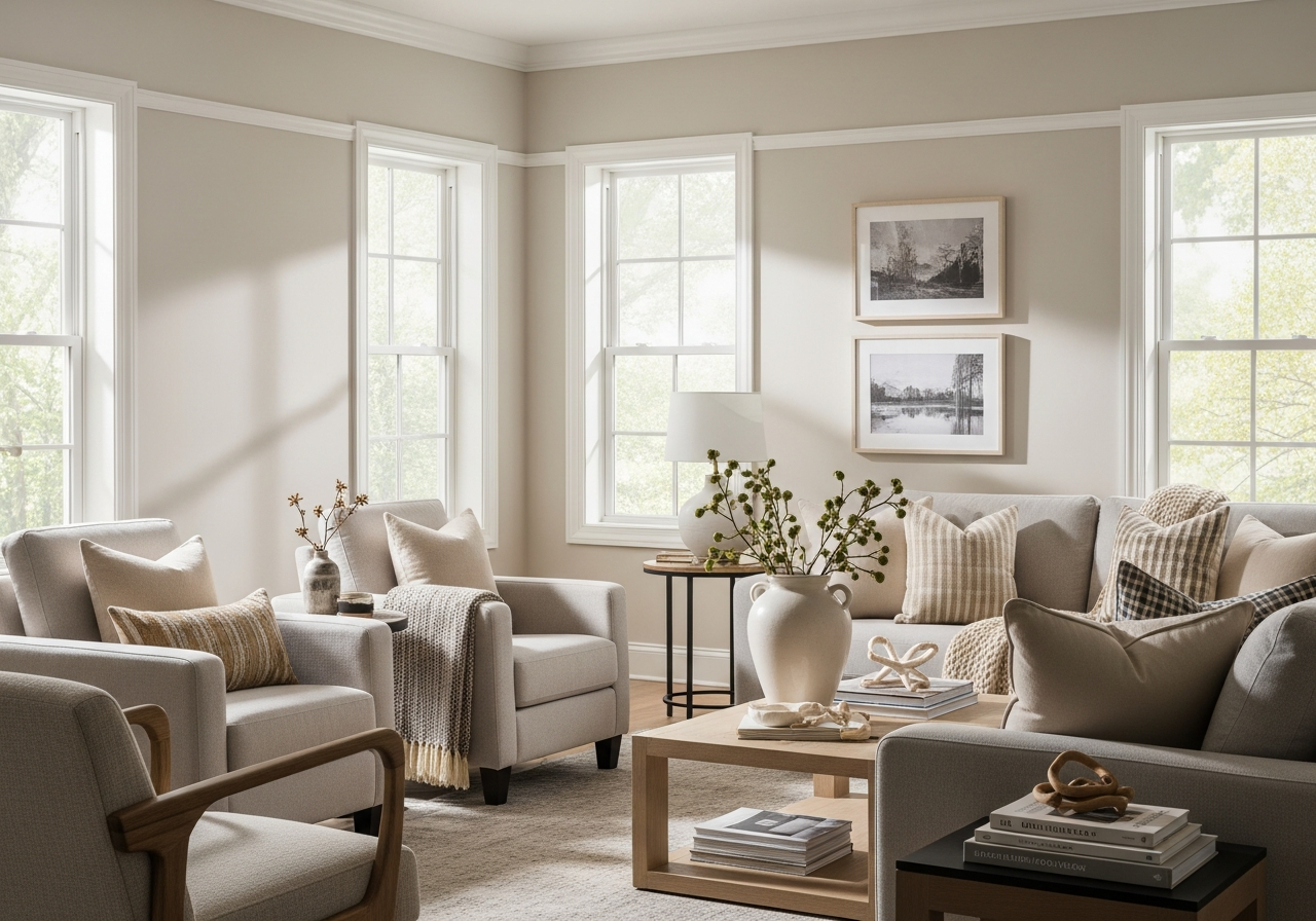
Warm neutrals like beige, greige, and warm gray strike a perfect balance. They add warmth without overpowering, and they blend well with most furniture and wood tones. These shades have enough warmth to be cozy but are neutral enough to serve as a clean canvas for accents.
Cool classics like soft blues and sage greens are calming and inviting. Blue is known for promoting relaxation, which makes it ideal for a space where you unwind. Sage green adds a natural depth, bringing in a subtle connection to the outdoors that suits many decorating styles.
There are also bold colors that, when used thoughtfully, can brighten a living room without overwhelming it. Deep navy or charcoal offer drama without making the space feel smaller. Rich jewel tones like emerald also add personality and elegance.
Practicality matters, too. Some colors hide imperfections better, especially in homes with textured walls or older plaster. Mid-tone colors can mask dents and scuffs where very light or very dark colors might make flaws more visible. This makes them a smart choice for busy living rooms.
Neutral Colors That Never Go Out of Style
Neutrals have staying power because they’re versatile and timeless. Beige creates a warm, inviting atmosphere without locking you into one color theme. Greige, a mix of gray and beige, feels modern and elegant. Warm grays add subtle color but keep the tone calm and adaptable. These colors pair well with various accent shades, from bright yellows to soft pastels.
Accent Wall Colors That Pop Without Overwhelming
An accent wall can energize a room without flooding it with color. Deep teal, navy, or charcoal gray create standout features that draw the eye but keep the rest of the room calm. Terracotta or burnt orange are warm accent options that bring in cozy energy. The key is to select an accent shade that complements your overall palette and furniture, helping the wall shine without clashing.
How to Match Paint Colors With Your Existing Furniture
The couch you love deserves a paint color that helps it look its best, not one that fights for attention. When matching paint to furniture, always consider undertones. For example, a cream couch might have pink, yellow, or gray undertones, and your wall color should either highlight or complement those.
Decide if you want contrast or coordination. Contrasting colors make furniture stand out. If your sofa is dark, a lighter wall color will create focus. Coordination means choosing wall colors that share undertones with furniture, creating a seamless, layered look.
Also think about wood tones and metal finishes in your furniture. Warm woods like cherry and oak pair well with warm paint tones, while cool-toned woods like maple work better with cooler wall colors. Metal accents, whether gold, silver, or black, influence the choice too. Gold and brass favor warm colors, while steel and chrome look sharp with cooler backgrounds.
For bold furniture pieces, tone down the walls. Paint in neutral or muted shades allows striking sofas or chairs to be the stars without the room feeling too busy. You can also balance bold furniture with subtle accent colors pulled from the upholstery patterns or textures.
Coordination With Flooring and Trim
Floor color affects how paint looks on walls. Light hardwood floors support both light and medium wall colors, while dark floors pair nicely with lighter or warm mediums. If you have dark trim or baseboards, selecting paint that contrasts enough with those trims ensures the room doesn’t feel closed in. White or off-white trim works with nearly all wall colors, so it gives you extra flexibility.
Making Mixed Furniture Styles Work Together
When your living room has a mix of furniture styles, the paint color can unify everything. Stick with a neutral or soft color that acts as a backdrop. It helps to pick paint with undertones that link subtle colors found across your varied furniture. Using similar accent colors or textiles can further tie the styles together and make the room feel cohesive despite differences.
Common Paint Color Mistakes That Ruin Living Rooms
Choosing the wrong paint color can make a living room feel uncomfortable or awkward. One common mistake is picking color from a chip or photo alone without testing it in your space. Colors may look different on walls, causing disappointment.
Another pitfall is ignoring the size and natural light of the room. Dark colors can make small rooms feel cramped, while very bright colors can overwhelm large spaces, making them hard to relax in.
Choosing trendy colors without considering how long you want to live with them often leads to repainting sooner than desired. Some colors may be beautiful now but lose their appeal quickly.
Paint colors that clash with key furniture or flooring elements can disrupt flow and cause a jarring feel rather than harmonious warmth. It’s easy to overlook undertones in furniture fabrics and wood finishes that don’t pair well with your wall color.
Lastly, overusing accent walls or high-contrast paint can dominate the room’s mood in unwanted ways, making the space feel smaller, busier, or too intense.
Tips for Choosing Long-Lasting Paint Colors
Focus on timelessness. Neutral colors with subtle undertones tend to age well. Even if fashions change, these colors remain flexible.
Look at your room holistically. Consider furniture, flooring, lighting, and accessories before settling on a color. Bring paint samples home and live with them.
Limit the use of very bright or very dark colors to small areas, such as accent walls or alcoves. This gives you the freshness of color without overwhelming the whole space.
Consider durability and finish. Matte and eggshell finishes hide imperfections well, while satin adds a slight sheen that is easy to clean and maintain.
Test your top choices over a week or two. Watch how they change in natural and artificial light and how they make you feel living daily with them.
Conclusion
A nice paint color for your living room sets the tone for comfort, style, and everyday living. It balances your personality with the room’s light, furniture, and function to create a space you can enjoy for years.
Start by observing your natural light and testing samples on your walls. Choose colors that fit your lifestyle and existing furnishings, then keep practicality in mind with neutral tones or subtle accents. Living with your test colors over several days helps you avoid surprises.
Take time, trust your instincts, and think about how your living room will be the heart of your home. A well-chosen paint color brings out the best in your space and moods alike.