
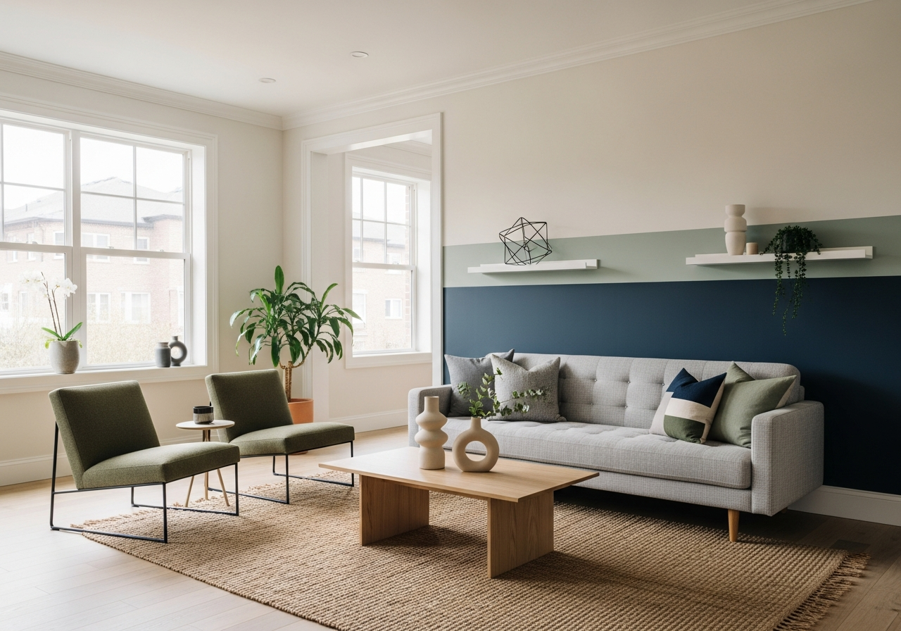

Fresh Modern Living Room Paint Ideas for Every Style
Your living room sets the tone for your entire home, and the right paint color can make all the difference between a space that feels dated and one that feels fresh and inviting. Choosing modern paint ideas means balancing timeless appeal with current trends that reflect your style.
Start by considering neutral palettes that provide a versatile backdrop. Warm whites, soft grays, and greige tones create calm, bright spaces that work with many decorating schemes. These colors make your living room feel open and modern without overwhelming it.
If you want to be bolder, accent walls in deep blues, forest greens, or warm terracotta can add energy and focus to your room. These statement colors bring character and depth, especially when paired with more subdued surroundings.
Two-tone walls are also rising in popularity, where walls feature contrasting shades either split horizontally or vertically. This technique adds visual interest and defines areas within the living room without crowding the space.
Monochromatic schemes build layers of the same color in varying shades and textures. This approach produces a modern, harmonious look ideal for those who prefer subtlety but still want dynamic design.
Neutral Foundations That Never Go Out of Style
Neutral colors such as creamy whites, gentle taupes, soft grays, and warm greiges are the easiest to live with and update. They provide a clean slate to showcase furniture and art, while making your living room feel larger and more welcoming. These shades serve as excellent foundations for multiple looks, from sleek and modern to cozy and rustic.
Greige, a blend of gray and beige, is particularly popular because it bridges cool and warm tones, fitting into different color schemes with ease. Soft gray with blue undertones brings freshness, especially appealing in contemporary settings.
Statement Colors for the Brave
For those who want to make a bold impression, paint colors like navy blue, charcoal, emerald green, or burnt orange can completely change the room’s mood. Deep tones absorb light, creating a sense of intimacy and richness.
Accent walls painted in jewel tones or saturated hues can serve as a backdrop for artistic displays or bold furniture choices. These strong colors work well alongside natural materials like wood and leather, balancing vibrancy with grounded textures.
Mix and Match Color Strategies
Two-tone painting strategies help define architectural features or separate functional areas in an open plan living room. For instance, a lighter shade on the upper wall paired with a darker color on the lower part can create a sleek, tailored effect.
Combining cool and warm tones can add sophistication. Pairing a soft gray with a dusty rose or mustard yellow injects gentle contrast without clashing. The key is to maintain harmony by choosing colors with similar undertones or matching intensities.
Monochromatic schemes also rely on layering—using different finishes such as matte, satin, and gloss in the same color family can add depth and interest without overwhelming the eye.
Choosing Paint Colors Based on Your Living Room’s Natural Light
The way sunlight enters your living room changes throughout the day and from season to season. This natural light affects how paint colors appear on the walls, making it essential to consider window direction and lighting conditions before settling on a shade.
North-facing rooms receive cooler, more consistent light that can make paint colors look muted or bluish. Choosing warm or neutral colors here can balance the cool light and keep the space feeling cozy and inviting.
South-facing rooms enjoy abundant warm sunlight most of the day, which enhances warm tones and can make cooler colors seem harsh. Soft, warm hues often work best in these spaces to avoid glare or color fatigue.
Reading Your Room’s Natural Light
Observing the light in your living room at different times helps understand how colors will react. Morning sun brings a different quality of light compared to afternoon or evening, influencing the mood and warmth of your paint.
Inside corners or windowless walls may appear darker and could benefit from lighter, reflective colors to open up the space. Rooms with large windows can handle deeper, richer tones since natural light will soften the impact.
Aside from direction, consider any external factors like trees or buildings that could shade your windows, changing light intensity throughout the day.
Paint Testing Strategy
Testing paint samples directly on your walls is a must. Apply several large patches in areas that show the true behavior of light through day and night. Observe them at various times to see how they respond to changing illumination.
Artificial lighting also influences paint color. Warm bulbs can make colors appear softer and cozier, while cool white lighting might add a blue tint. Testing paints near your fixtures helps anticipate the final look when lights are on.
Beyond color, finishes matter. Flat or matte finishes absorb light and hide imperfections, ideal for large surfaces. Satin or eggshell finishes reflect subtle light and are easier to clean, perfect for living rooms. High gloss offers the most shine but can highlight flaws.
Coordinating Paint with Your Existing Furniture and Flooring
Before settling on a paint color, it’s wise to review what you already own in your living room. Sofas, rugs, floors, and pieces of art create a palette that your wall colors must complement rather than compete against.
Wood tones especially play a significant role. Warm woods like cherry or oak pair well with warm paint colors such as creamy whites and rich beiges. Cooler woods such as walnut or ash look best with cooler grays or blues.
Understanding the undertones in your fabrics, whether your couch is deep navy or olive green, will help in selecting paint colors with matching undertones. This prevents discord in the room’s color story.
Working with Wood Tones
Identify whether your wood furniture and floors have warm (yellow, red) or cool (blue, gray) undertones. Choosing paint shades on the same side of the undertone spectrum creates harmony and ensures your room feels cohesive.
If you want contrast, pick paint colors that differ from your wood tone but still complement it. For instance, warm wood tones contrast beautifully with cool grays or blues, adding visual interest while maintaining balance.
Matching Undertones in Fabrics
Fabric colors often have hidden undertones not obvious at first glance. For instance, a beige couch could lean toward peach or gray. Aligning wall paint undertones with dominant fabric tones can keep the room unified.
When a room has many patterned textiles, choose a paint color that picks up the unifying undertone to avoid visual chaos.
Creating Contrast vs Harmony
Decide whether you want your living room to feel calm and cohesive or dynamic and vibrant. Soft paint colors paired with matching furniture tones create harmony and a soothing vibe. Strongly contrasting colors add drama and energy but require careful balancing to avoid overwhelming the space.
Using the 60-30-10 Color Rule
This classic decorating formula can guide your paint decisions. Use 60% of your dominant paint color, 30% for furniture and upholstery, and 10% for accent pieces like pillows or artwork. This balance creates a well-rounded look and allows the wall colors to support rather than overshadow your furnishings.
Conclusion
Modern living room paint ideas revolve around choosing colors that reflect light well, coordinate with existing furniture, and match your personal style. Whether opting for neutral foundations, bold accents, or layered tones, the right paint can transform your living space into a comfortable, stylish area.
Pay close attention to the natural light in your room and test paint samples in different lighting conditions. Assess your furniture and flooring undertones before selecting colors to ensure everything works together harmoniously. Use color balance strategies like the 60-30-10 rule to create a space that looks thoughtfully composed and inviting.