Why Paint Colors Matter More in Small Rooms
The right paint color can add up to 30% more visual space to your small room without knocking down a single wall. When rooms are limited in size, every detail counts—including the paint on the walls. Paint colors influence how spacious or cramped a room feels, often in surprising ways.
The Science Behind Color and Space Perception
Colors affect the way our eyes interpret space. Light colors tend to bounce light around, making walls seem to recede and rooms feel more expansive. Dark colors absorb more light, which sometimes makes walls appear closer than they are, narrowing the space. Our brains also react emotionally to colors, which influences how comfortable or confined a room feels. For example, warm tones like reds or oranges can feel cozy but may make a small room feel tighter, while cooler shades can open up the area visually.
Light Reflection vs. Light Absorption
Light reflection is a key factor in how paint colors impact the perception of size. Paint with a higher level of reflectivity spreads natural and artificial light throughout the room. When light bounces off walls, the space feels brighter and bigger. In contrast, colors with high absorption capture light, creating shadows or darker corners that visually shrink the room. But this doesn’t mean dark colors should be avoided altogether—they can work well with strategic lighting and the right design choices.
Another important point: the relationship between wall color and natural light is vital. A room with lots of natural light can handle darker hues better since sunlight balances the absorption. Conversely, a small room with minimal windows benefits most from light colors that amplify daylight. Sometimes, a combination of wall color and window treatments can optimize this effect.
It is also common to hear that dark colors are off-limits in small rooms. However, when used thoughtfully—such as accent walls or paired with bright furnishings—dark colors can create depth or drama without shrinking the space. The trick lies in understanding how paint interacts with light and human perception.
Light and Neutral Colors: The Safe Choice for Small Rooms
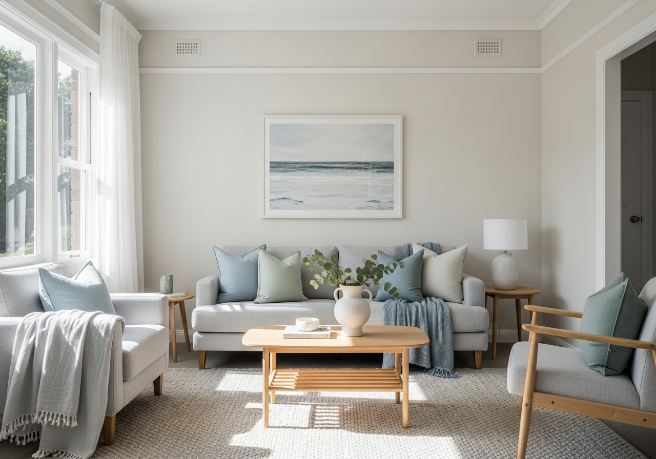
Light neutrals remain the go-to choice for small spaces because they bounce light around and blur the boundaries between walls. Neutral colors create a soft backdrop that makes a room feel open and airy. Their versatility and timeless appeal have made them reliable favorites for small rooms.
Top Neutral Paint Colors by Brand
Several shades have earned fans for their reliability in small spaces. Popular choices include soft whites, creamy ivories, pale beiges, and subtle greiges. For example, colors like “Alabaster” and “Simply White” from Sherwin-Williams, Benjamin Moore’s “Classic Gray” and “White Dove,” and Farrow & Ball’s “Cornforth White” offer gentle neutrals with different undertones. These colors provide enough warmth or coolness to suit various lighting conditions.
Choosing the right neutral involves understanding the undertones—whether warm yellows, cool blues, or balanced grays—that will complement your room’s lighting and furnishings. Warm neutrals feel cozy and inviting, especially in rooms with lots of south-facing light. Cool neutrals can feel fresher and more open, especially when paired with white trim and ceilings.
Testing Neutrals in Your Specific Lighting
Not all whites or neutrals behave the same in every room. It’s crucial to test paint samples on different walls and observe how the color changes throughout the day. A tone that looks bright and light in morning sun might turn flat or dull under artificial light in the evening. To get a real sense of the paint’s behavior, apply large swatches on multiple walls and look at them during different times of day.
Coordinating the wall color with trim and ceiling colors also helps to enhance space. White or slightly lighter ceilings lift the room upward. Similarly, matching baseboards and moldings to the wall color blurs boundaries, making rooms feel bigger. Sometimes, a soft contrast with bright white trim highlights architectural details without breaking the open flow.
Cool Colors That Create Visual Depth
Cool blues, greens, and grays trick the eye into perceiving walls as farther away than they really are. This subtle illusion opens up the space by visually pushing it back, creating a sense of depth ideal for small rooms.
Soft Blues and Sea-Inspired Shades
Light blues offer calmness and freshness. Shades like powder blue, pale teal, and soft aqua evoke water and sky, which widen the room with their openness. These colors can balance both natural and artificial light well, especially in north-facing rooms that tend to be cooler and dimmer. Sea-inspired hues also bring a serene, restful mood, perfect for bedrooms or bathrooms where relaxation is key.
When choosing blue shades, consider their undertones. Blue with slight gray undertones can add sophistication and match with a variety of decor styles. Pairing soft blues with warm elements, like wood textures or creamy furnishings, prevents the room from feeling cold or sterile.
Sage Greens and Nature-Inspired Hues
Sage green and muted moss shades reflect natural landscapes, bringing a sense of calm and spaciousness indoors. These hues blend well with natural light and complement plants or natural decor, making a small room feel connected to the outdoors.
Green also has the advantage of being a very restful color for the eyes. Light green tones soften walls without overwhelming the space. They work great in living rooms or kitchens, where a calm but lively atmosphere is desired. Neutral accents and warm wood finishes balance sage green’s coolness and add warmth to the overall room vibe.
Both blues and greens create a balanced look when accented with warmer accessories. Soft cushions, rugs, or artwork in dusty rose, terracotta, or even gold tones add depth without crowding the space visually. This helps rooms feel layered, welcoming, and thoughtfully styled.
Conclusion
The best paint colors for small rooms reflect more than simple preference; they shape how the room feels and appears. Light neutrals work by reflecting light and softening edges, while cool blues and greens create depth by visually pushing walls away. Understanding the interaction of light, color, and perception can transform a cramped space into one that feels bright and inviting.
To start, test your favorite light neutrals in different lights and observe the effect on your walls. Consider cool tones if you want a hint of color without sacrificing openness. Finally, coordinate trim and ceiling colors to blend boundaries. These steps will help you pick a paint color that makes your small room truly come alive.