Why Neutral Living Room Paint Colors Work for Every Style
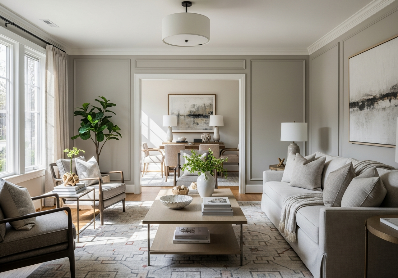
Neutral paint colors give you the freedom to change your living room’s personality with just a few new pillows or a different rug. They provide a smart base that evolves with your tastes and design trends. Choosing a neutral color means your space can be refreshed seasonally or whenever you want without repainting the entire room.
One reason neutrals work so well is their flexibility. They pair easily with many styles, whether modern, rustic, traditional, or eclectic. You can switch out furniture, art, or decor without worrying about clashing colors. Neutral shades also tend to make rooms feel more spacious because they reflect light softly and don’t overwhelm the senses.
Resale value is another big plus. Homes painted in neutral tones often attract more buyers because they can imagine personalizing the space. Bright or bold colors can sometimes distract or turn off potential buyers looking for a clean slate. Neutral colors provide a welcoming backdrop for any furniture or layout.
The Psychology Behind Neutral Colors
Neutral colors often create a calming and balanced environment. Shades like beige, gray, and taupe don’t demand attention but encourage relaxation and comfort. This is why many people choose neutrals for spaces where they want to unwind or enjoy quiet time. By not competing with bright hues, neutrals allow your eyes and mind to rest.
These colors also suggest simplicity and cleanliness. They feel timeless rather than trendy, which adds a sense of stability and peace to your living room. Because neutrals don’t evoke strong emotional reactions, they are less likely to tire you over time.
Warm vs Cool Neutrals: What’s the Difference?
Neutral colors fall into two main categories: warm and cool. Warm neutrals include shades like creamy beige, soft taupe, and warm gray. They create a cozy, inviting feeling, often with subtle undertones of yellow, red, or brown. Warm neutrals work well in spaces you want to feel welcoming and comfortable.
Cool neutrals, like blue-toned grays, crisp off-whites, and muted greens, provide a fresh, airy vibe. These colors can make a room feel more spacious and modern. Cool neutrals are great for rooms with plenty of natural light, as they enhance brightness and create calm surroundings.
Deciding between warm and cool neutrals depends on your room’s lighting, furniture, and the mood you want to set. For example, a room with lots of natural sunlight can handle cool neutrals without feeling cold, while a darker space could benefit from warm neutrals to add depth and coziness.
Top 12 Best Neutral Living Room Paint Colors for 2024
From soft beiges that wrap your room in warmth to crisp grays that feel fresh and modern, these tried-and-true neutrals have earned their spot as designer favorites for 2024. Below are some of the best neutral paint options with details on their Light Reflectance Value (LRV), undertones, and ideal room lighting.
Warm Neutrals That Never Go Out of Style
- Benjamin Moore – Revere Pewter (HC-172): This warm gray-beige has an LRV of 55. It offers a subtle warmth that works beautifully with wood floors and traditional furniture. Ideal for south-facing rooms where natural light enhances its richness.
- Sherwin-Williams – Accessible Beige (SW 7036): With an LRV of 58, this beige brings soft warmth and an inviting feel. Its undertones lean toward yellow and brown, lending coziness to living rooms with warm lighting or darker wood accents.
- Behr – Almond Wisp (PPU7-11): Featuring an LRV of 63, this light, buttery beige warms spaces without overpowering them. It pairs well with natural materials and works nicely in rooms with moderate natural light.
Cool Neutrals for a Modern Feel
- Benjamin Moore – Gray Owl (2137-60): This popular light gray has an LRV of 66 and blue undertones that bring a crispness to the room. It’s perfect for north-facing rooms that need brightening or spaces with sleek, modern furnishings.
- Sherwin-Williams – Repose Gray (SW 7015): LRV 58, a balanced cool gray with subtle beige undertones making it versatile. It adapts well to various lighting, especially well-lit rooms, providing a soft yet modern backdrop.
- Behr – Silver Drop (790C-2): This light gray with a 68 LRV has cool undertones that add a fresh feel to areas with abundant natural light. It’s great for contemporary settings aiming for a clean, crisp look.
Greige: The Perfect Middle Ground
Greige, a mix between gray and beige, blends the warmth of beige with the coolness of gray, making it a balanced choice that complements many styles and lighting conditions.
- Benjamin Moore – Edgecomb Gray (HC-173): With an LRV of 63, it blends beige and gray for warmth and softness. It suits transitional styles and works well under natural or artificial light.
- Sherwin-Williams – Agreeable Gray (SW 7029): LRV 60, a greige shade with a slight warm undertone. It’s popular for open-concept living spaces because of its adaptability.
- Behr – Balanced Beige (PPU3-10): This greige offers an LRV of 50 and strikes a cozy, inviting tone that isn’t too warm or cool. It complements both light and dark furnishings.
These neutral colors provide a solid foundation you can build on with decor and furnishings. Choosing colors with the right LRV helps ensure your living room feels balanced and bright, while undertones guide you in matching with your existing elements like cabinetry, flooring, or textiles.
How to Choose the Right Neutral Paint for Your Living Room
Picking the perfect neutral isn’t about grabbing any beige off the shelf. Your room’s light, furniture colors, and flooring all influence how a paint color will look on your walls. Testing paint samples properly and understanding undertones can help you find a neutral that feels just right.
Start by painting large swatches on your walls or on poster boards. Observe them during different times of day and under different lighting—natural, incandescent, and LED. Colors can shift dramatically depending on light, sometimes turning warmer, cooler, or even muddy.
Undertones are subtle colors mixed into a neutral paint. For example, a “gray” may carry blue, green, or purple undertones that show up differently in your space. Similarly, beige may lean toward yellow, pink, or brown. It’s important to recognize these because they affect how your paint pairs with your furnishings.
Match your paint to fixed elements like floor color, fireplace surrounds, or cabinetry. If you have warm wood floors, a warm neutral will coordinate better. If you have cool-toned stone or tiles, cooler neutrals will complement those surfaces.
The direction your room faces also plays a key role. North-facing rooms receive cooler, less direct sunlight, so warm neutrals can add a sense of coziness. South-facing rooms get bright, natural light all day, so cooler neutrals often work best to keep the space feeling fresh and open.
Conclusion
The best neutral living room paint colors transform your space by providing a flexible, timeless backdrop that complements any style or decor. They brighten rooms, boost resale value, and allow your design to evolve without frequent repainting.
To choose the right neutral, test paint samples in your lighting, look for undertones that blend well with your furniture and flooring, and decide between warm or cool shades based on your room’s exposure. Paying attention to these details ensures your living room feels inviting and balanced for years to come.