Why Off White Paint Colors for Living Room Walls Create the Perfect Canvas
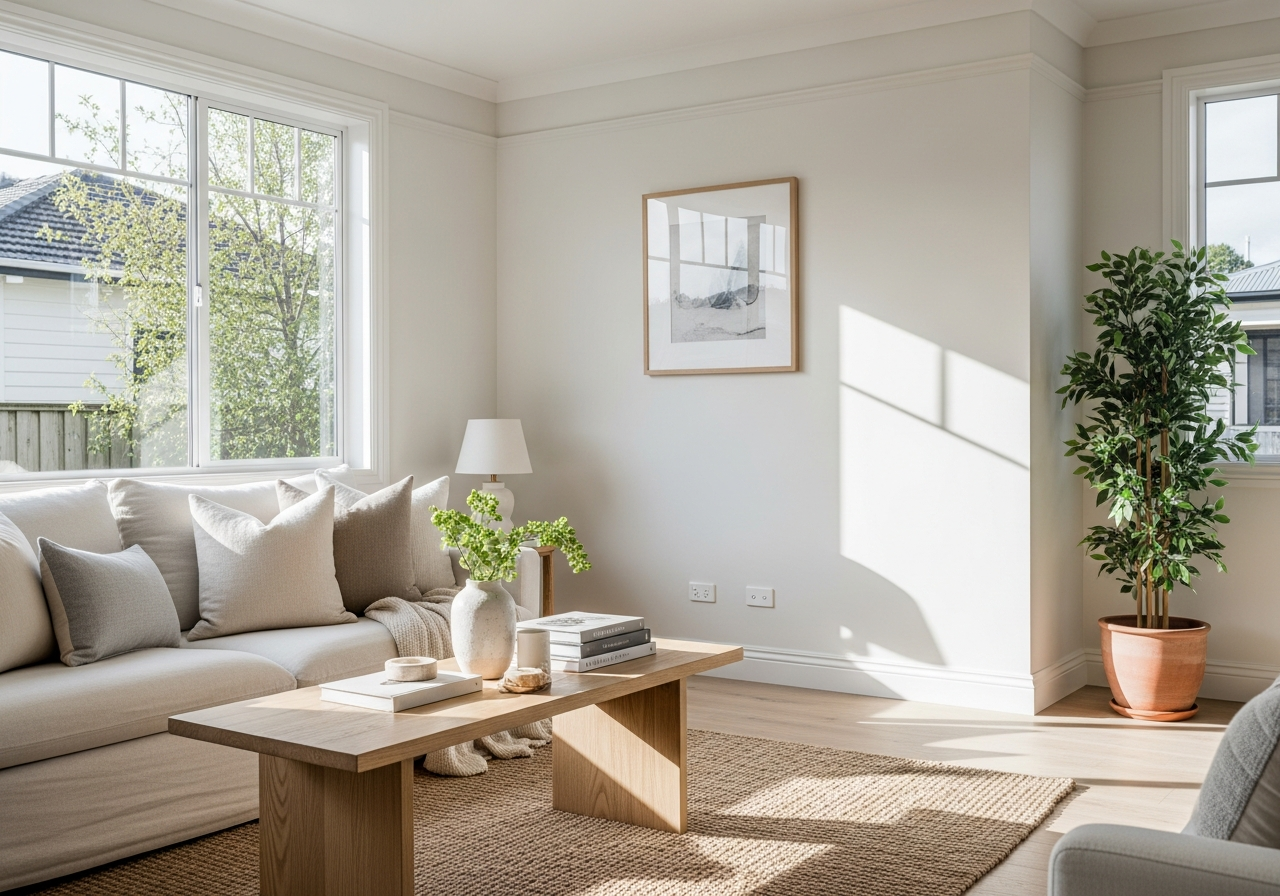
Off white paint blends the warmth of beige with the crispness of white, creating a soft, welcoming space that feels both open and cozy. Unlike pure white, which can sometimes feel cold or sterile, off white adds just enough warmth to soften a room without darkening it. It also differs from beige by maintaining a lightness that keeps rooms feeling bright and fresh.
One major benefit of off white paint is how it reflects light. In smaller or dimly lit living rooms, off white walls make the space appear larger and more inviting. It balances light so the room feels airy but never harsh. This quality makes off white an ideal choice when you want a room that feels cheerful without overwhelming your decor.
Psychologically, off white has a calming effect. It creates a serene atmosphere that supports relaxation and conversation, perfect for the heart of your home. Because it pairs well with many color schemes and styles, off white serves as a stunning backdrop that lets your furniture and accessories shine.
The Science Behind Off White’s Appeal
Off white paint colors contain subtle mixes of pigments that soften the brightness of pure white. These pigments add hints of yellow, gray, or beige, making the shade easier on the eyes. This gentler hue can reduce glare and eye strain, especially in rooms with large windows or direct sunlight.
The way off white interacts with light creates depth and texture on walls. It can highlight architectural details and complement natural elements like wood and stone. The slight warmth it offers also promotes a sense of comfort and grounding, which pure white alone often lacks.
Off White vs Pure White: What’s the Real Difference?
While pure white is a clean and bright color with no added hues, off white includes soft undertones that shift depending on the lighting and adjacent colors. Off white shades tend to work well in spaces where harshness must be avoided.
Pure white can sometimes feel clinical and stark, especially under artificial lighting. Off white tones give the same brightness but bring softness, reducing the contrast with furnishings and floors. Visually, pure white can create a more modern or minimalist look, while off white more often suits traditional, rustic, or transitional styles.
Ultimately, off white balances brightness and warmth, offering flexibility and a timeless feel that pure white may not always deliver.
Top 10 Off White Paint Colors That Designers Swear By
Not all off whites perform the same in every space. Designers pick specific shades because of their unique undertones and how well they adapt to different light and decor. Here are ten popular off white paint colors favored by professionals for living rooms.
Warm Off Whites for Cozy Spaces
- Benjamin Moore Swiss Coffee: A creamy off white with soft yellow undertones that create a snug, inviting atmosphere. Ideal for rooms that get less natural light or have darker flooring.
- Sherwin Williams Alabaster: This shade is warm but subtle, leaning slightly towards beige. It works exceptionally well for traditional or cottage-style rooms that aim for a relaxed comfort.
- Farrow & Ball Pointing: With its hint of warm gray, Pointing gives a calming feel while maintaining brightness. Perfect for spaces with warm wood tones and plush fabrics.
Cool Off Whites for Modern Looks
- Benjamin Moore Cloud White: A cooler off white that reads less yellow and more neutral, Cloud White pairs well with sleek furniture and contemporary accessories.
- Sherwin Williams Natural Linen: A subtle blend of cool beige and gray undertones, this color suits minimalist living rooms or interiors with metal and glass pieces.
- Farrow & Ball Strong White: Cooler than many off whites, Strong White works beautifully with blues and cool grays to create fresh, airy spaces.
Neutral Off Whites That Work Everywhere
- Benjamin Moore Simply White: Balanced between warm and cool, this universally flattering off white adapts to different lighting conditions, making it a popular pick for living rooms with varying exposure.
- Sherwin Williams White Duck: With muted beige undertones, it creates a bright, serene backdrop neither too warm nor too cool.
- Farrow & Ball Wimborne White: A gentle neutral perfect for transitional spaces that blend modern and traditional elements.
- Benjamin Moore White Dove: Warm yet light, this shade is a favorite for its versatility and ability to blend seamlessly with most furniture styles.
How Natural Light Changes Your Off White Paint Choice
Natural light is a game-changer when selecting off white paint for your living room. Depending on the room’s direction and the time of day the light hits, an off white shade may shift in tone significantly. Choosing the right shade means considering how sunlight affects the color throughout the day.
North-facing rooms tend to receive cooler, softer light. This can make some warm off whites look muted or dull. In these spaces, off whites with creamier or warmer undertones work best to counteract the blue light and prevent the room from feeling cold.
South-facing living rooms get bright, warm light most of the day. This strong sunlight brings out yellow and golden tones in off whites. Colors with cooler hints or gray undertones help keep the space balanced, avoiding an overly yellow or “washed out” look.
East-facing rooms enjoy bright, direct morning light that becomes softer by midday. Here, natural light emphasizes the subtle undertones of off white paint. Choose shades that look fresh and clear in morning light without feeling too stark later.
West-facing spaces get rich, warm light in the afternoon and evening. To harmonize with this warm glow, off whites with a hint of beige or peach feel welcoming. Avoid too cool off whites in these rooms, as they might clash with the sunset hues.
Remember that paint samples should always be tested in the actual space at different times. Viewing the paint in store or under artificial light alone can be misleading. The subtle nuances of off white show differently depending on sunlight angles, nearby colors, and room size.
Tips for Pairing Off White Walls with Living Room Decor
Off white walls provide a flexible background that pairs amazingly with various furniture and decor styles. Here’s how to make the most of your chosen off white shade with your living room design.
- Wood Tones: Rich wood furniture and floors, from walnut to oak, create beautiful contrast with off white. Warm off whites complement golden or reddish woods, while cool off whites pair well with grayish or bleached wood.
- Textiles and Fabrics: Use color and texture to bring life against off white walls. Deep blues, greens, or terracotta pillows and rugs add warmth and interest. Soft linens and velvets create an inviting feel.
- Metallic Accents: Gold, brass, and bronze add a vintage or glam touch against warm off whites. Silver and chrome metals enhance modern off white tones for a sleek look.
- Artwork and Accessories: Colorful or black-and-white art stands out on off white walls. Consider frames and placement carefully—they create focal points and bring personality.
- Layering Color: Off white works well as a neutral base for layering other colors—try accent walls, colorful furniture, or vibrant plants to keep the space dynamic and cozy.
Common Mistakes to Avoid When Choosing Off White Paint
Choosing off white paint sounds easy, but a few pitfalls can spoil the effect. Avoid these common mistakes to keep your living room fresh and inviting.
- Ignoring Lighting: Not testing paint samples at different times in the room can lead to unexpected results. Light can drastically change an off white’s appearance.
- Choosing Without Samples: Paint large swatches on your walls before buying a whole gallon. Small sample pots give a real-world view of how the paint reacts to your space.
- Forgetting Undertones: Off whites with strong undertones can clash with your existing decor or flooring. Consider undertones carefully and pick a shade that complements your style.
- Not Considering Durability: Some off white paints are more prone to yellowing or showing dirt. Choose durable, washable options, especially in high-traffic living rooms.
- Overthinking Contrast: While contrast is good, too much can make the room feel choppy. Aim for harmony between walls, furniture, and decor.
Conclusion
Off white paint colors for living rooms create a warm, flexible backdrop that brightens and expands your space while offering comfort. They balance brightness and softness better than pure white or beige alone. Choosing the right off white depends on your room’s lighting, style, and personal taste.
Start by testing paint samples in your space throughout the day. Consider your furniture and decor colors, then pick an off white with undertones that complement your style. Use this neutral base to layer textures, colors, and accents for a living room that feels inviting and timeless.