Understanding Coastal Living Room Paint Colors
Transform your living room into a serene beach retreat with the right paint colors—no ocean view required. Coastal living room paint colors bring the calm and comfort of the seaside into your home. They reflect the natural elements often found on the beach: soft sand, gentle waves, and refreshing sea breezes. These colors not only create an inviting mood but also help foster relaxation and peace of mind.
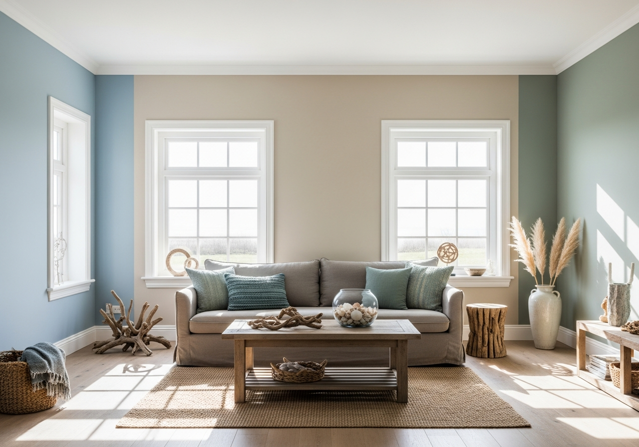
Four core color families define coastal palettes: whites, blues, greens, and sandy neutrals. Whites mimic the brightness of sunlit driftwood and shells, blues echo the ocean’s varying depths, greens draw on the soft hues of seafoam and coastal plants, while sandy neutrals recall shorelines and dune grasses. Together, these tones offer a soothing balance that can easily elevate your living room’s atmosphere.
Coastal colors are often misunderstood or lumped together with other ocean-inspired themes. In fact, there’s a key distinction between beach house style and nautical style. Beach house colors tend to be soft, muted, and weathered, inspired by natural surroundings and a relaxed lifestyle. Nautical style, however, usually involves bolder colors like deep navy blues and crisp reds, evoking maritime signals and uniforms.
Even if you live far from any shoreline, coastal paint colors can bring the peaceful vibe of the beach to your home. Soft blues and sandy tones help open up a space and add a timeless charm that feels fresh year-round. This style adapts well to various home designs and climates, making it a practical yet beautiful choice.
What Makes a Color “Coastal”
A coastal color is one that captures the essence of the shore. These shades are typically light and airy, often with muted saturation so they mimic natural elements rather than bright artificial colors. For example, a “coastal blue” rarely means a vivid royal blue; it more often refers to powdery or steel blues that represent the sky or ocean in gentle sunlight.
Coastal colors usually lean toward cool or neutral undertones that suggest water, sand, shell, or driftwood. They often evoke feelings of refreshing coolness and calmness. Colors like soft turquoise resemble shallow waters, while creamy whites echo the look of sun-bleached wood or sand. The overall effect is one that enhances relaxation and creates a subtle connection to nature.
Beach House vs. Nautical Style
While both styles are inspired by the sea, beach house and nautical aesthetics differ in color choice and overall mood. Beach house colors are softer and more relaxed, with an emphasis on natural textures and organic shades. You’re likely to see soft seafoam greens, misty grays, and sandy beiges paired with light, weathered wood furniture in a beach house style.
In contrast, nautical design draws on sailor uniforms and maritime flags. It features strong contrasts like navy blue combined with crisp white and bold red accents. The mood here is more structured and energetic, often including stripes or maritime symbols such as anchors and ropes.
Understanding these differences helps you choose the right colors for your living room based on the feeling you want to create. If you want a calming retreat, lean into beach house colors. If you prefer a lively, classic sea theme, then nautical colors are the way to go.
Top Coastal Living Room Paint Colors by Category
From crisp whites to weathered blues, these tried-and-true paint colors bring beach vibes home. Selecting the right shade is key because coastal colors span a wide spectrum, each with its own mood and personality. Here’s a breakdown of the best coastal colors across several categories to inspire your living room makeover.
Best White and Neutral Beach Colors
Coastal whites aren’t just any white—they have undertones that make a space feel bright yet soft. Antique White is a classic choice, offering a warm, creamy base that feels cozy without being too yellow. Greek Villa, another favorite, delivers a clean, almost sun-drenched glow with subtle warmth that works well in both bright and shadowy rooms.
Beyond white, sandy neutrals form the backbone of many coastal color schemes. Taos Taupe provides an earthy tone reminiscent of wet sand near the shoreline, adding grounding warmth without heaviness. Warm beige hues blend smoothly with other coastal colors and textures, providing a versatile and timeless backdrop.
Perfect Blues for Coastal Spaces
The blues favored in coastal living rooms are inspired by shifting ocean moods. Colors like Watery, a light and breezy blue, mimic the translucent shallows at low tide, bringing a refreshing feel indoors. Azores Blue offers more depth with a smoky undertone, perfect for adding character while maintaining softness. Slate blues evoke overcast skies and rolling waves, lending a peaceful and contemplative vibe to the room.
These blues pair wonderfully with all kinds of furniture and décor, from light woods to crisp whites. Blues with subtle gray hints handle changes in light evenly, making them a reliable choice for rooms with varying exposure.
Green Tones That Work
For a fresh twist on coastal colors, seafoam and sage greens capture the colors of coastal vegetation and tide pools. Seafoam green is light and slightly muted, evoking foamy waves and mossy rocks. Sage green skews a touch earthier, offering a calming presence that balances brighter blues and sandy neutrals.
Because these greens have both blue and yellow undertones, they adapt exceptionally well in rooms facing different directions. Their soft presence invites nature inside without overwhelming the senses.
How Natural Light Affects Your Coastal Paint Choice
That perfect seafoam green might look mint in north-facing rooms—here’s how to get your colors right. Light can change how paint looks dramatically, so understanding your living room’s lighting conditions is crucial for successful coastal color application.
North-facing rooms tend to receive cooler, indirect light throughout the day. This keeps colors from warming up, which is why some warm coastal shades like soft beiges or coral may appear more muted or even dull. Conversely, blue and green tones often look crisper and fresher under northern light.
South-facing rooms receive strong, direct sunlight for much of the day, warming up colors naturally. Warm whites and sandy neutrals glow softly, while blues might take on a brighter, sometimes almost electric quality. Afternoon sunlight can cause stronger shifts in color perception, making some hues feel more intense or saturated.
It’s best to test paint swatches at different times of the day. Paint large samples on your walls and observe them in morning, midday, and evening light. This hands-on approach reveals subtle differences and helps avoid surprises after painting.
Window size and placement also influence paint color. Large windows brighten rooms and can wash out pale tones, which makes slightly deeper coastal shades a smarter choice. In smaller or shaded rooms, lighter colors help open up the space and maintain a breezy, airy feel.
If your living room doesn’t get much natural light, consider artificial lighting carefully. Warm, soft white bulbs can enhance sandy and warm white paints, while cooler fluorescent lights tend to highlight blues and greens more vividly. Layering lighting sources, such as combining ceiling lights, floor lamps, and table lamps, adds dimension and helps reinforce your chosen coastal palette.
Conclusion
Coastal living room paint colors include whites, blues, greens, and sandy neutrals that create a calm, beach-inspired atmosphere. These shades work well to craft a relaxing and inviting space, whether you live near water or not. They are chosen for their muted tones and natural appeal that connect indoor living to the serene outdoors.
Start by selecting colors that suit your room’s lighting and your preferred coastal style—soft beach house or classic nautical. Test paint swatches throughout the day to see how light affects them. Pair your chosen paint with natural textures and simple décor to complete the peaceful coastal vibe in your living room.