What Makes Warm Living Room Paint Colors So Special
Warm paint colors do more than just cover your walls—they wrap your living room in comfort and make everyone feel welcome the moment they walk in. These tones provide a sense of calm energy and invite people to relax together. When you paint with warm shades, you create a space that feels alive yet cozy, perfect for both quiet evenings and lively gatherings.
The psychology behind warm colors shows how they affect emotions and behavior. Shades like soft yellows, gentle oranges, and muted reds are linked to feelings of happiness, friendliness, and security. When you enter a room painted with these colors, your brain picks up on signals that encourage connection and comfort. This makes warm colors ideal for spaces like living rooms, where people come together to share time and stories.
How warm colors influence the perception of a room is equally important. Warm tones tend to make large rooms feel more inviting by creating a sense of closeness. But in smaller spaces, too much warmth can sometimes make a room feel cramped. Balancing these colors with lighter neutrals helps maintain an open feeling while still keeping warmth. Knowing this balance can shape your painting decisions to perfectly suit your room’s size and layout.
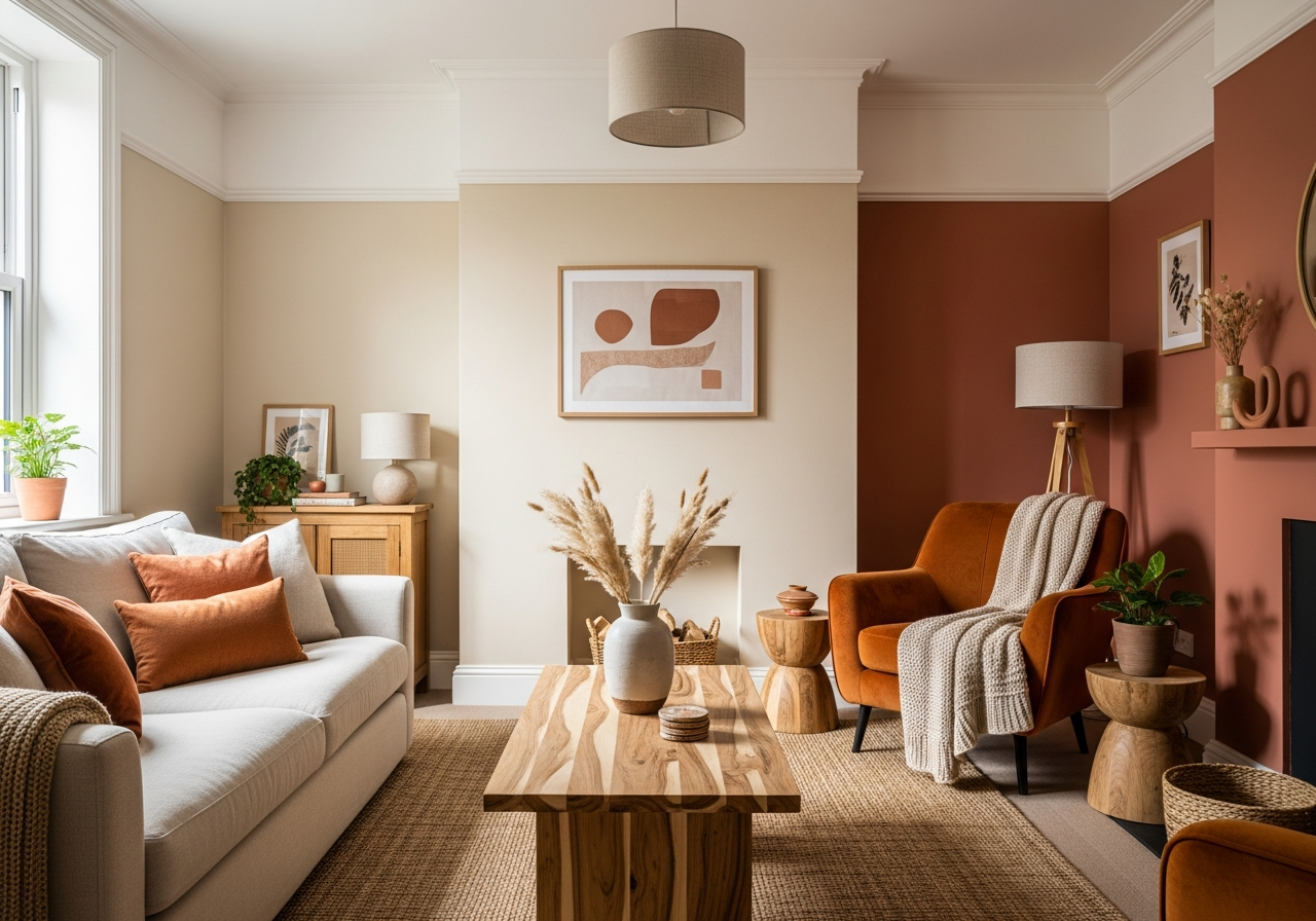
Understanding the difference between warm neutrals and bold warm shades is key to achieving the right mood. Warm neutrals—such as creamy beiges and soft taupes—act as gentle backdrops. They set a peaceful tone that flows well with various furniture styles. On the other hand, bold warm hues like burnt orange or deep terracotta add drama and energy, especially when used as accent walls.
The Science Behind Warmth in Color
Colors carry wavelengths that influence how we perceive temperature. Warm colors fall on the red, orange, and yellow side of the spectrum, making them appear closer and more stimulating to the eyes. This closeness creates a sensation of warmth, which can be quite comforting. In practical terms, these colors often make a room feel cozier, encouraging people to linger and relax.
When light hits warm-colored walls, it reflects soft, rich tones that enhance the room’s ambiance. This natural interaction between light and color boosts feelings of happiness and calm. Scientists have found that environments with warm colors can even lower stress levels and support social interaction by putting people at ease.
Warm vs. Cool: Quick Identification Tips
Knowing whether a color is warm or cool helps you make smarter paint choices. Warm colors lean more toward reds, oranges, yellows, and some warm neutrals like creamy whites or beige. Their undertones might look like soft gold, peach, or even rusty copper. Cool colors, by contrast, sit closer to blues, greens, and purples, giving a calming or refreshing feel.
A simple trick to spot warmth is to look for any hints of red or yellow in the color’s undertone. If you see a golden, peachy, or amber tint, it’s likely warm. Cool colors tend to show bluish or gray undertones. You can also place a swatch of the color against white paper; a warm shade will often seem brighter and more inviting, while a cool shade will feel calmer and more distant.
Top Warm Paint Colors for Living Rooms in 2024
From creamy beiges to rich terracottas, these warm shades are transforming living rooms into the heart of the home. This year’s trends lean toward colors that feel natural and inviting, blending classic warmth with fresh, modern vibes. Whether you want subtle warmth or a bold statement, there’s a shade that fits your living room’s style and personality.
Warm neutrals continue to dominate as safe, versatile picks. Shades like “Almond Cream” and “Toasted Oatmeal” offer soft, creamy bases that make it easy to layer in colorful accents or mix materials. These hues adapt well to both contemporary and traditional homes, allowing furniture and decor to shine without clashing.
Bold warm tones are gaining popularity as accent walls or even full-room choices in larger spaces. Colors like “Sunset Terracotta,” “Maple Red,” and “Burnt Sienna” make an impact without overwhelming. They bring nature-inspired richness, evoking clay, wood, and autumn leaves. Such bold shades complement natural textures like wood beams, brick, or woven fabrics.
When choosing a warm paint color, pay close attention to undertones. Subtle pink undertones can soften a beige, adding warmth without feeling too yellow. Yellow undertones brighten the space and add cheer. Orange undertones deepen warmth and create a cozy, enveloping feel. Even red undertones can make a dramatic, rich backdrop. Understanding these nuances helps pinpoint your perfect warm tone.
Finishes also affect how warmth shows up. Satin and eggshell finishes often highlight warmth by reflecting soft light gently across surfaces. Matte finishes can make colors feel deeper and more soothing, perfect for a relaxed vibe. Glossy finishes might bring too much shine, so they are usually better suited for trim rather than walls.
Best Warm Neutrals for Any Style
- Almond Cream: A soft, buttery beige that warms without overpowering, perfect for minimalist and classic spaces.
- Toasted Oatmeal: Earthy and inviting, this neutral blends gray with golden undertones for subtle warmth.
- Warm Sand: A gentle beige with yellow undertones that brightens any room while maintaining a cozy feel.
Statement Warm Colors That Pop
- Sunset Terracotta: Rich and earthy, it adds depth and character to accent walls or entire rooms in bigger spaces.
- Maple Red: A bold, warm red with subtle orange hints—perfect for a lively, social living room atmosphere.
- Burnt Sienna: Deep and rustic, this color works beautifully with natural materials and classic decor.
Underrated Warm Shades Worth Trying
- Peach Clay: A soft peachy orange that’s refreshing yet warm, ideal for adding gentle color without overwhelming.
- Golden Amber: Light and luminous, it brings sunshine indoors, especially in rooms with less natural light.
- Cinnamon Spice: Spicy and warm with subtle brown undertones, this shade makes a cozy living room feel inviting year-round.
How Natural and Artificial Light Changes Your Warm Paint Colors
That perfect peachy beige you picked might look completely different at night—here’s why lighting matters more than you think. Paint colors don’t stay fixed; they shift depending on how light hits them. Warm tones especially show different moods under daylight and depending on the type of bulbs you use.
Rooms facing north often receive cooler, indirect light. This can make warm colors appear more muted or even slightly grayish during the day. In contrast, south-facing rooms get bright, direct sunlight, which intensifies warm tones and makes them glow warmly. If your living room has limited sunlight, choosing colors with stronger yellow or orange undertones can bring brightness and cheer.
Artificial lighting plays a big role too. Incandescent bulbs tend to warm up colors, making reds, oranges, and yellows pop more vibrantly. LED lights come in various tones—some cooler (bluish), some warmer (yellowish). Choosing warm-toned LEDs can help keep paint colors rich and inviting after sunset, while cool LED lights risk washing out the warmth.
Testing paint samples on your walls under different lighting conditions is essential. Look at swatches in the morning, afternoon, and evening to see how shifts in natural light affect the color. Also, view the colors under your existing light bulbs to catch any unplanned changes before committing to a full paint job.
Using layered lighting can enhance your warm colors. Table lamps, floor lamps, and wall sconces with warm bulbs add depth and create cozy pockets of light. Dimmer switches let you adjust light levels to bring out different aspects of your warm paint tones, adapting the mood to your needs throughout the day.
Conclusion
Warm living room paint colors create inviting, cozy spaces that comfort and encourage connection. These tones range from soft neutrals to bold shades, each bringing a rich sense of warmth that shapes your room’s mood.
To pick the right color, understand the psychology and lighting effects at play. Test samples in your space with natural and artificial light. Consider how undertones match your style and how finishes reflect warmth. Balance bold and neutral tones to suit your room’s size and purpose. These steps set you up to create a living room that truly feels like a welcoming haven.