Why Apricot Paint Color for Living Room Spaces Works So Well
Apricot paint offers the perfect mix of warmth and elegance, giving any living room a feeling of comfort and style. This soft peachy-orange tone is inviting without being too bright or overpowering, making it ideal for creating a cozy home space. It strikes a balance between fresh and classic, making it popular among designers and homeowners alike.
The Color Psychology Behind Apricot
Colors influence how we feel, and apricot is no different. Its warm hues evoke friendliness, optimism, and relaxation. This shade blends the cheer of orange with the calm touch of peach, helping to uplift moods while keeping things calm and soothing. Choosing apricot can make your living room feel welcoming to guests and restful for family moments.
The gentle warmth of apricot also encourages conversation and connection, making it great for spaces where people gather. It’s often used in areas meant for relaxation or creativity because it balances energy without racing the mind.
Apricot vs. Other Warm Paint Colors
Apricot sits comfortably between peach, coral, and salmon but has its own distinct personality. Peach leans softer and more pastel, often lighter with pink undertones. Coral usually has a stronger orange or red presence, bringing more intensity and vibrancy. Salmon tends to be pinker and sometimes darker, evoking a more muted warmth. Apricot combines softness with a light zest, making it less harsh than coral and more lively than peach. It’s easier to live with over time because it feels fresh yet subtle.
Compared to traditional warm colors like beige or tan, apricot injects a subtle pop of color, helping spaces avoid feeling dull while still staying neutral enough not to clash with various decor styles.
Best Room Sizes and Natural Light Conditions for Apricot
Apricot tends to work best in medium to large living rooms that receive plenty of natural light. Bright sunlight enhances the color’s warm and lively qualities, making spaces feel cheerful and spacious. In smaller rooms with limited light, apricot can sometimes look darker or more orange than expected. Using apricot in north-facing rooms or spaces with cooler light might bring out pinkish or muted undertones, changing the mood of the room.
To counterbalance this, pairing apricot with white trim or light wood flooring can brighten the atmosphere and prevent the color from feeling heavy.
Current Design Trends Featuring Apricot Walls
Apricot has gained popularity in recent years as part of a trend toward warm, earthy tones in interior design. Designers favor it for its ability to complement natural materials such as wood and rattan. It pairs wonderfully with plants, woven textures, and brass accents, fitting well into bohemian, mid-century modern, and Scandinavian styles.
Beyond walls, apricot is also seen in accent pieces like cushions and artwork, tying rooms together with subtle warmth.
Choosing the Right Apricot Shade for Your Space
Not all apricot paints look the same once applied. Some shades have pink undertones, while others bring out more orange. Choosing the right apricot depends on your room’s lighting, existing furniture, and the mood you want to create. Testing samples is key to finding the perfect tone that complements your home.
How Natural Light Changes Apricot Tones
Natural light changes throughout the day, affecting how apricot paint looks on your walls. Morning light, which is cooler and softer, may reveal the pinker undertones of apricot, giving the room a delicate glow. Afternoon light tends to be warmer and brighter, bringing out orange or peach facets.
Rooms with north-facing windows often have cooler, bluish light, which can make apricot seem more muted or dusty. In contrast, south-facing rooms with abundant sunlight make apricot feel fresh and lively.
Because of these changes, it’s wise to observe your chosen paint samples at different times during the day before committing.
Working with Artificial Lighting
Artificial lights have different color temperatures that can alter apricot’s appearance. Warm bulbs (around 2700K) enhance the peach and orange tones, making the room feel cozy and inviting. Cooler bulbs (4000K and above) may wash out the warmth or highlight pink undertones, depending on the paint.
Using dimmers can help you adjust the mood and tone throughout the evening. Layering light sources—such as lamps, overhead fixtures, and wall sconces—helps create depth and prevents flatness in rooms with apricot walls.
Top Apricot Paint Picks from Benjamin Moore, Sherwin-Williams, and Behr
| Brand | Paint Name | Shade Description |
|---|---|---|
| Benjamin Moore | Coral Gables 2013-30 | A soft apricot with a warm, gentle glow, leaning toward peach. |
| Sherwin-Williams | Peach Nougat SW 6332 | Muted apricot shade with subtle orange undertones, perfect for cozy rooms. |
| Behr | Apricot Whip M270-1 | Light and fresh apricot tone, bright enough for smaller spaces. |
Testing swatches from these brands can give you a clear sense of the various apricot tones available. It’s smart to take home sample pots and apply them on different walls to see how they change with lighting and surroundings.
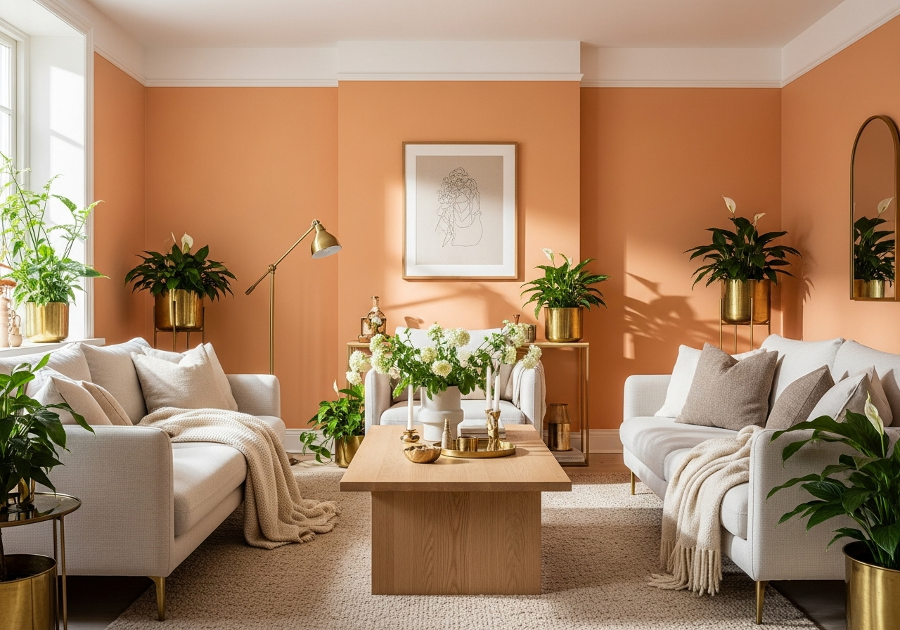
Coordinating Apricot Walls with Your Living Room Elements
Apricot walls can create a stunning backdrop, but pairing them with the right furniture and decor helps ensure the room feels balanced and pulled together. Choosing colors, materials, and textures that harmonize with apricot will bring out its best look and prevent clashes that distract.
Furniture Colors That Work Well with Apricot
- Neutrals: Shades of beige, cream, and soft gray complement apricot by keeping the room calm and airy.
- Wood Tones: Light oak, walnut, and teak furniture add warmth that matches apricot’s inviting feel.
- Blues and Greens: Muted blues like slate or dusty teal contrast apricot nicely, offering a fresh, balanced look.
Textiles and Accessories
Using cushions, throws, and rugs in natural fibers such as linen, cotton, or wool helps add texture without competing against apricot’s warmth. Patterns with soft geometric prints or botanical designs often work well, giving the room personality without overwhelming the eye.
Metal accents in warm gold or brass enhance apricot’s glow and offer a touch of elegance, especially in lighting fixtures, frames, and small decor pieces.
Wall Art and Accent Pieces
Artwork featuring gentle colors can accentuate apricot walls. Avoid overly bright or clashing colors that compete with the wall paint. Instead, lean toward muted pastels or monochrome prints for a harmonious atmosphere.
Consider adding mirrors to reflect light and make the room feel more open. Decorative shelves with plants or ceramics in neutral shades complement apricot without stealing focus.
Balancing Boldness with Softness
Because apricot can be bold, it’s important to balance strong wall colors with softer furniture and decor choices. White or cream upholstered sofas soften the space, while light-colored curtains prevent the room feeling heavy.
The goal is to create a cohesive feel where apricot provides warmth but doesn’t dominate, so the entire room feels inviting and stylish.
Conclusion
Apricot paint color for living rooms is a warm, inviting choice that blends cheerfulness with calm. It works well in bright, medium to large spaces and pairs beautifully with natural elements and soft neutrals. Choosing the right shade requires testing under both natural and artificial lighting, as these conditions change apricot’s appearance.
To make apricot walls shine, select complementary furniture in neutral or muted tones, add textured textiles, and use warm metal accents for balance. Try sample paints on your walls at different times of day before deciding. With careful coordination, apricot walls will create a cozy and stylish living room where you feel truly at home.