Why Paint Color Matters in Kitchen Dining Room Combos
Choosing the right paint colors for a kitchen dining room combo can change how the space feels and functions. When two different areas share one room, the colors you pick help them flow together smoothly or stand out separately. The wrong choice can make the room seem smaller or disjointed, while the right colors open it up and create a welcoming atmosphere.
Colors affect how we feel and behave in a space. In an area where you cook, eat, and gather, the paint sets the tone for your daily routine. It can make you feel calm and focused while cooking or relaxed and happy during meals. These emotional effects happen because of how colors influence mood and even appetite.
Another important point is how paint colors impact the value of your home. Buyers often picture themselves living in the kitchen and dining area. Smooth, attractive color schemes that tie the combo room together can make a strong, positive impression.
A combo kitchen and dining area need different color strategies than two separate rooms. Because they share a space, their colors must bridge function and style. The goal is to create one harmonious room that meets the needs of two activities without confusing the eye.
The Flow Factor: Making Two Spaces Feel Like One
In a kitchen-dining combo, flow means the eye moves naturally between the cooking and eating spots. Paint colors help this by creating a visual connection. If the colors are too different or clash, the areas look disconnected and smaller.
Using similar shades or colors that share undertones helps unify the space. For example, a soft gray wall in the kitchen paired with a matching gray-beige in the dining area invites your gaze across both zones comfortably. This seamless transition makes the room seem larger and more open.
Color Temperature and Appetite: What Science Says
Colors have temperature—warm or cool—that influence appetite and mood. Warm colors like reds, oranges, and yellows tend to stimulate hunger and social energy. This is why many restaurants use warm hues in dining areas.
Cool colors such as blues and greens have a calming effect but can sometimes reduce appetite if overused. For kitchen dining combos, balancing warm and cool tones encourages both energy for cooking and comfort for eating.
Soft warm tones invite conversation and good meals, while cooler shades help keep the space feeling fresh and clean. Combining these temperatures thoughtfully enhances the whole experience in a shared room.
Top Paint Colors for Kitchen Dining Room Combo Success
Trends and data collected from hundreds of kitchen dining combos reveal certain colors that constantly work well. These shades balance style and function, handling light and use variations better than others.
Warm whites are at the top of the list. Shades like Swiss Coffee or Cloud White offer a soft, creamy look with subtle undertones. They brighten the room while keeping it cozy. Whites aren’t just pure; the undertones matter for matching cabinets and flooring.
Soft grays provide a modern yet neutral backdrop. These colors look great with almost any cabinet or countertop material. Gray also creates subtle contrast without overwhelming the senses. It pairs especially well with white trim or wood accents.
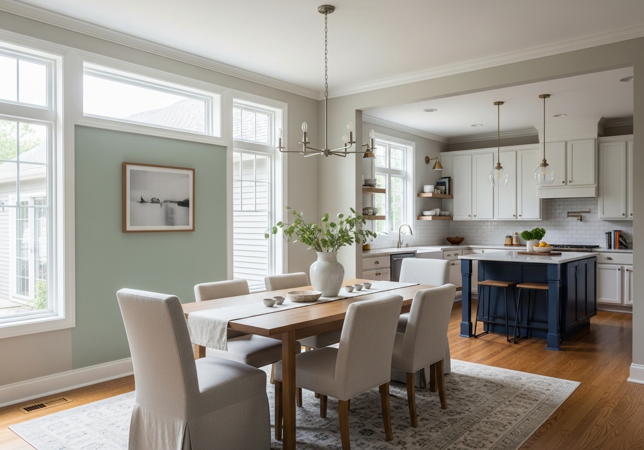
Sage green is another favorite. This muted natural green adds life without shouting for attention. Sage blends well with wood tones and warm metal finishes. It’s trendy but also timeless, growing in popularity for its calming qualities.
Navy blue adds drama but won’t darken the room if chosen carefully. Its deep shade creates a cozy, inviting space that feels rich and elegant. Navy works well as an accent wall or below a chair rail, paired with lighter shades to keep balance.
Warm beiges and greiges give the space comfortable sophistication. These often overlooked colors bridge warm and cool tones within the same room. They bring warmth without intense pigmentation, making them versatile foundations.
Light Neutrals That Never Fail
Light neutrals form the safe, stylish baseline for any kitchen dining combo. Swiss Coffee is a warming off-white with buttery undertones that pairs with nearly everything. Cloud White leans a bit cooler but stays soft and inviting.
Soft gray neutrals like Repose Gray or Agreeable Gray work with both warm and cool elements. They make the room feel spacious and airy while offering flexibility if you want to change accent colors later.
Bold Colors That Actually Work
Sometimes a bold choice is needed for impact. Navy blue or charcoal gray walls add depth, especially in larger combo rooms. These colors help anchor spaces with lighter furniture or accents.
Sage green is bold in a soft way. It’s strong enough to be interesting but won’t overpower light-filled kitchens or bright dining nooks.
Two-Tone Combinations Worth Trying
Using two colors allows you to define each zone subtly. For example, an upper kitchen wall painted warm beige pairs beautifully with a dining room wall in soft gray. This technique keeps the areas distinct yet visually connected.
Another option is navy blue on lower walls or cabinetry paired with warm white or cream walls above. This classic look creates height and dimension while balancing boldness with light.
How Natural and Artificial Light Changes Your Paint Choice
The way light hits your kitchen dining combo can transform paint colors completely. A shade that looks perfect during the day might seem dull or strange under artificial light at night.
Natural daylight varies by the direction your windows face. North-facing rooms get cooler, bluer light, which can make warm colors look dull or gray. South-facing rooms fill with warm, golden sunlight, often bringing out yellow and orange tones in paint.
East-facing rooms receive bright morning light, which makes colors appear crisp and fresh early in the day but softer later on. West-facing rooms get warm afternoon light that can change colors toward deeper, richer hues.
Artificial lighting plays a big role too. Warm incandescent bulbs enhance reds and yellows, making warm tones feel cozy. Cool LED bulbs can push paint colors into cooler ranges, sometimes making whites look bluish or grays look purple.
Fluorescent lights often cast green or blue undertones that alter paint hues, especially in kitchen areas with overhead fixtures. Paint choices must consider the mix of natural and artificial light throughout the day.
Trying paint samples on different walls and observing them at various times is crucial. The same color might behave differently near a window compared to a darker corner lit only by overhead lights.
Conclusion
The best paint colors for kitchen dining room combos blend harmony and function. They create a seamless flow between cooking and eating spaces and set the right mood for family time and meals. Choosing colors that respond well to your light conditions ensures the room feels inviting all day long.
Start by testing light neutrals like warm whites or soft grays as a base. Consider adding sage green or navy blue for interest without overwhelming the space. Observe how your chosen colors look under both natural and artificial light before committing.
Adjust color placement to define zones with two-tone approaches. Remember that paint affects how the space feels and even your appetite, so choose shades that support your lifestyle. Thoughtful choices will make your kitchen dining combo a favorite gathering spot in your home.