What Makes Paint Colors Feel Happy (And Why Your Living Room Needs Them)
Certain colors trigger joy in our brains—it’s science, not just personal taste. Since the living room is where most family time and gatherings happen, the colors you choose here can shape your whole day. Bright, happy colors uplift, calm, and energize, making your living room a positive place to be.
The Science of Color and Happiness
Colors affect us because of the way our brains process light and hue. Warm tones like yellows and oranges stimulate happiness by activating parts of the brain linked to energy and optimism. Cooler tones, such as blues and greens, can make us feel calm and refreshed. Saturation matters too—vibrant colors boost alertness, while soft, muted shades offer a gentle comfort.
Light reflection plays a big role. When sunlight hits brightly painted walls, it scatters light and creates a lively atmosphere. Dark or dull colors absorb light, which can bring down the mood. This is why a well-lit living room painted in happy colors can feel more welcoming and alive.
How Living Room Colors Set Your Home’s Tone
The living room is where you relax, entertain, and connect. Choosing colors that promote happiness turns this space into a sanctuary from daily stress. Warm colors invite laughter and lively chats, while cooler happy tones provide peace and clarity. Your living room sets the tone for your entire home’s vibe—choose colors that reflect joy, comfort, and energy so everyone who enters feels uplifted.
Since this room usually gets a lot of use, creating an atmosphere that supports your mood helps family members and guests feel at ease. The right paint colors don’t just decorate—they transform how you experience your home every day.
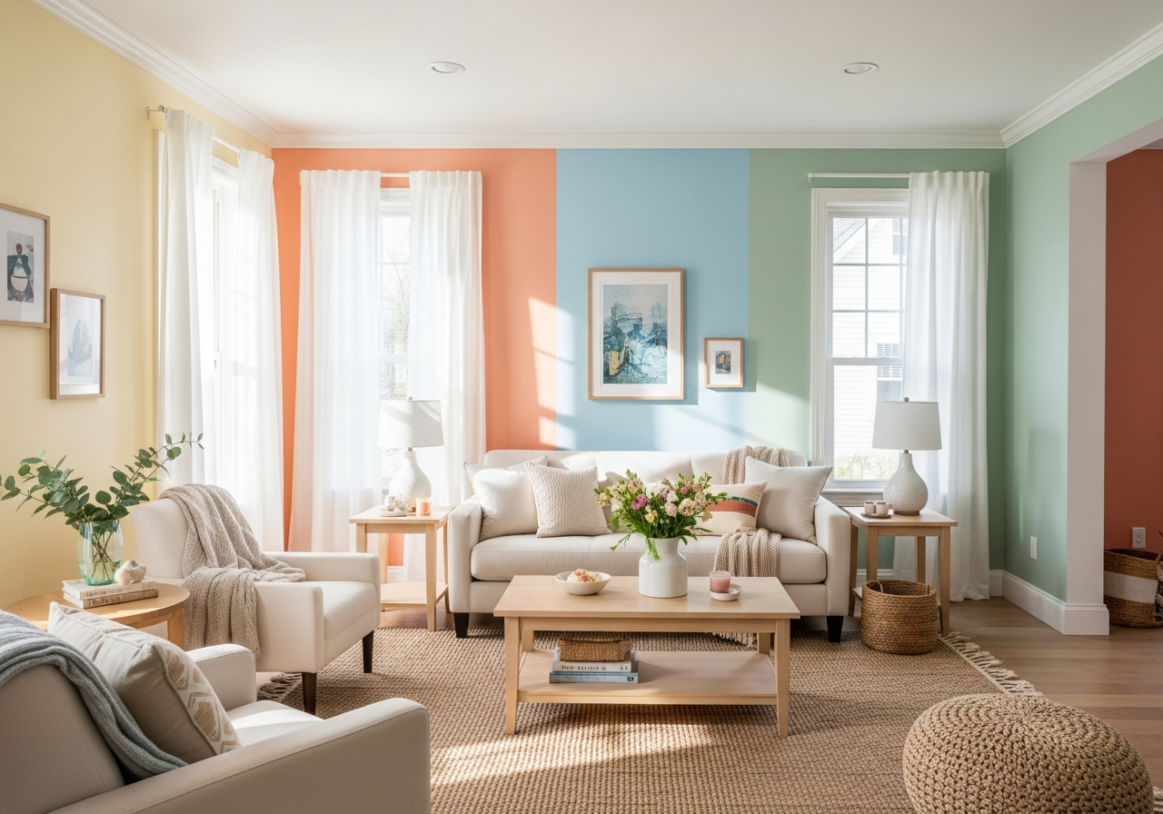
Top Happy Paint Colors for Living Room Walls
Some colors consistently make people smile and brighten any style of living room. Here are seven top paint colors that bring instant joy and warmth to your space.
Warm Colors That Energize
Soft yellows like butter, vanilla, and champagne offer a sunny, uplifting feel. These shades brighten rooms without overwhelming the eye. They create a cozy sense of cheer, making mornings and afternoons feel fresh and bright.
Warm corals and peaches add a playful, inviting touch. They blend red’s energy with a soft, peachy glow to inspire conversation and comfort. These tones make living rooms feel alive and friendly, perfect for gatherings.
Cool Colors That Refresh
Sky blues and aquas bring a breath of fresh air and calm into your living space. These colors help ease stress and invite a peaceful mindset. Their clear, watery vibe reminds us of open skies and calm seas, creating a relaxing retreat.
Sage greens and mint connect us with nature. These shades bring tranquility along with subtle brightness. They feel healing and fresh, perfect for rooms where you want to unwind and recharge without dulling the energy.
Neutral Happy Shades
Warm whites with gentle pink or yellow undertones provide a soft, glowing backdrop that works with any décor. They feel clean, light, and cheerful without feeling cold or sterile.
Soft lavenders carry a quiet happiness, blending blue calmness with a hint of warm purple. They add a gentle color lift that soothes while keeping spirits high.
Terracotta and clay tones bring earthy warmth and richness. These grounded colors welcome guests with their cozy, natural glow, making your living room feel deeply comforting and joyful.
How Natural Light Changes Your Happy Paint Colors
Your living room’s natural light shapes how happy paint colors look throughout the day. A color that delights you in bright sunlight might shift to dull or too intense as the light changes.
North-facing rooms receive cooler, softer light all day. Here, warmer undertones like buttery yellows or soft peaches balance the natural chill, making the room feel cozy and bright.
South-facing rooms soak in warm, direct sunlight, especially midday. Cooler shades such as sky blue or mint thrive in this light, refreshing the space without feeling washed out.
East-facing rooms get bright morning light that warms up colors early in the day. Choose shades that look fresh in strong sunlight, like coral or lavender, to capture energy at dawn.
West-facing rooms receive rich, golden light in late afternoon and evening. Warm terracotta and soft warm whites glow beautifully during this time, creating a restful and inviting atmosphere as the sun sets.
Always test paint samples on your living room walls at different times of day. Look at them in both sunlight and artificial light to make sure the colors stay cheerful and balanced under all lighting conditions.
Techniques to Maximize Happy Colors in Your Living Room
Color doesn’t work alone. How you use it affects how happy it feels. Here are some ways to get the most joy from your chosen paint colors.
Accent Walls and Color Balance
Using a bright, happy color on an accent wall adds energy without overwhelming your senses. It draws focus and creates depth. Pair it with softer neutrals or cooler shades on other walls to keep the room feeling open and balanced.
Combining Colors with Textures and Lighting
Textured fabrics, rugs, and curtains bring out the best in happy colors. Light bouncing off soft textiles adds warmth and movement. Layer your lighting—use dimmers, lamps, and natural light—to shift the mood easily throughout the day.
Matching Colors to Furniture and Decor
Choose happy paint colors that complement your furniture. Warm corals pair well with wooden pieces, while cool aquas look great next to white or metal accents. This harmony makes the room feel intentional and lively.
Common Mistakes to Avoid When Picking Happy Paint Colors
Even happy colors can fall flat if the wrong choices are made. Keep these pitfalls in mind to maintain a joyful and welcoming living room.
- Choosing colors that are too dark: While rich tones can be beautiful, overly dark colors in a busy room may feel heavy and suppress happiness.
- Ignoring natural light: Picking colors without testing them in your room’s light can lead to sadness when the color shifts unexpectedly.
- Overcrowding with too many bright colors: Too many vibrant tones can clash and create visual stress rather than joy.
- Forgetting the room’s purpose: Choosing exuberant colors in a room meant for relaxation may interrupt calm moods.
Conclusion
Happy paint colors for your living room are shades that brighten your mood, energize your space, and create comfort. These colors stimulate positive feelings through science-backed effects on the brain and light reflection. Choosing warm yellows, cool blues, or gentle neutrals suited to your room’s natural light gives your living room a joyful and welcoming atmosphere.
Start by testing samples in your own space, observe how colors change with light during the day, and balance vibrant shades with softer tones. Use accents, textures, and lighting to make the happiness last. This way, your living room will become a bright spot that lifts spirits every time you walk in.