What Makes a Good Painting for Living Room Spaces
Your living room painting sets the mood for the entire space—choose wrong and you’ll cringe every time you walk in. Picking the right painting goes beyond just liking the image. It’s about how that piece fits the room, matches your style, and feels right when you relax or entertain there.
Size Matters: Getting Proportions Right
The first thing to think about is size. A painting too small on a big wall can look lost or insignificant. On the other hand, a giant piece over a tiny sofa can feel overwhelming. Ideally, the painting should fill about 60-75% of the wall space above furniture like a couch or console. This balance helps the artwork become a clear focal point without overpowering the room.
Consider how the painting’s dimensions relate to nearby furniture. A wide sofa calls for a wider piece or a grouping of smaller artworks arranged together. If the ceiling is high, taller artwork can add drama and draw the eye upward. But keep in mind the overall visual weight — heavy frames or very bold colors might call for slightly smaller sizes to maintain harmony.
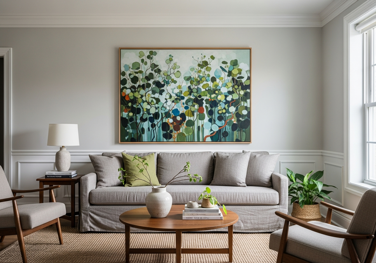
Color Psychology in Living Room Art
Colors in your living room painting affect mood more than we often realize. Warm tones like reds, oranges, and yellows can energize and invite conversation. Cool tones such as blues and greens tend to calm and relax, making them a good choice if you want your living room to feel peaceful.
The painting’s palette should connect with the room’s existing colors. If the living room uses neutral shades, a painting with pops of color can add interest without clashing. If the decor is already rich in color, a more muted or complementary palette helps avoid visual chaos.
Also think about how lighting changes colors at different times of day. Some tones might look vibrant in sunlight but dull under artificial light. Testing the painting in your actual room lighting helps ensure the colors work all day long.
Overall, a good painting balances personal meaning with design sense. If you love a piece but it doesn’t quite fit the room, either choose a different spot or adjust the surrounding decor. The best paintings feel like they belong.
Types of Paintings That Work Best in Living Rooms
Not all art belongs above your couch. Some styles naturally fit living spaces while others fight against the room’s purpose. Knowing which paintings suit living rooms helps you pick art that adds comfort, style, and personality without disrupting flow.
Abstract Art: Safe or Boring?
Abstract paintings come in many forms — from wild splashes of color to subtle shapes. They’re flexible because they don’t tell a story, leaving interpretation open to the viewer. This can be a huge advantage in living rooms used by many people with varied tastes.
Abstract art often fits well in modern or eclectic decor. Its colors can complement furniture and accessories without clashing with patterns or themes. However, very muted or monochrome abstract pieces risk feeling dull or uninspired if the room lacks energy. Bright abstracts add a pop of life but can upstage furniture or other decor.
When choosing abstract art, think about what mood you want. Energetic brush strokes can make the room feel more vibrant, while gentle curves and soft hues bring calm.
Nature Scenes That Actually Work
Landscape paintings and nature scenes are classic choices for living rooms because they create a sense of peace and openness. Scenes like forests, beaches, or mountains invite relaxation and fresh air, even indoors.
Soft, natural colors in these paintings often blend well with earthy or neutral interiors. Art showing a horizon or water reflections can visually expand the space. Landscapes also offer familiarity that many find comforting without being boring.
However, avoid overly busy or dark nature pictures. They can make the room feel smaller or tense. Instead, pick images with clear focal points and balanced composition.
When Bold Art Makes Sense
Sometimes you want the painting to be a statement piece that grabs attention and sparks conversation. Bold portraits, colorful mixed media, or large single images in vivid hues can energize the room and express personality.
These pieces work best in rooms where other elements are simpler or more neutral, so the artwork shines without overwhelming. Mixed media art with texture adds depth and interest, especially on flat walls.
Bold art encourages engagement and can reflect your style, but it requires confidence—both yours and from anyone sharing the space. When in doubt, try balancing bold art with calming colors or minimalism elsewhere to keep the vibe welcoming.
How Lighting Changes Your Painting’s Impact
That stunning gallery piece might look terrible in your living room if the lighting’s wrong. Lighting affects not just how bright a painting appears but how its colors and details come through. Understanding this helps you avoid costly mistakes and enjoy your art fully.
Testing Light Conditions Before Buying
Before you buy, try viewing the painting under the exact lighting conditions in your living room. This means checking it in daylight and after dark with your typical lamps or overhead lights. A painting that looks bright and vibrant in a store may lose impact or appear dull in your home’s light.
Pay attention to glare and reflections, especially if the painting is behind glass or has a glossy finish. Light that hits the painting at certain angles can hide important details or create distracting shine. Matte finishes tend to reduce this, but each room and setup is unique.
Consider how natural light changes through the day. Morning and afternoon sun cast different tones. If a painting catches direct sunlight, its colors might fade faster or feel too harsh. Position paintings on walls with indirect or filtered sunlight for longevity and comfort.
The color of artificial light influences how you see paintings too. Warm lights bring out reds and yellows, while cool lights highlight blues and greens. Mixing light sources can complicate this, so a consistent lighting scheme often works best.
Conclusion
A good painting for your living room matches your room’s size, colors, and style while connecting with you personally. It balances mood and design to feel both comfortable and inspiring.
Choose art proportional to your wall and furniture, consider color effects in your lighting, and pick a style that fits your taste and space. Test how the painting looks in your actual room before deciding. This ensures your living room stays a welcoming place you enjoy every day.