Best Paint Colors for Open Concept Kitchen and Living Room Spaces
Choosing the right paint colors for an open concept kitchen and living room can change how your space feels and functions. A well-chosen color palette helps tie the two areas together while giving each its own charm. Since the spaces flow into one another without walls, the colors you pick will affect everything from size perception to mood. This guide will break down why color matters so much in open layouts and show you some of the best paint options to bring harmony and style into your home.
1. Why Paint Colors Matter More in Open Concept Spaces
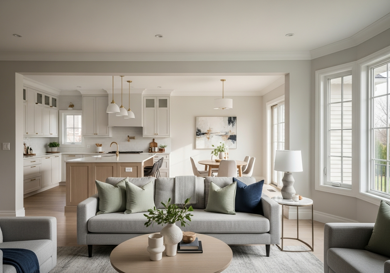
Open floor plans require a thoughtful approach to color because the kitchen and living room must feel connected yet distinct. If you use paint colors that clash or don’t complement each other, the whole space can look disjointed or confusing. Good color choices create a smooth visual flow that lets you move between zones naturally. You also want colors that help the space feel larger and invite light to bounce around freely. Since walls don’t create separation, paint must do the work of defining areas without closing them off. This makes picking the right tones key to a welcoming, balanced open concept.
The Psychology of Color in Connected Spaces
Colors influence mood and perception, which is why they are powerful in open layouts. Soft, warm tones tend to feel cozy and inviting, perfect for living areas where people relax and gather. Cooler colors in the kitchen can make it feel clean and refreshing, encouraging appetite and activity. When these colors harmonize, they promote comfort and flow, letting each space keep its personality while feeling part of a larger whole. Bright or bold colors can energize one zone but need careful use to avoid overpowering the other areas.
How Paint Creates Invisible Boundaries
Paint colors act like subtle borders in an open plan, helping your eye recognize one space from another even without walls. Using different shades or finishes lets you set zones in open rooms. For example, you could pick a calming gray for the living room and a soft beige in the kitchen to separate the spaces in a gentle way. Accent walls with a contrasting color also define specific areas like dining spots or kitchen islands. These invisible boundaries give structure and purpose while keeping the openness intact.
2. Top Paint Colors for Open Concept Kitchen and Living Room Combinations
Some paint colors consistently perform well in open concept spaces. These palettes create hairstyling harmony and feel right every time. Choosing materials that work both together and separately means you don’t have to second-guess your color decisions. Whether you want neutral tones or something trending, these tried-and-true options provide a reliable base to build your look on.
Classic Neutrals That Never Fail
Neutrals like beige, taupe, and greige offer a warm, calming backdrop for any open area. These colors reflect light well and make rooms feel bigger. Taupe combines soft brown and gray, adding complexity without overwhelming. Beige is timeless and works in nearly all lighting conditions. Greige blends gray and beige to give a modern neutral that complements both cool and warm accents. Neutrals are flexible choices that set the stage for colorful furniture or bold accents later.
Modern Color Combinations
If you want a fresher look, pair cool grays and soft whites for a crisp, clean vibe. Light gray walls with white trim keep spaces open and airy. For a richer modern palette, add deep navy or charcoal as an accent. Earth tones such as olive green or terracotta bring nature indoors and blend well with wooden floors or plants. Two-tone schemes—like a pale upper wall with a darker lower half—offer subtle depth and visually divide open rooms without adding clutter.
Trending Colors for 2024
This year’s popular colors include warm creams, muted sage, and soft blush tones. These shades bring warmth and softness to large, connected rooms. Warm creams brighten the space without harshness, while muted sage ties into natural elements. Soft blush adds a gentle, unexpected touch that pairs well with gold or brass hardware. Bold accent walls in deep emerald or burnt orange are gaining traction for those who want a standout feature without overpowering the openness.
3. How to Choose Paint Colors Based on Your Lighting
Lighting changes how paint looks, so it’s essential to consider your home’s light before picking colors. A shade that seems perfect in the store may shift dramatically once applied. Whether your space faces north or south, or uses LED or warmer bulbs, your paint will reflect the light differently throughout the day. Testing samples at various times lets you find colors that look good morning to night and complement your natural and artificial light sources.
Natural Light Assessment
Assess the direction your kitchen and living room face. South-facing rooms get abundant sunlight, which highlights true paint colors but can also reveal imperfections. North-facing rooms tend to have cooler and dimmer light, making warm colors feel even warmer and cooler hues more subdued. Window size and position also affect light flow. Large windows brighten spaces, which means you can handle darker or bolder colors without making the room feel cramped.
Artificial Light Considerations
Artificial light temperature influences how paint colors appear after sunset. Warm bulbs cast a yellow or orange glow that can soften cool colors but make whites and grays appear creamy or yellow-tinted. LED lights often provide clearer, cooler light that shows colors closer to how they look in daylight. Consider the balance of lightbulbs in your kitchen and living room to pick colors that won’t shift too much under your main fixtures. Combining dimmable lights with neutral paint lets you control mood easily.
Conclusion
Choosing the best paint colors for open concept kitchen and living room spaces means finding shades that connect the areas while defining each one. Colors influence size perception, light distribution, and mood, which makes picking the right palette crucial for harmony.
Start by examining your lighting and testing samples at different times of day. Consider classic neutrals or trending warm tones for a reliable foundation. Use color to create subtle zones without walls, and don’t hesitate to add accents that bring personality. With these steps, you can create an open space that feels welcoming and balanced.