Best Colors to Paint Your Room Based on Room Type
The right paint color can make a small bedroom feel bigger or turn a cold living room into a cozy retreat. Different rooms have different moods, so choosing the best color helps create the right atmosphere for each space.
Bedroom Paint Colors for Better Sleep
Bedrooms are meant for rest and relaxation, so calm colors are usually the best choice. Soft blues and greens help slow the heart rate and lower stress, making it easier to fall asleep. Muted lavenders and grays can also create a peaceful setting. Avoid bright reds or oranges here because they are energizing and might keep you awake. Choosing cooler tones can help the brain wind down after a long day.
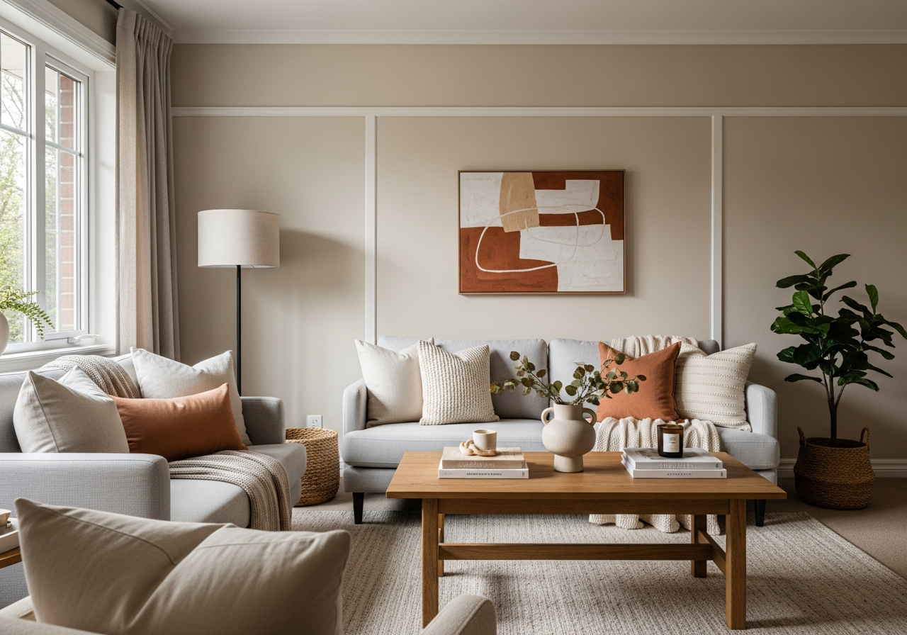
Living Room Colors That Welcome Guests
The living room is a social space where people gather to talk and relax together. Warm neutrals like beige, soft taupe, or light gray create a neutral background that feels welcoming and comfortable. Warm tones such as muted yellows or gentle orange-browns encourage conversation without feeling overwhelming. Blues can also work well, especially softer or dusty shades, because they add calmness while still feeling inviting. The key is balancing warmth and calm so everyone feels at ease.
Kitchen Colors for Morning Energy
The kitchen is a place of activity and energy, especially in the morning. Colors that boost appetite and alertness work well here. Bright yellows stimulate happiness and energy, while fresh greens remind us of nature and freshness—good choices for kitchens. Crisp whites make spaces look clean and wide open. Red can influence appetite but is best used in small accents since it is very intense. Light blues or aqua tones add brightness without taking away the kitchen’s lively spirit.
Bathroom Colors for Spa-Like Relaxation
Bathrooms benefit from colors that create a soothing, spa-like atmosphere. Soft blues and seafoam greens mimic the calm of water and nature. Muted grays and whites keep things clean and fresh, perfect for smaller bathrooms. Pale lavender or blush pink adds a gentle touch of softness. Avoid bright or overly dark colors which can make a small bathroom feel cramped or harsh.
Home Office Colors for Focus and Productivity
For home offices, colors that encourage concentration without causing fatigue work best. Light blues and greens reduce anxiety and promote clear thinking. Muted yellows add a touch of optimism and creativity without being distracting. Avoid overly bright reds or orange hues as they can increase stress. Neutral grays paired with colorful accents can create a balanced workspace that feels both professional and inspiring.
How Room Lighting Changes Your Paint Color Choice
The perfect paint color can look very different depending on the lighting in the room. A shade you loved on a paint chip might appear darker, lighter, or even change tone when on your walls. Understanding lighting can save you time and headaches.
Natural Light Direction and Paint Selection
Rooms facing north get cooler, bluer natural light throughout the day. This can make paint colors appear cooler and sometimes duller. Warm shades like soft yellows or warm neutrals work well here to counterbalance that chill. South-facing rooms get warmer, brighter light which makes colors look more vibrant. Cooler hues like blues and greens can feel refreshing in these rooms. East-facing rooms have bright early light that warms up quickly, while west-facing rooms bathe in golden light later in the day, often making colors appear richer.
Artificial Lighting Types and Color Temperature
Artificial bulbs impact paint colors differently based on their color temperature. Incandescent bulbs give off a warm, yellowish glow that makes reds, oranges, and yellows stand out but can dull blues and greens. Fluorescent lights are cooler and can bring out greens and blues but make warm tones look washed out. LED bulbs come in many temperatures—from warm to cool—so choose bulbs that complement your paint choice. Using more than one type of light source in a room helps balance how colors appear and adds depth through shadow and highlights.
Testing paint samples on your walls and observing them at different times—morning, afternoon, and evening—is the best way to see how light changes the color. This simple step prevents surprises once painting begins.
Popular Paint Color Families and Their Effects
Colors can shape how a room feels. Different paint families bring their own moods and personality to your space.
Neutral Colors for Flexibility
Neutral colors like whites, grays, and beiges are the most flexible options. They create clean, calm backgrounds that make furnishings and art pop. Whites open up rooms and bring in brightness, though too much can feel sterile. Grays range from warm to cool tones and pair easily with other colors for modern or classic styles. Beiges add warmth and softness without overpowering other design elements.
Cool Colors for Calm Spaces
Blues, greens, and purples generally have a calming effect. Blue is one of the most popular choices for bedrooms and bathrooms because it lowers blood pressure and reduces anxiety. Green brings freshness and balance, ideal for living rooms or offices. Purple, especially in lighter shades like lavender, adds gentle elegance and peace.
Warm Colors for Energy
Reds, oranges, and yellows create energy and warmth but should be used with care. Bright reds bring passion and excitement but can feel overwhelming in large amounts. Soft reds or terracotta bring cozy warmth. Oranges stimulate creativity and socializing, making them good accent colors. Yellows uplift and brighten but work best in muted tones to avoid eye strain.
Dark Colors for Drama and Coziness
Dark colors like deep navy, charcoal, or forest green create drama and a sense of coziness. They work well in rooms where you want intimacy or elegance, such as dining rooms or libraries. Dark colors make walls recede visually, making spacious rooms feel more inviting. Use them on an accent wall or paired with lighter trim for contrast.
Light Colors for Spacious Feeling
Light colors like pale pastels or soft white shades expand a room visually. They bounce light around to make small spaces feel bigger and airier. Pastels also add subtle color without overwhelming. These shades work well in bedrooms, kitchens, and bathrooms where a clean, open feeling is desired.
Conclusion
The best colors to paint your room depend on the room’s purpose and how you want to feel there. Calming blues suit bedrooms for better sleep, warm neutrals create inviting living rooms, and fresh yellows energize kitchens. Light and lighting also change how paint looks, so testing colors at different times is crucial. Popular color families offer flexible options from soothing neutrals to bold darks.
Start by thinking about what mood you want your room to evoke. Then consider how much natural and artificial light you get daily. Finally, test samples on your walls before committing. These steps will help you choose colors that fit your space and style perfectly.