
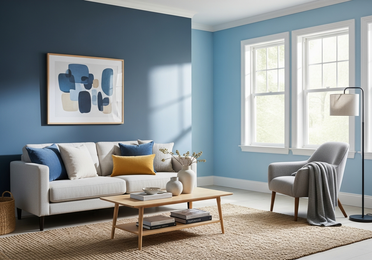

Why Choose Blue Color Paint for Living Room Walls
Blue paint brings instant calm and sophistication to any living room, making it a popular choice for homeowners seeking a fresh look. Its calming influence, combined with its ability to fit various styles, makes blue a dependable way to create a welcoming and balanced space.
The Psychology Behind Blue in Living Spaces
Blue is often linked with feelings of tranquility and peace. This color naturally slows the heart rate and can lower stress levels, helping create a relaxing environment. That’s why blue is often used in rooms where calm and focus are desired. In a living room, blue walls can promote a cozy yet airy vibe. It’s a color that invites you to sit back and relax, making it ideal for communal spaces where people gather to unwind.
Aside from calming effects, blue also invokes stability and trust. It’s a color that often translates well across cultures as soothing and reliable. This timeless association means blue won’t just look good today but can age gracefully without feeling out of style.
How Blue Paint Affects Room Perception
Blue has a unique way of influencing how we perceive space. It tends to recede visually, making walls feel farther away and therefore creating a sense of openness. This quality can make smaller rooms appear larger and airier. The color’s cool undertones also bounce light around the room differently than warm hues, giving the space an inviting glow.
Because blue reflects light in a subtle, muted way, it helps avoid harsh shadows and contrasts. This effect makes the entire room feel more balanced and spacious. Whether your living room faces a lot of natural light or uses artificial sources primarily, blue can enhance the feeling of openness.
Unlike many trend-driven colors, blue strikes a balance between classic and modern. It holds both timeless charm and fresh appeal, letting your space remain stylish without frequent redecorating.
Best Shades of Blue Paint for Different Living Room Styles
Choosing the right shade of blue sets the tone for your entire living room. Whether you want a soft, breezy look or a bold, dramatic feel, the shade you pick should support the atmosphere you want to create and complement your existing décor.
Light Blues for Airy, Open Spaces
Soft blues, like powder blue or sky blue, work beautifully in coastal and cottage-style rooms. These hues capture the calmness of the sky or sea and pair well with whites or natural wood tones. They make a room feel light and spacious, perfect for creating that open, fresh-air vibe associated with beach houses or rustic retreats.
In spaces with lots of windows or bright exposure, light blue can amplify the daylight and add a cooling effect during warmer months. These shades feel friendly and inviting without overpowering other design details.
Deep Blues for Cozy, Intimate Settings
Dark blues, such as navy or midnight blue, bring in a sense of warmth and sophistication. They’re great for traditional or modern rooms that want to feel cozy without being heavy. Navy walls make accents and furnishings pop, especially when paired with metallics like gold or brass.
These shades work well in larger rooms or spaces with ample lighting, as they can feel a bit overwhelming in smaller or dimly lit rooms. They encourage a gathering-friendly atmosphere, ideal for evenings when the goal is relaxation or focused conversations.
Versatile Mid-Tone Blues
Mid-tone blues strike a balance between light and dark, offering a versatile background for many design styles. Shades like denim or steel blue fit transitional rooms where modern elements meet traditional touches. They soften sharp contrasts and create unity among varying textures and furnishings.
These blues work especially well in spaces designed for multitasking—living rooms that serve as play areas, home offices, or casual gathering spots. They provide enough color to keep the room lively without distracting from the room’s purpose.
Gray-Blues for Contemporary Looks
Gray-blue tones lean cool and modern. They add subtle color while maintaining a neutral base, making them a favorite in contemporary and minimalist interiors. These shades pair nicely with sleek furniture, clean lines, and metallic accents.
Because they are close to neutrals, they allow for flexibility in changing décor without needing to repaint. They’re perfect for those who want a hint of color but prefer calm, understated environments.
How Natural and Artificial Light Changes Blue Paint Colors
Blue paint can look very different depending on the lighting in your living room. What seems perfect on a paint chip may suddenly feel cold or dull once on your walls. Understanding how light interacts with your blue shade helps avoid surprises and ensures the color does what you expect.
Testing Blue Paint in Your Lighting Conditions
To truly see a blue paint’s effect, sample it on your walls and observe it throughout the day. Morning sunlight casts a cooler tone, while afternoon light warms up the space. Evening and artificial lighting can either enhance or mute the blue, depending on the light’s color temperature.
Paint just a 3-foot square on different walls, and check the color at various times. Moving around the room to see the paint from multiple angles helps you catch any unintended color shifts caused by natural or artificial light.
Adjusting for Room Orientation
North-facing rooms tend to have cooler, softer natural light all day, which can make blue tones appear more muted or grayish. In these spaces, choosing a blue with warmer undertones or adding warmer accents counteracts this effect, keeping the room inviting.
South-facing rooms receive strong, direct sunlight for much of the day, which brightens blue paint and intensifies its color. Dark blues can feel almost electric in this light, so picking slightly toned-down shades helps maintain balance.
East-facing rooms enjoy morning light that is warm and gentle, ideal for softer blues that reflect the early sun’s warmth. West-facing rooms get warm evening light, which can enhance the richness of deep blue walls, adding glow and comfort.
Impact of LED vs Warm Bulbs
Artificial lighting also changes how blue paint looks. LED bulbs with cool white light tend to emphasize the blue tones, making them appear brighter and more vibrant. Warm bulbs, which cast a yellowish hue, soften blue walls and can make them lean closer to gray or green.
Using multiple light sources, such as overhead fixtures combined with lamps, helps create an even balance that allows the blue walls to look their best at any time of day.
Conclusion
Blue color paint for living room walls brings calm, spaciousness, and style to your home. It offers timeless appeal that fits many design looks and changes beautifully with light to enhance your space’s mood. Picking the right blue shade involves considering your room style and lighting carefully.
Start by testing paint samples on your walls throughout the day. Think about the mood you want to set and match shades accordingly—soft blues for airiness, dark blues for coziness, or versatile mid-tones for balance. Be aware of your room’s natural light and the kind of artificial lighting you’ll use. These steps help ensure your chosen blue feels just right, turning your living room into a welcoming retreat.