
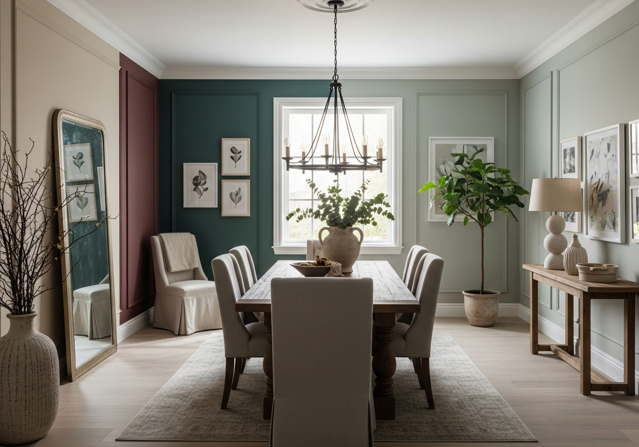

Why Popular Dining Room Paint Colors Matter for Your Home
The right paint color can turn your dining room from a plain box into the heart of your home. This space deserves more than just leftover paint from other rooms. A well-chosen color affects much more than looks—it shapes how you feel, eat, and connect with others.
Colors play a powerful role in our moods and even our appetites. Bright reds and deep oranges can stimulate hunger, making meals feel more satisfying. Softer, cooler tones tend to calm the space, setting a relaxed tone for conversation and connection. The color you pick can encourage lively talks or quiet, cozy dinners.
Light changes throughout the day, and your paint color reacts with it. Natural sunlight brings out different shades and tones, while artificial lighting adds warmth or coolness in the evenings. Picking a color with these shifts in mind helps your dining room stay inviting at all times.
Because dining rooms combine family moments, meals, and style, they need careful color thinking. Unlike a bedroom or office, the dining room faces unique needs for sociability, appetite enhancement, and warmth. A popular dining room paint color is one that balances all these demands beautifully.
The Psychology Behind Dining Room Colors
Colors impact our brain in ways we might not realize. Reds and oranges are known to raise energy and trigger a hunger response. That’s why many restaurants use these shades. In a home dining room, these colors can make food appear more tempting and meals feel more exciting.
Blues and greens bring calmness and help lower stress. These can encourage relaxed meals with peaceful, steady conversations. Yellow boosts optimism and friendliness, making the room feel sunny and welcoming.
Understanding these effects helps you pick a color that matches how you want your dining room to feel. Whether you want families to gather with laughter or unwind quietly after a long day, the psychology of color guides your choice.
How Paint Changes Your Room’s Feel
Beyond mood, paint shapes the room’s physical sense. Light colors can open up small spaces, making your dining room feel larger and airier. Dark colors add depth and intimacy but might make the space seem smaller if it lacks natural light.
Warm colors like yellows and reds make spaces feel cozier and closer. Cool colors such as blue and gray tend to push walls further away, creating a spacious, modern vibe. Paint can highlight architectural details or smooth over imperfections, depending on its tone and finish.
The right paint also blends with furniture and decor styles. Traditional wooden tables call for warm, rich shades, while minimalist glass or metal furniture pairs better with crisp neutrals or monochromes. Understanding how paint works in your dining room’s flow is key to shaping the right atmosphere.
Top 10 Popular Dining Room Paint Colors Right Now
These colors aren’t just pretty—they’re tried and true picks that designers and homeowners keep choosing. They balance trends with timeless style, helping any dining room look fresh and inviting.
Warm Colors That Create Cozy Vibes
Warm neutrals remain a favorite for good reasons. Shades like beige, greige, and warm gray create a soothing canvas that enhances wood tones and soft lighting. These colors work well with classic, rustic, and modern styles, bringing comfort and a touch of elegance.
Bold jewel tones like emerald and burgundy add rich drama without overwhelming the room. Emerald green feels luxurious and grounded, while burgundy brings a warm, welcoming feeling perfect for meals with family. Sapphire blue adds depth with a regal touch, encouraging focus and calm.
Cool Colors for Modern Spaces
Soft earth tones such as sage and terracotta blend warmth and freshness. Sage green creates a peaceful, natural feel and pairs beautifully with plants or wooden furniture. Terracotta brings warmth and vibrancy reminiscent of sunbaked clay pottery. Ochre introduces golden, sunny undertones that brighten the space quietly.
Dramatic dark shades like charcoal, navy, and even black paint dining rooms in bold style. Charcoal is soft and mysterious, making spaces feel intimate but not gloomy. Navy adds a classic, soothing depth that matches a variety of decorating approaches. Black walls require careful lighting, but when done right, they create a stunning backdrop for artwork and table settings.
Neutral Shades That Never Go Out of Style
Classic whites and off-whites never lose their charm. They brighten the room, reflect light effectively, and act as perfect partners to colorful art or patterned textiles. Whites can make a dining room feel clean, spacious, and stylish in any season.
Neutrals like greige blend gray and beige to achieve a balanced tone that warms without dominating. These colors provide a muted backdrop that complements most furniture finishes, from polished wood to brushed metal. They also offer flexibility if you like to change your room’s look by swapping accents or decor.
How to Pick the Perfect Paint Color for Your Dining Room
Finding the right paint color isn’t about following the latest trend. It’s about what works best for your room’s light, furniture, and how you live there. Thoughtful testing and observation can save you from costly mistakes.
Start by trying paint samples on your walls. Testing them at different times of day shows how sunlight and artificial light affect the shade. This helps avoid surprises. A color that looks perfect in bright daylight may feel dull or harsh under evening light.
Next, consider what furniture you have. Colors should either complement your dining table and chairs or create a contrasting statement. Dark woods work well with lighter, warm neutrals, while light or painted furniture pairs nicely with deeper or cooler tones.
Room size and ceiling height change how colors look. Small rooms benefit from lighter shades that bounce light around, while large spaces can handle darker or richer paint. Low ceilings pair better with pale colors to keep the space from feeling cramped.
Don’t forget how your dining room connects to other rooms. Colors should flow naturally into adjacent spaces to avoid awkward jumps in mood or style. You might pick a shade in the same tonal family or a complementary color that creates harmony.
Finally, look at your flooring and trim. Warm wood floors call for warm paint colors or balanced neutrals. Cool tile or stone floors can be matched with cool grays or blues. White or off-white trim works with nearly every wall color, but very bright or very dark walls may need special care to avoid harsh contrasts.
Conclusion
Popular dining room paint colors can change how the room feels, looks, and functions. These hues affect mood, light, and appetite, helping create spaces that invite good food and good company.
Choosing the perfect color involves understanding your room’s light, size, furniture, and connection to other spaces. Testing samples and considering warm, cool, or neutral tones helps you make a comfortable, lasting choice.
Begin by gathering paint samples and observing them in your dining room’s light. Think about the style and color of your furniture and the feeling you want to create. Match your selection to flooring and trim while keeping harmony with nearby rooms for a seamless look.