Popular Paint Colors for Living Room and Dining Room Combos
The right paint colors can make your living and dining spaces feel twice as big and three times as inviting. Choosing the shades that suit both these connected areas is key to creating a warm and balanced home. Some colors help open up the space, while others bring in personality and mood.
Neutral Colors That Never Go Out of Style
Neutrals remain a dependable choice for living and dining rooms. Shades like greige—a perfect mix of gray and beige—offer subtle warmth without becoming overpowering. Taupe and soft beige add a cozy feel that makes an area feel welcoming but stays elegant at the same time. These tones work beautifully because they act as a gentle backdrop, letting your furniture and décor shine.
Warm neutrals tend to harmonize well in open floor plans by creating a continuous flow between living and dining areas. They soften the transition between spaces, making the entire room feel connected rather than segmented. Also, their understated elegance ensures that lighting changes won’t dramatically shift their look.
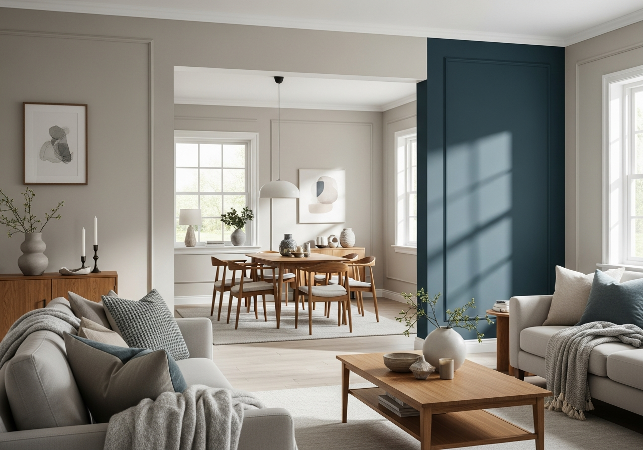
Bold Colors for the Brave Homeowner
Bold colors like deep navy, rich emerald, or even daring terracotta can add instant character to your combined living and dining spaces. People who want to make a strong statement sometimes use these shades for a feature wall or partial accent. This approach adds depth while keeping the rooms balanced with lighter opposing walls.
Using bold colors is a smart way to highlight a dining area or define a seating section in a living room without closing off the space visually. These colors often work well alongside soft neutral elements to prevent the rooms from feeling too intense or cramped. Just one or two highlight walls can make a dramatic yet tasteful difference.
Popular cool classics like soft gray, sage green, and dusty blue are safe bets for those who want color without overwhelming brightness. These hues combine well with warm wood tones and natural textures in furniture, tying living and dining areas together in a calm and composed environment.
How to Choose Colors That Flow Between Rooms
Getting your living room and dining room colors to play nice together isn’t rocket science—you just need to know a few simple tricks. The goal is usually to keep a sense of unity between the spaces without everything blending into one flat color.
The Three-Color Rule That Always Works
The 60-30-10 rule is a reliable formula for picking paint colors that work well in multiple connected rooms. It means using a main color (60%) across most walls, a secondary color (30%) on smaller surfaces like an accent wall or big pieces of furniture, and a bright or bold accent (10%) for smaller decor or trims.
This balance keeps your rooms feeling connected yet interesting. For example, you might paint both rooms in a soft warm neutral (the 60%), then use a cooler gray on one wall in the dining area (30%), and finally add pops of deep blue or gold elsewhere (10%) for warmth and contrast.
Testing Paint Samples Like a Pro
Before making a final choice, it’s wise to test several paint colors on your walls. Paint large swatches and observe them at different times of day under natural and artificial lighting. Colors often shift dramatically, so what looks good in a bright morning can appear dull or harsh at night.
Also, view samples with your existing furniture and flooring in mind. A color that looks amazing on its own might clash with the tones of your carpets, wood grain, or upholstery. Choose shades with similar undertones—either warm or cool—so everything feels intentional and coordinated.
Keep in mind, a perfect color flow isn’t about matching paint exactly but about creating subtle connections. For instance, if your living room uses a dusty blue, carrying that tone into throw pillows or table decor in the dining room can tie the spaces together beautifully.
Lighting and How It Changes Your Paint Colors
That gorgeous gray you picked might look purple at night, and your perfect beige could turn pink by sunset. Here’s why lighting matters more than you think when choosing paint colors for your living and dining rooms.
Natural Light and Its Effect on Paint
The direction your room faces plays a huge role in how paint looks throughout the day. North-facing rooms get cooler, bluer light which can make your walls seem colder or slightly dimmer. Warm tones may appear muted or even chalky here.
South-facing rooms receive abundant sunlight, which can bring out the warmer undertones in your paint. Beige or greige walls may glow warmly in the afternoon sunshine but might seem stronger or more yellow than anticipated.
East and west-facing rooms show colors very differently at morning and evening. A peach or pink undertone may be subdued in morning light but more prominent by evening. Understanding the natural light cycle in your space helps you select colors that stay flattering all day.
Choosing the Right Bulbs to Match Your Paint
Artificial lighting also affects how paint appears, especially when natural light fades. Warm LED bulbs cast a yellowish glow, which can enhance warm wall colors but may dull cool tones like blue or gray. On the other hand, cool white or daylight bulbs bring out blues and greens but may make warm colors feel harsh or washed out.
Consider layering your lighting with a mix of ceiling lights, table lamps, and wall sconces. Each type of light can highlight your paint differently and create a balanced appearance. Dimmable bulbs are helpful because they let you adjust brightness and see how colors respond under varied light levels.
Before committing, check how your chosen colors react to both the natural light and your lighting fixtures. This testing ensures your living and dining rooms always feel welcoming and true to your vision, no matter the hour.
Conclusion
The best paint colors for living room and dining room spaces blend warmth, style, and flow. Using timeless neutrals or cool classics can create a calm, connected background, while bold accents add character and interest. Choosing colors that work across both rooms involves understanding balance, lighting, and the mix of undertones.
Start by picking a main color with matching undertones, use the 60-30-10 rule to balance accents, and always test samples under your room’s natural and artificial light. Keep an eye on your furniture and flooring colors to ensure harmony. Taking these steps will help you create inviting, beautiful spaces you enjoy living in every day.