Why Media Room Paint Colors Matter More Than You Think
The right media room paint colors can transform your viewing experience from ordinary to cinematic, while the wrong choice can leave you squinting through glare and washed-out images. Paint isn’t just about style—it plays a crucial role in how well you see your screen, how comfortable your eyes feel, and even the mood of the room.
Colors affect picture quality and contrast by controlling how light behaves inside the room. Bright walls reflect light, causing glare and reducing the sharpness of images on the screen. On the other hand, darker shades absorb light, minimizing reflections and making colors pop.
Eye strain is another factor to consider. A media room is often used for long viewing sessions. Walls that bounce light around too much can tire your eyes faster and distract from the content. Choosing the right paint color helps reduce this fatigue, making every movie or game night more enjoyable.
Beyond technical function, paint colors set the stage for a true theater vibe. A dark, rich shade creates an immersive atmosphere that makes you feel part of the scene. It shapes the whole experience, from the moment you enter the room to the final credits.
The Science Behind Light Reflection in Media Rooms
Light Reflectance Value, or LRV, measures how much light a paint color reflects on a scale from 0 to 100. A low LRV (closer to 0) means the color absorbs more light, while a high LRV (closer to 100) means it reflects more. For media rooms, colors with low LRVs are preferred because they reduce the amount of stray light interfering with the screen.
Darker colors like deep charcoal or black have low LRVs that help prevent glare and keep the picture looking sharp. Even small improvements in contrast can heighten the detail you see on the screen, especially in darker scenes.
Paint Finish Matters as Much as Color
It’s not just about the shade you pick; the finish of the paint significantly influences your viewing comfort. Matte finishes are ideal in media rooms because they diffuse light rather than reflecting it directly back. This means less glare and a smoother viewing experience.
Glossy or semi-gloss paints, while easier to clean, can cause distracting reflections from your screen or room lighting. They may look bright and polished in other spaces but often work against you in a media room.
Some paint finishes also help with sound quality by absorbing sound waves instead of bouncing them around. This can reduce echoes and improve clarity, complementing your audio setup.
Top Media Room Paint Colors That Professionals Recommend
From classic theater black to sophisticated navy blue, these proven paint colors deliver the perfect balance of style and performance for your media room. Each option offers unique benefits for light control and ambiance, making them favorites among designers and home theater enthusiasts.
Classic Black and Why It Works
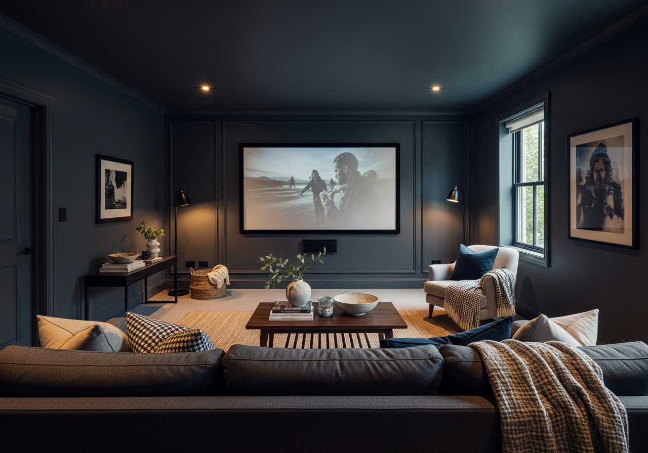
Black paint is the gold standard for media rooms because it absorbs almost all light, preventing reflections that can wash out the picture. This color maximizes contrast, allowing bright scenes to shine and dark scenes to appear richer.
Choosing black creates a true theater feel, similar to commercial cinemas. It makes the screen the star of the room by eliminating distractions from wall reflections. While some worry that black could make the room feel smaller, this effect often enhances the immersive quality of the space.
Dark Gray Options for Multi-Purpose Rooms
Charcoal or dark gray tones are a practical choice if your media room doubles as a living space or office. These colors still absorb enough light to improve screen visibility but feel a bit softer and more flexible than pure black.
Gray is neutral and pairs well with various furniture styles and lighting setups. Shades like “Charcoal Slate” or “Graphite” provide a deep finish that complements both modern and traditional decors.
Dark gray also reduces eye strain effectively, striking a balance between performance and comfort for longer viewing sessions.
Other popular colors include navy blue, which adds a touch of elegance and depth without overwhelming the room. Burgundy or maroon paints offer a classic cinema feel while warming the space. For those wanting a cozy vibe, dark brown works well to absorb light and create a snug environment.
Understanding LRV and How to Choose Paint by the Numbers
Light Reflectance Value, or LRV, simplifies the challenge of picking media room paint colors. Rather than guessing how a shade will impact your setup, you can use this number to predict how much light the color will absorb or reflect.
LRV is measured on a scale from 0 to 100, where 0 represents absolute black that absorbs all light, and 100 represents pure white that reflects all light. For a media room, the ideal LRV usually falls between 5 and 25 to minimize light bounce while keeping the space comfortable.
Choosing paint with too high an LRV means more reflected light, causing glare and washed-out images. A color with too low an LRV, near pure black, is perfect for dedicated theater rooms but may be too dark for multi-purpose spaces where some light is needed.
To make the best choice, consider your lighting setup along with the LRV. Rooms with strict light control like blackout curtains can handle colors with very low LRV. Those with some ambient light might benefit from slightly higher LRV shades like dark gray or navy.
Keep in mind that finish affects effective LRV too. Matte paints slightly reduce light reflection compared to glossy finishes. Using an LRV chart helps narrow down your options and gives a clear direction beyond just trusting color swatches.
| Color | Example LRV | Key Feature |
|---|---|---|
| Black | 5 | Maximum light absorption and contrast |
| Charcoal Gray | 10-15 | Balance of light control and versatility |
| Navy Blue | 12-18 | Elegant depth with good light absorption |
| Burgundy/Maroon | 15-20 | Warmth and classic cinema mood |
| Dark Brown | 18-22 | Cozy feel with moderate light absorption |
Conclusion
Choosing the right media room paint colors means selecting shades that absorb light well, reduce glare, and enhance the screen’s contrast. Dark colors with low Light Reflectance Values like black, charcoal gray, and navy blue create the best environments for immersive viewing.
Consider both color and finish to reduce eye strain and shape the perfect theater atmosphere. Start by measuring your room’s lighting conditions and use LRV as a guide to pick the right shade. Test samples with a matte finish before painting to ensure optimal performance and comfort for your media space.